Transformation Brainstorm
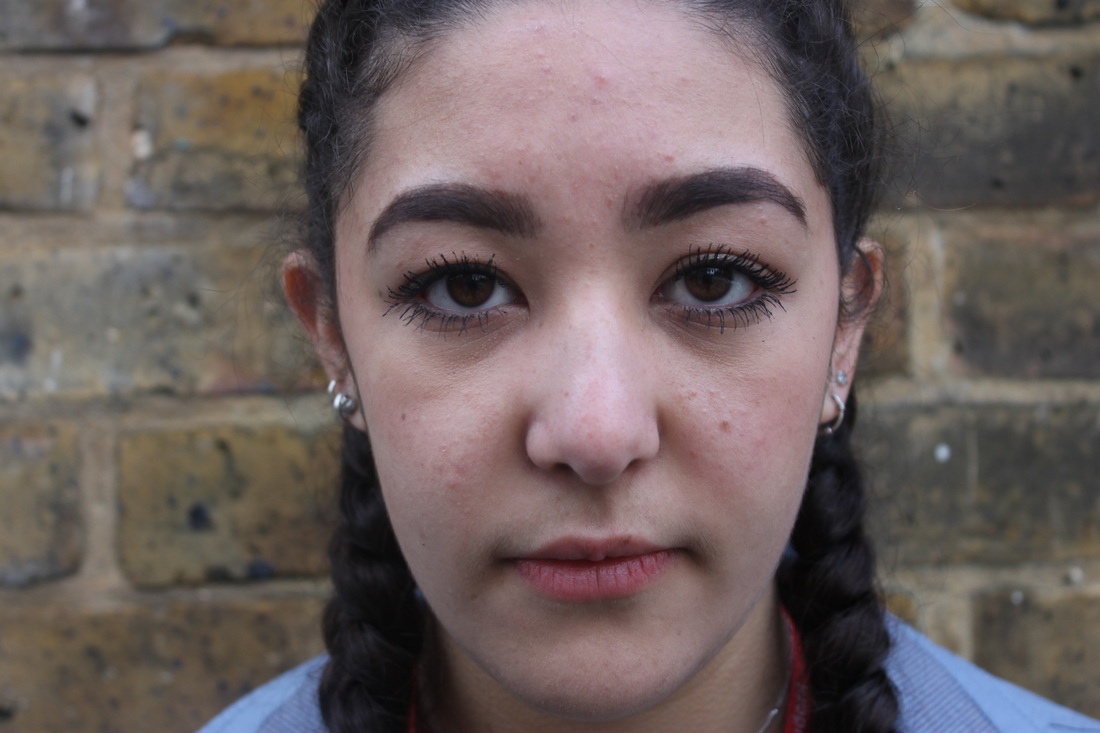
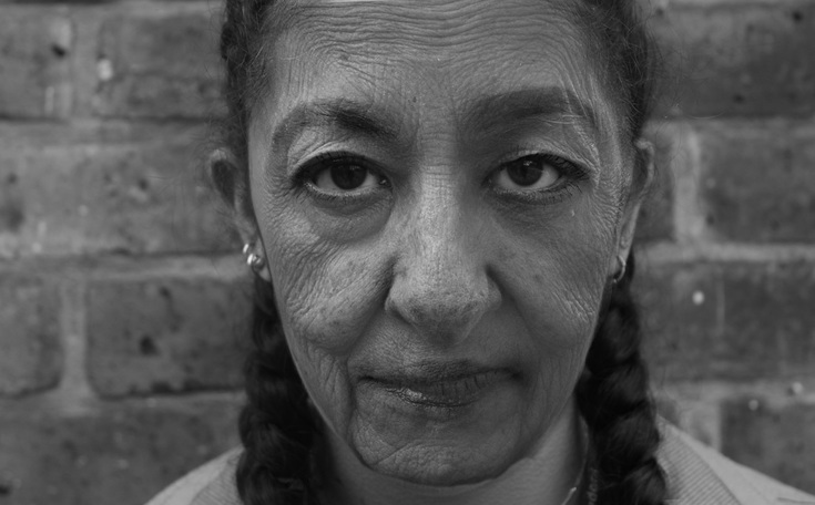
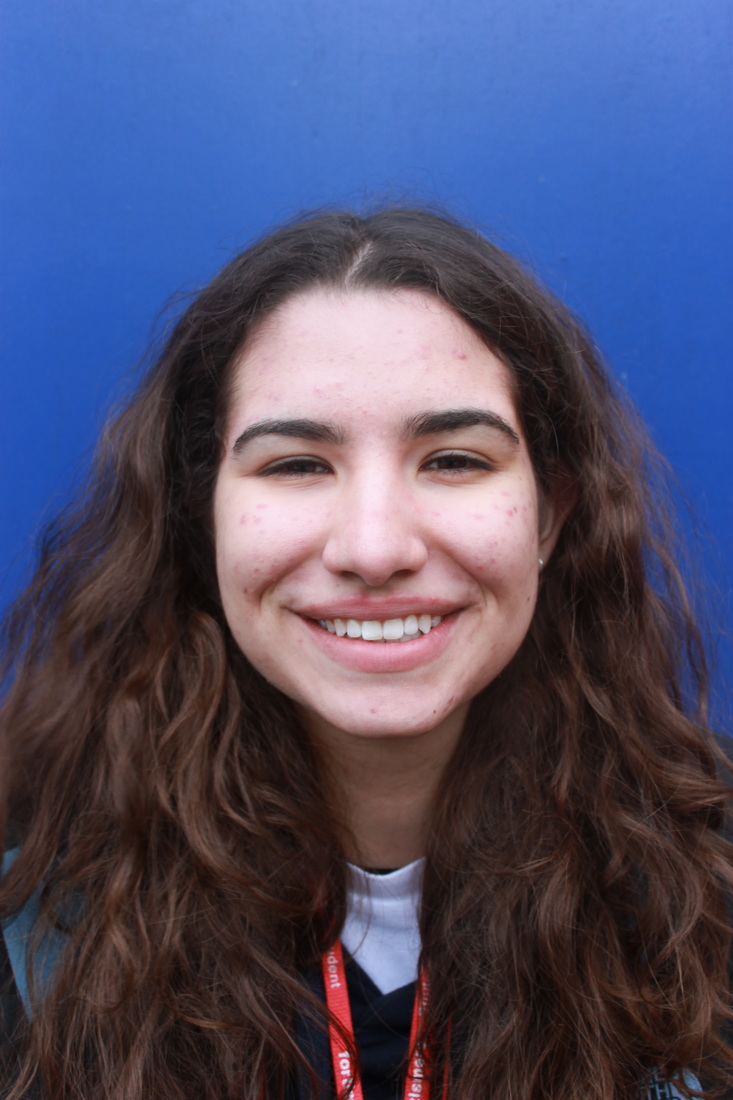
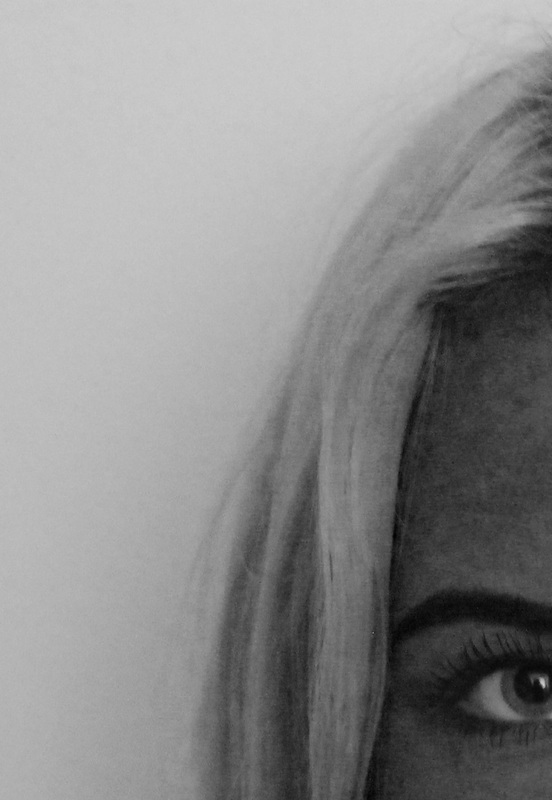
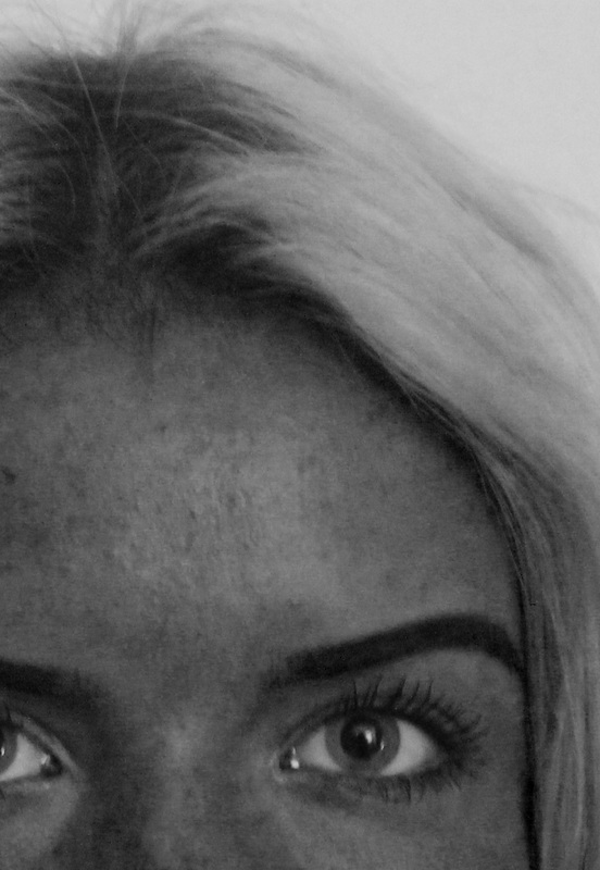
Portrait Transformation - Time
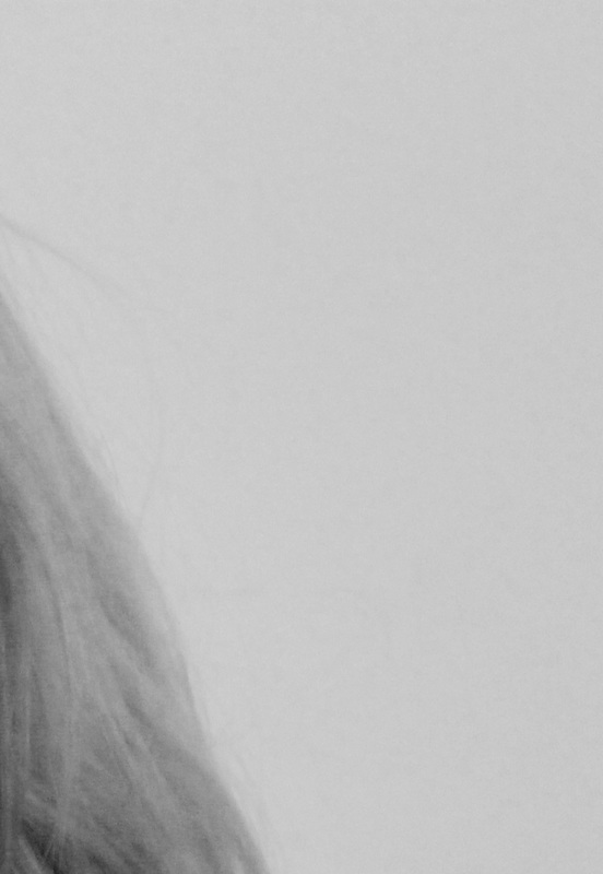
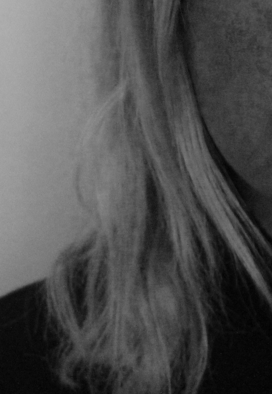
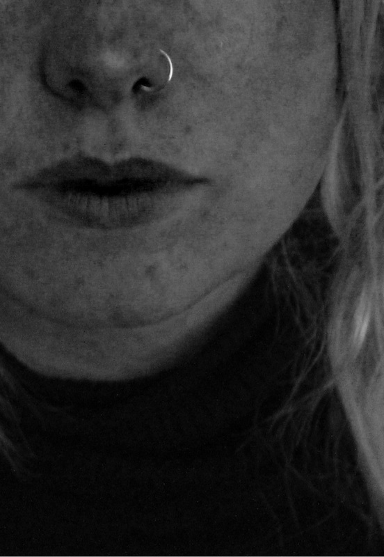
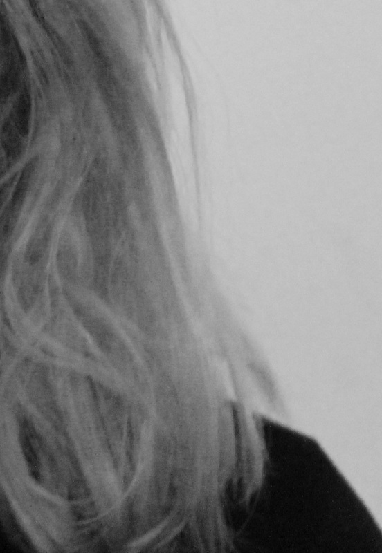
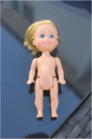
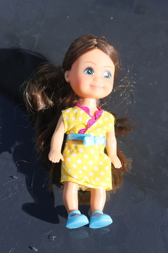
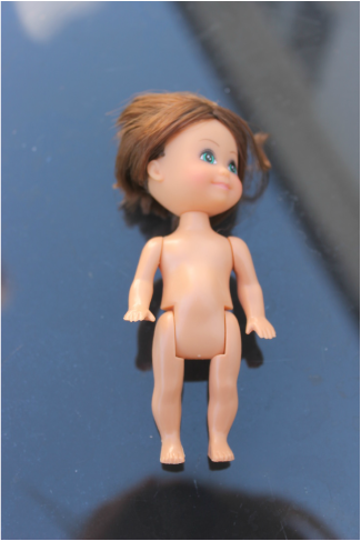
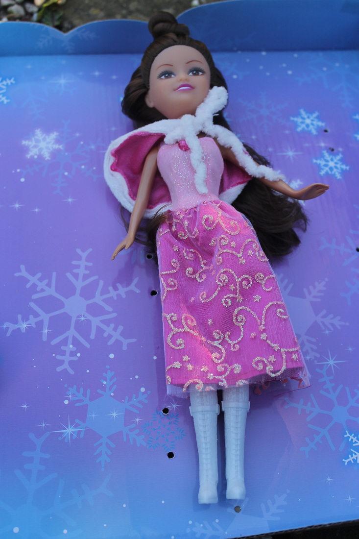
For this task I used Photoshop to age young people by at least 60/70 years, using images I found online and images I took myself. In doing this I managed to display the idea of transformation over time, this technique was almost like a predicting tool, creating what people could look like when they are older.
|
|
|
|
Process
For this task our aim was to take pictures of young people (16/17) and make them look old by merging their faces with that of older people on Photoshop. Below is a slideshow explaining the process in which I took to create the images above:
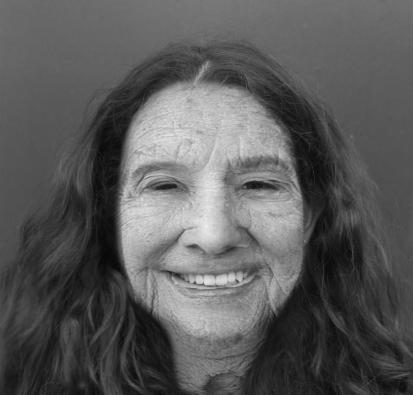
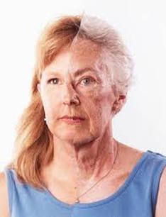
Bobby Neel Adams
'Bobby Neel Adams was born in Black Mountain, North Carolina and presently resides in Arizona on the Mexico Border. He has exhibited worldwide and his photographs are in the collections of: International Center for Photography, NY, Houston Museum of Fine Arts, Station Museum, diRosa Foundation, and the Norton Family Foundation to name a few. Adams has received grants and awards from the Aaron Siskind Foundation, LEF Foundation, MacDowell Art Colony and the Hermitage. His book Broken Wings was published by the Greenville Museum in 1997. Adams is currently working on a series of Memento Mori photographs of insects, birds, and mammals.'
Adams created this images for his collection called 'Family Tree' by taking images of family members doing the same pose and then printing the negatives at equal size before tearing them and gluing them back together. Adams' process is 100% Analog, with no digital manipulation to alter or enhance the original images, for him the process was trial and error - they either merged or didn't.
The FamilyTree collection's aims was to creates portraits that visually map the genetic characteristics we inherit from our parents, as people always wonder from the day their baby is born will it look like their mum or their dad? This project exposes these questions for all to see, by directly comparing the two.
His work was the inspiration behind our ageing images, but in upcoming tasks we plan to respond further to Adams by merging pictures of our families and relatives in hopes of producing work similar to Adams'. Adams' pictures below are a good example of our brief 'Transformation' as he looks at age and growth and merging the young and the old via what seems to be ripped in half photos. He's managed to choose relatives that look incredibly similar but just different ages, it's quite powerful and interesting to see them merged parallel to one another.
|
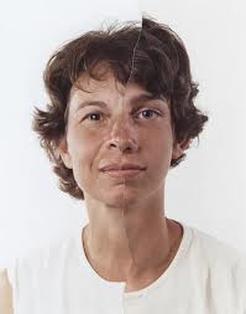
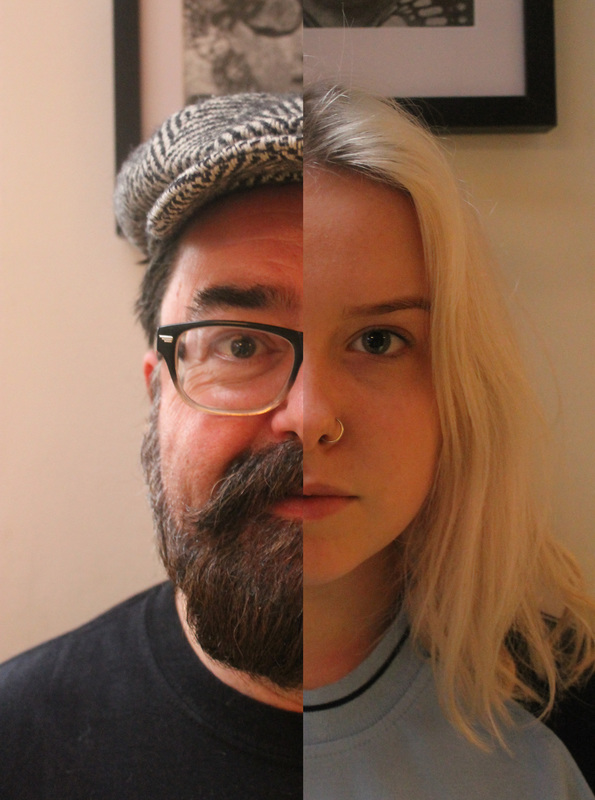
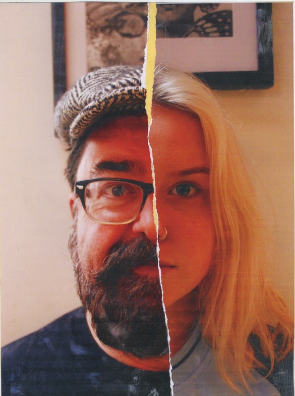
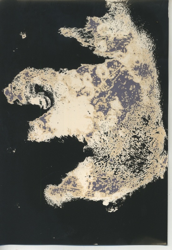
<-- In this image we see the merging of a mother and his son ripped raggedly through the middle. Both wear white shirts and you can see quite clearly the similarities between them such as their mouths. However their eyes and nose look different and their height, but not so much that you can't see that they're related. Adams has managed to compose these two images nearly identically has they seem to merge quite seamlessly . Due to the random ripping of the images by Adams there is more of the mother's face on view than the son's. His photos have clarity and use what we can assume is a mixture of natural and artificial lighting. This image is one of Adams many are visual maps showing the genetic characteristics we inherit from our parents.
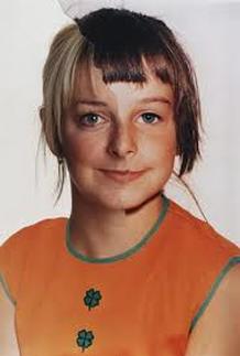
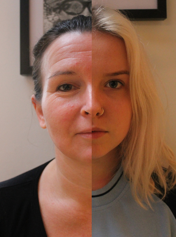
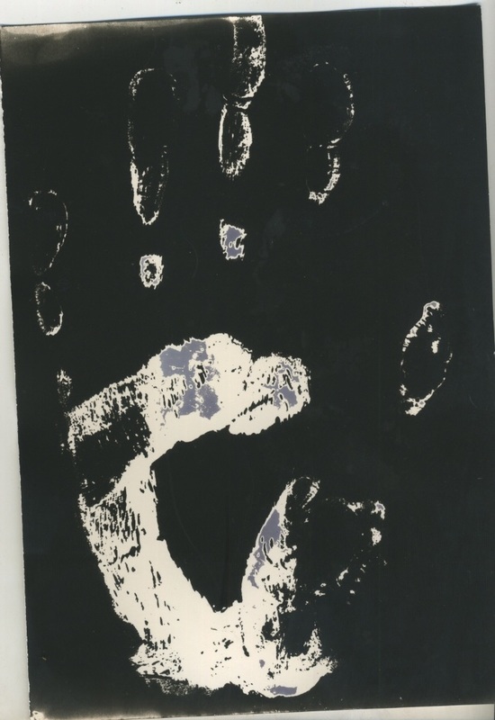
--> This image shows the merging of a mother and daughter through the technique of ripping two images in half and putting them together. Texture in this image is more prevalent due to the wider difference in age, there is also varying colours, tanner skin vs. lighter skins and ginger hair vs. white hair. At first glance there aren't many similarities you can pick up yet they still look related, but with a closer look you can see the structure of their face and mouth are similar, and you can almost see that when this women's mother was younger she probably looked a lot more like her daughter, but age has affected their similarities. His photos have clarity and use what we can assume is a mixture of natural and artificial lighting. This image is one of Adams many are visual maps showing the genetic characteristics we inherit from our parents. |
|
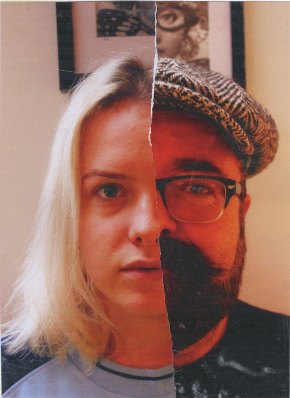
Response to Bobby Neel Adams
For this task I took images of my mum, dad and sister and merged them together to see what similarities their faces had. I used photoshop to merge them the first time and then printed out the same images, ripped them in half and stuck them together on card. I felt that the merging of my mum and sister's face didn't go aswell as the merging of my sister and dad (bar the beard). From this I can conclude that my dad and sister have more facial features in common than my mum and sister.
Edited on Photoshop
|
|
Physically Torn and Merged
|
|
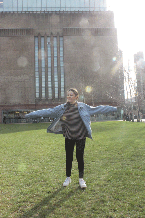
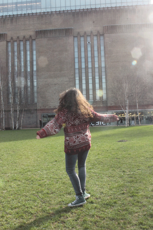
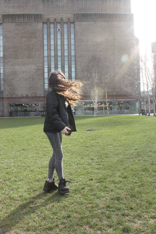
Camera Transformation
For this task I exlpored the transformation of the camera over the years, from film to digital to iPhone, by taking photos of the same person with every kind of camera. For the extension task I explored alternative ways to creating images on photographic paper. Nivea printing consists of applying nivea moisturiser to your face then pressing a piece of photographic paper onto it then put it in developer, washed it in washing up liquid then put it in fix. Then I took some cyanotypes, which consisted of painting a piece of paper blue with special chemicals in the mixture, taking that paper, your acetate and a piece of glass outside in the sun. When doing this you place the paper in between the acetate and place the glass on top and leave it in the sun for 10 minutes. When bathing it in water after this process your image comes to life and you get what I have showed beneath in 'Extension of Camera Transformation.'
Film Camera - first put on sale in 1888. A film camera is a camera that exposes photographic film to light in order to take a picture. When shooting with film you seem to age the person in the image, taking them back to a different decade. Even though the images are quite refined they don't compare to the quality of technology today, however there is a sort of timelessness to these images that you don't find in digital as it's so instant and easily manipulated.
Digital Camera - first made in 1975 (first electronic camera). A digital camera is a camera that records and stores digital images. The speed and immediate results of digital gives these images more room for development as you can change the look of an image by altering the shutter speed, aperture or ISO. The ease that comes with the simple manipulation of images captured on digital makes the interesting, but also makes them incredibly refined and highly defined.
iPhone 5S - introduced in 2013. An iPhone is a smartphone made by Apple that combines an iPod, a tablet PC, a digital camera and a cellular phone. The device includes Internet browsing and networking capabilities.On an iPhone 5S the quality is never as good as a digital camera however these images are much more personal as you can take them whenever and wherever and can consist of many of selfie. Your camera roll is personal, a visual diary of your life, where as a digital camera is a lot more professional.
Film
 Digital
Extension of Camera Transformation
Cyanotype
Nivea Print - Face
|
Nivea Print - Hand
|
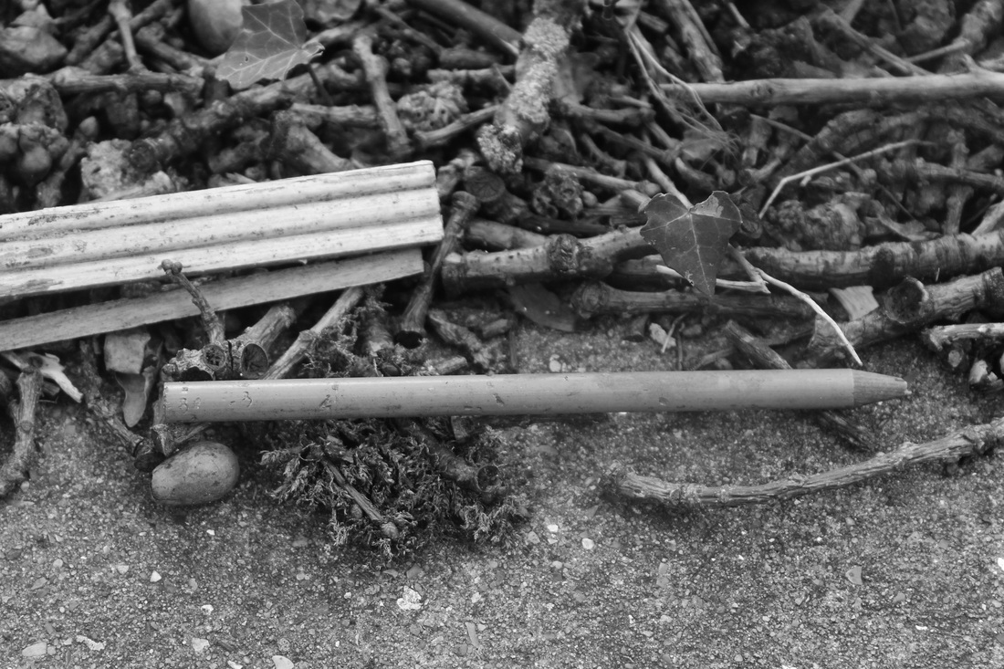
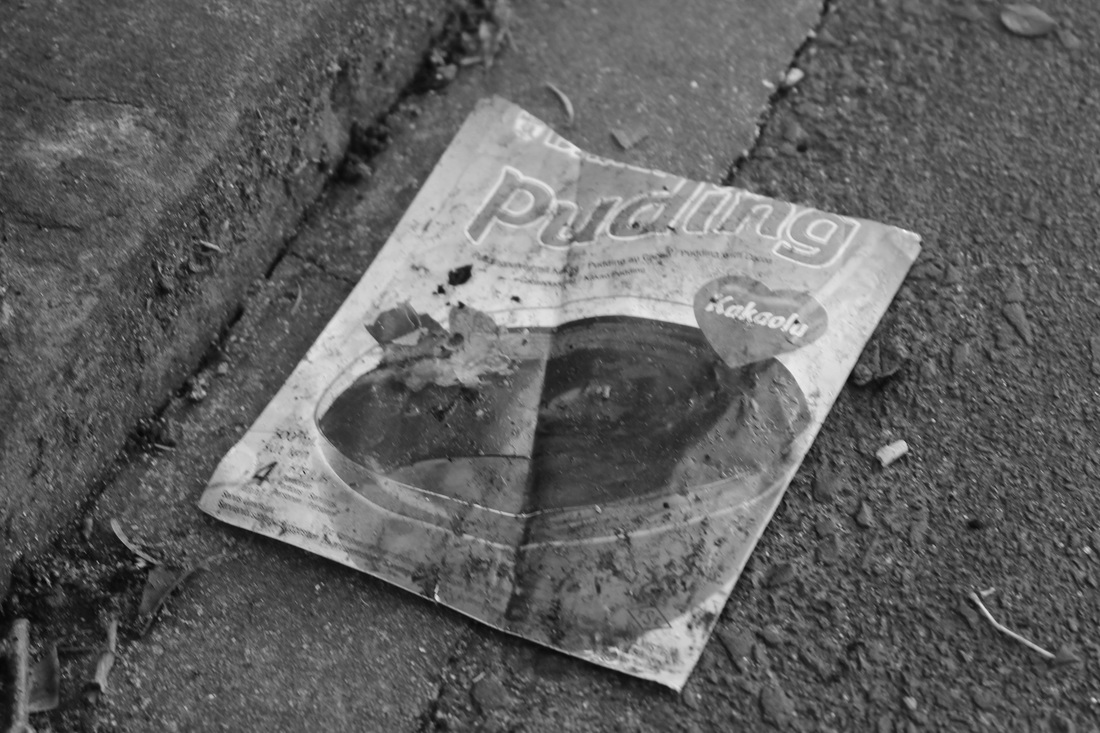
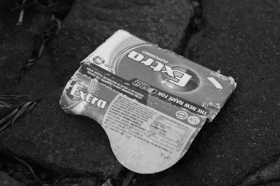
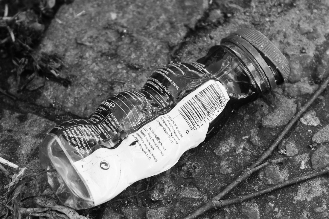
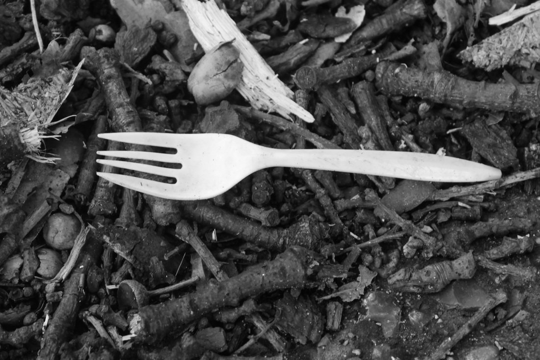
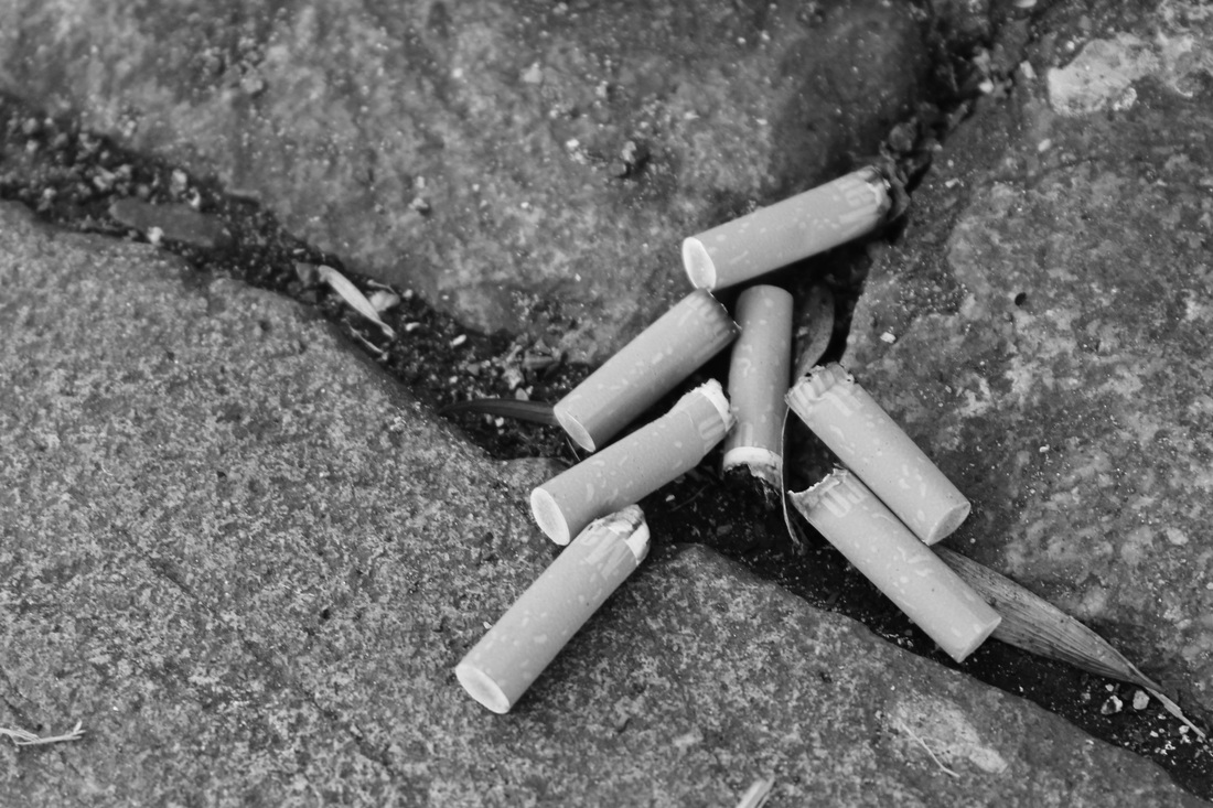
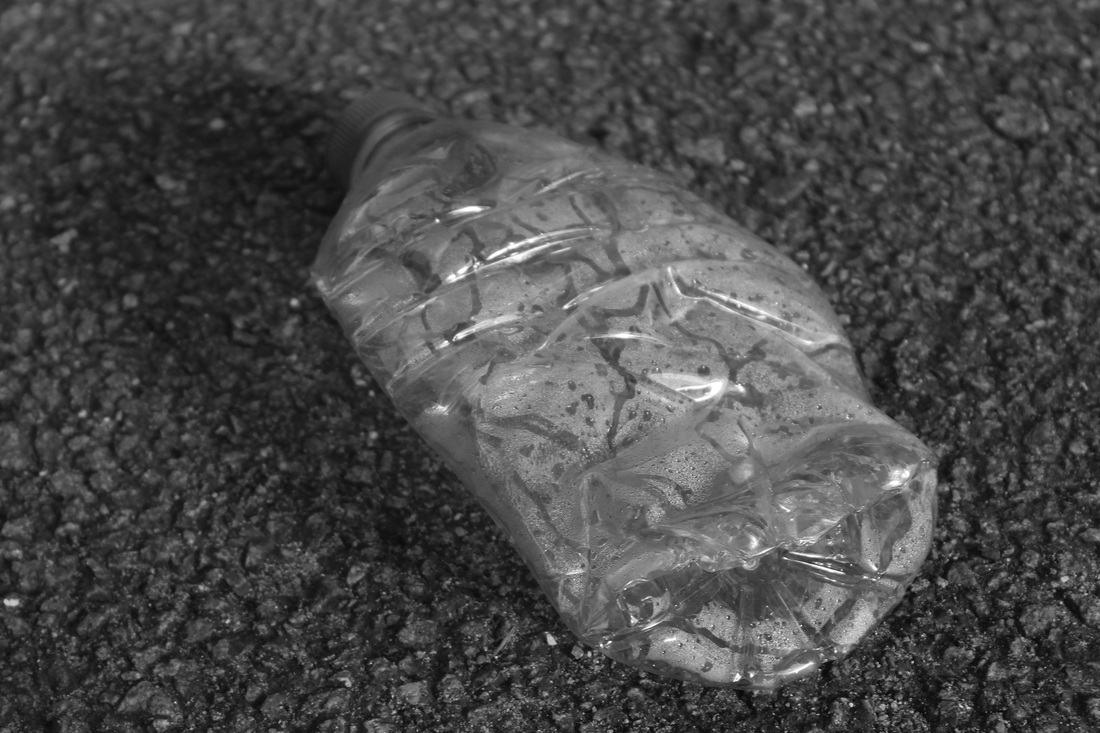
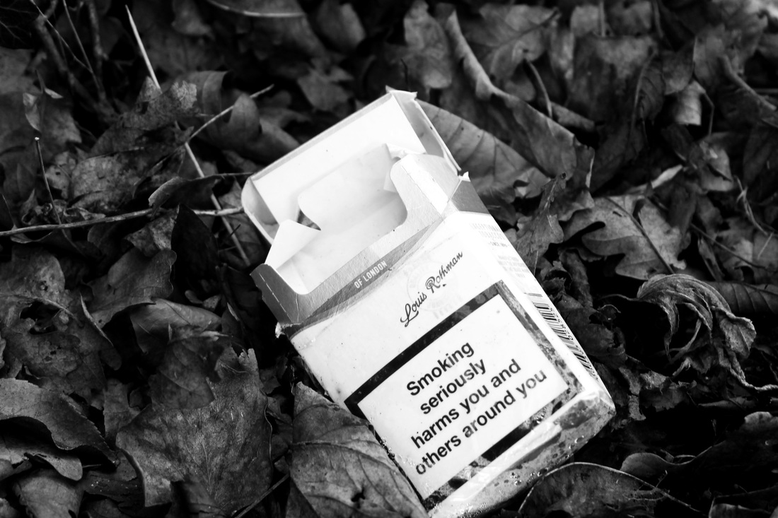
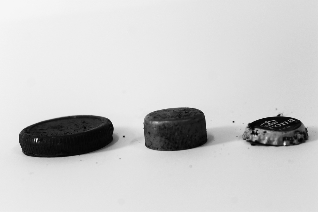
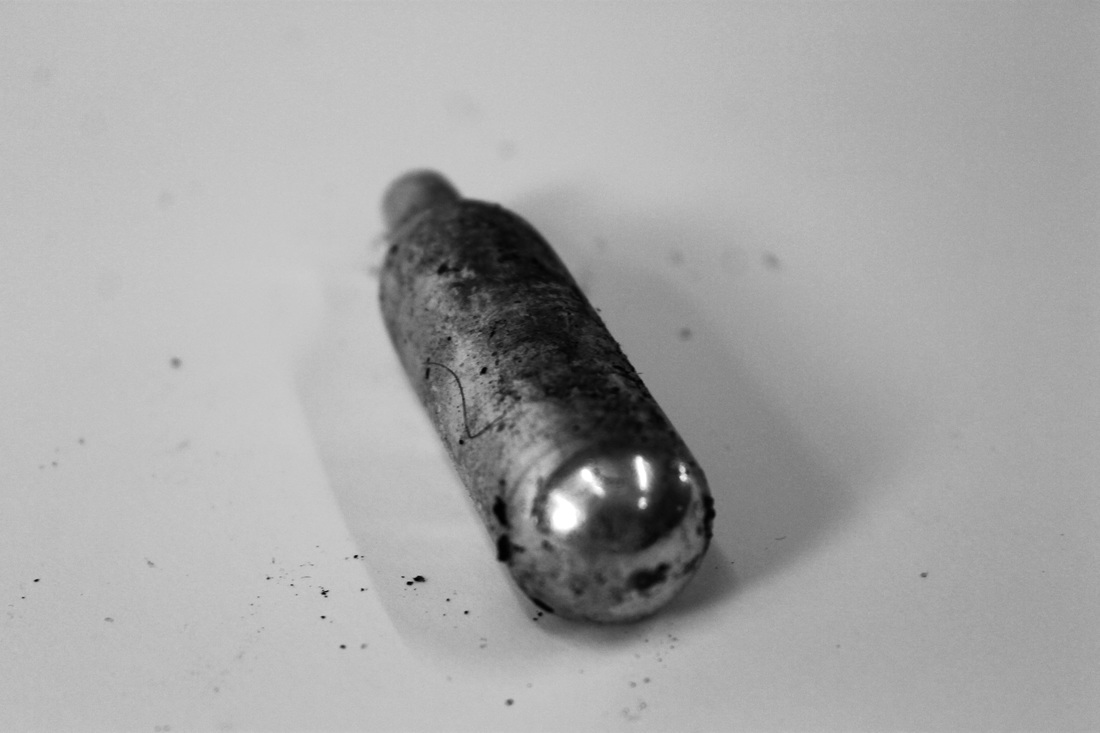
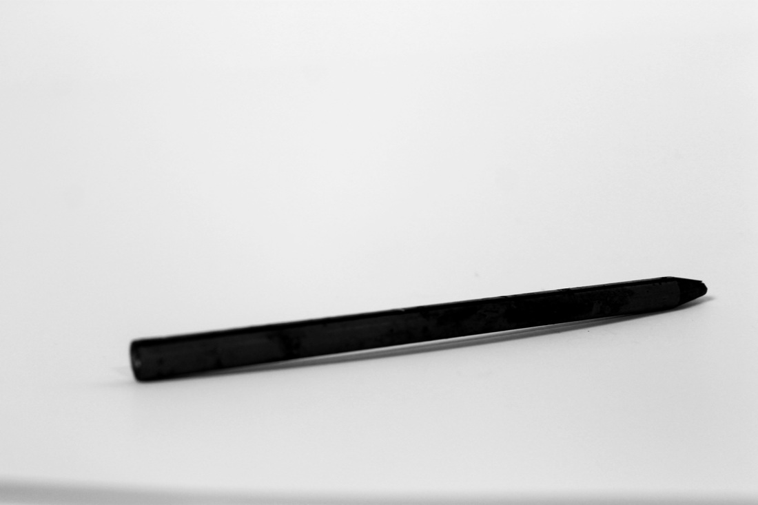
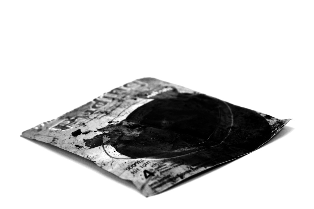
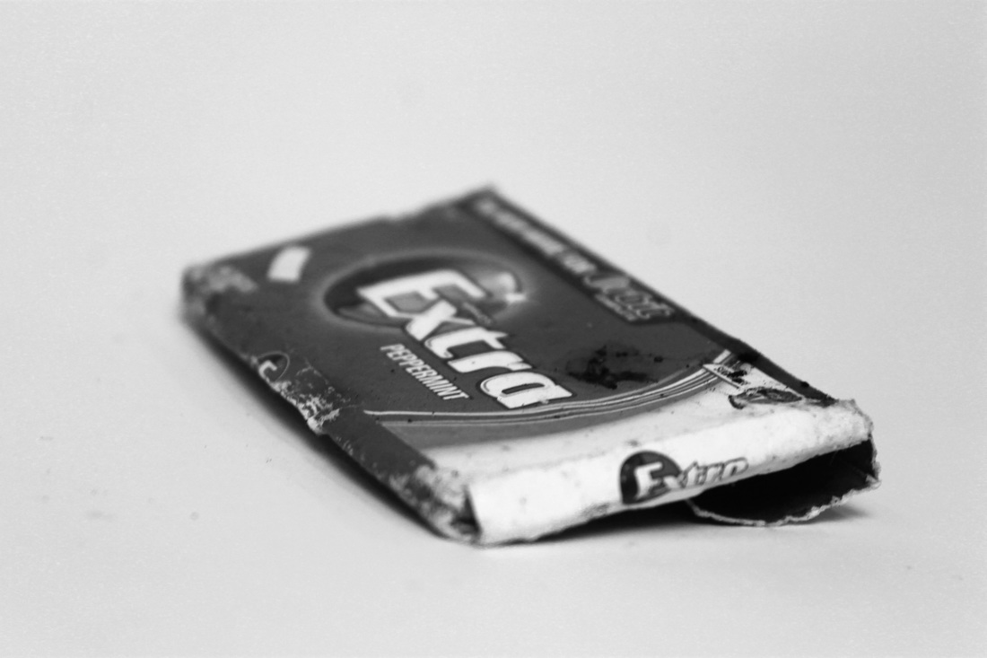
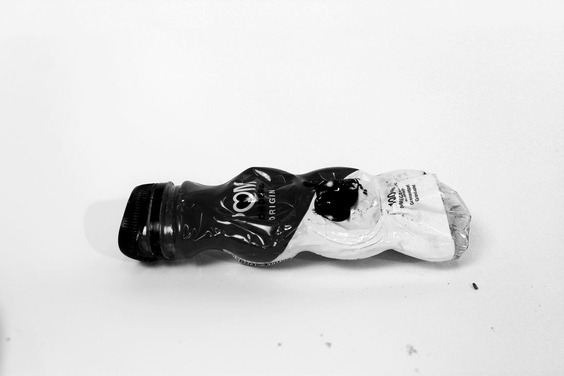
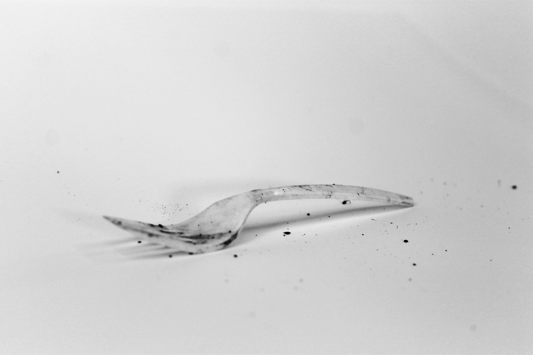
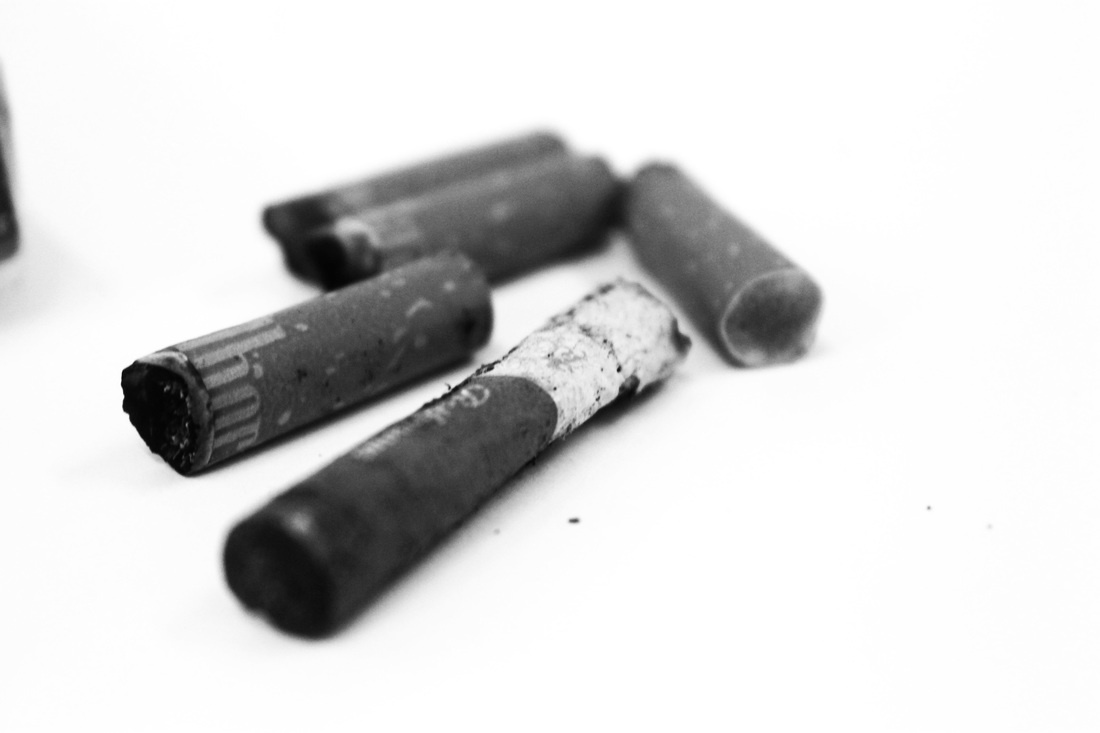
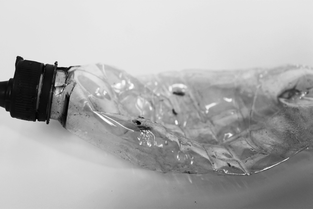
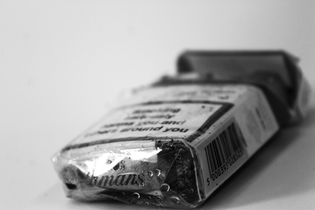
Object Transformation
For this task I photographed everyday objects and rubbish on the ground in my local area, then picked them up and put them in a bag to take back to the studio. Once in the studio I took pictures of them again, and edited both types of image on Photoshop. So from taking pictures of these objects in their natural habitat, by taking images of them again in the studio elevated their status to that of an art piece, which was an interesting transformation.
I found that once I put these discarded items in the studio, I saw them in a different light as they seemed to attain more beauty, it was interesting to view such ordinary objects status elevate so effortlessly. The use of monochrome also gave them more style, making them into art pieces rather than rubbish on the side of the street. This simple transition had an impact on my appreciation of the objects as it was fascinating to see how easily you can turn someting into art.
I found that once I put these discarded items in the studio, I saw them in a different light as they seemed to attain more beauty, it was interesting to view such ordinary objects status elevate so effortlessly. The use of monochrome also gave them more style, making them into art pieces rather than rubbish on the side of the street. This simple transition had an impact on my appreciation of the objects as it was fascinating to see how easily you can turn someting into art.
|
Contact Sheets - When Found
|
Contact Sheets - In The Studio
|
|
|
Irving Penn
|
Penn's approach to the still life evolved over decades; from the 1930s onwards, he arranged everyday objects that he found on the street and transformed them into conceptual pieces of art. This is exactly the technique Penn used in 'Cigarettes', by bringing his subjects into his studio (like we did ours), he created minimalist compositions that evolved into a statement on one of the most widely consumed and discarded products of society. There decayed forms symbolising the decay they do to people physically but also adding context to contemporary culture.
Irving Penn was an American photographer known for his fashion photography, portraits, and still lifes. Penn's career included work at Vogue magazine, and independent advertising work for clients including Issey Miyake and Clinique. Born June 16th 1917, he died in 2009 on October 7th in New York. |
|
Transformation of Space
Below is the photograph I split into 6 A3 rectangles that I then stuck onto the stairway walls. Below this split image is a slideshow of what happened to our stairway walls when our whole class stuck our large images onto it. A once bare set of walls now covered in monochrome photographs. This task was in response to JR who I discuss more under the slideshow.
|
|
|
|
|
|
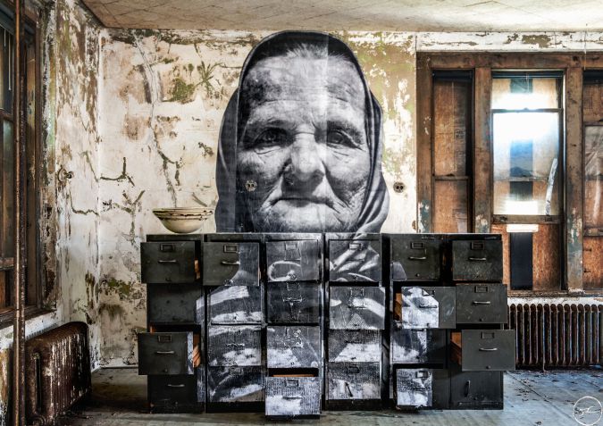
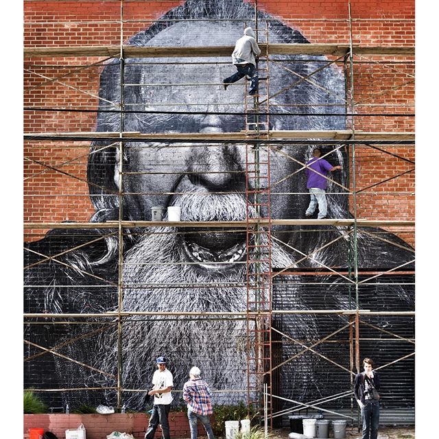
J.R
JR (identity unconfirmed but is the owner of the biggest art gallery in the world) exhibits freely in the streets of the world, catching the attention of people who are not typical museum visitors. His work mixes Art and Act, talks about commitment, freedom, identity and limit. After he found a camera in the Paris subway, he did a tour of European Street Art, tracking the people who communicate messages via the walls. Then, he started to work on the vertical limits, watching the people and the passage of life from the forbidden undergrounds and roofs of Paris. He created a film/video that re-inacts the riots in France and the knocking down of the buildings in which these rioters lived, on this building JR had stuck his photographs of the inhabitants of the building showing a sense of defiance and creating power and stability for the residents of the building. In our response we took photographs blew them up to A3 and stuck them on our staircase walls, whilst not an act of defiance or power, it still put forward the idea of identity as JR does.
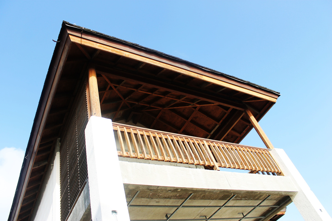
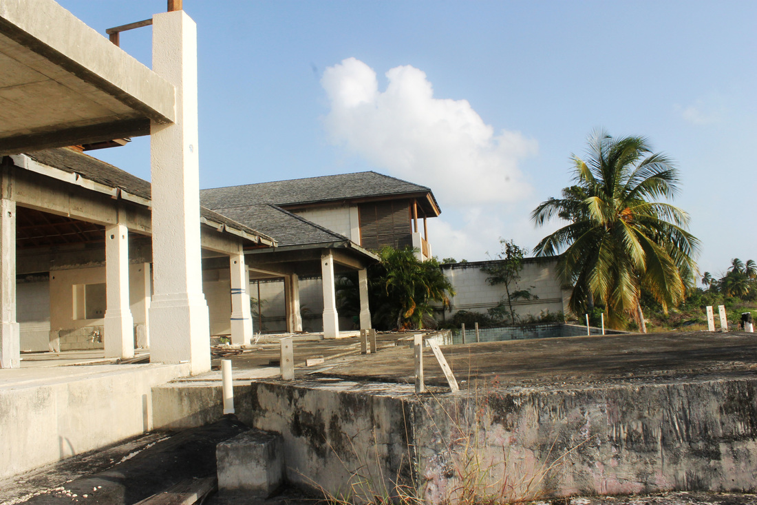
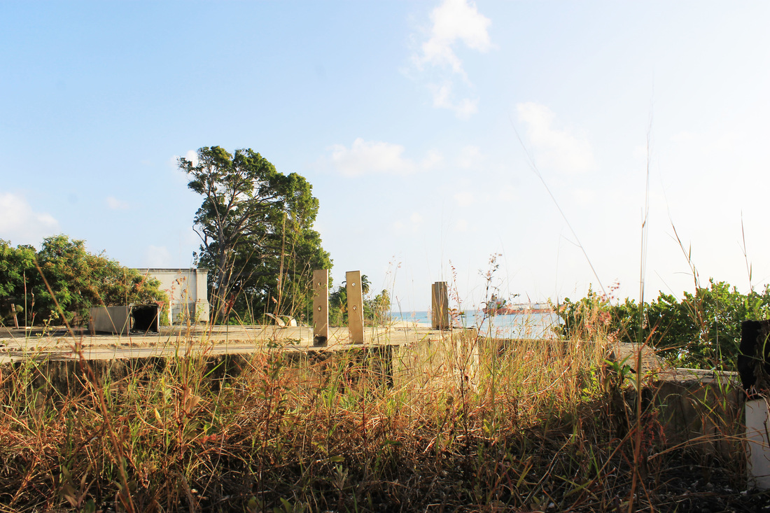
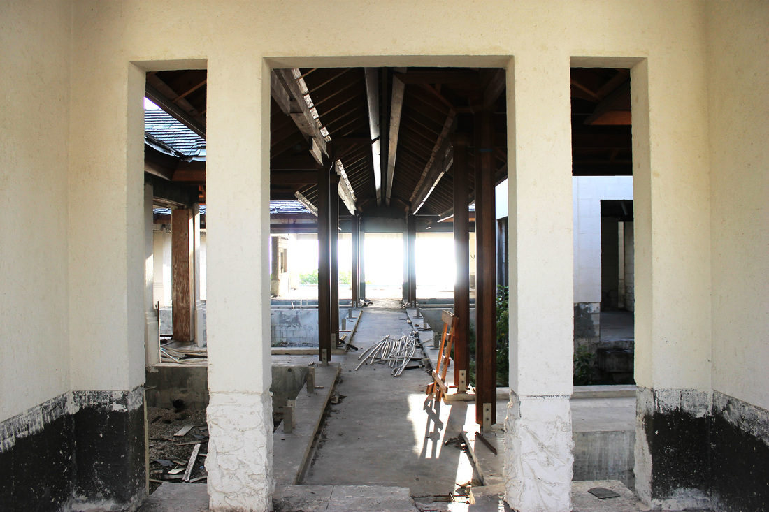
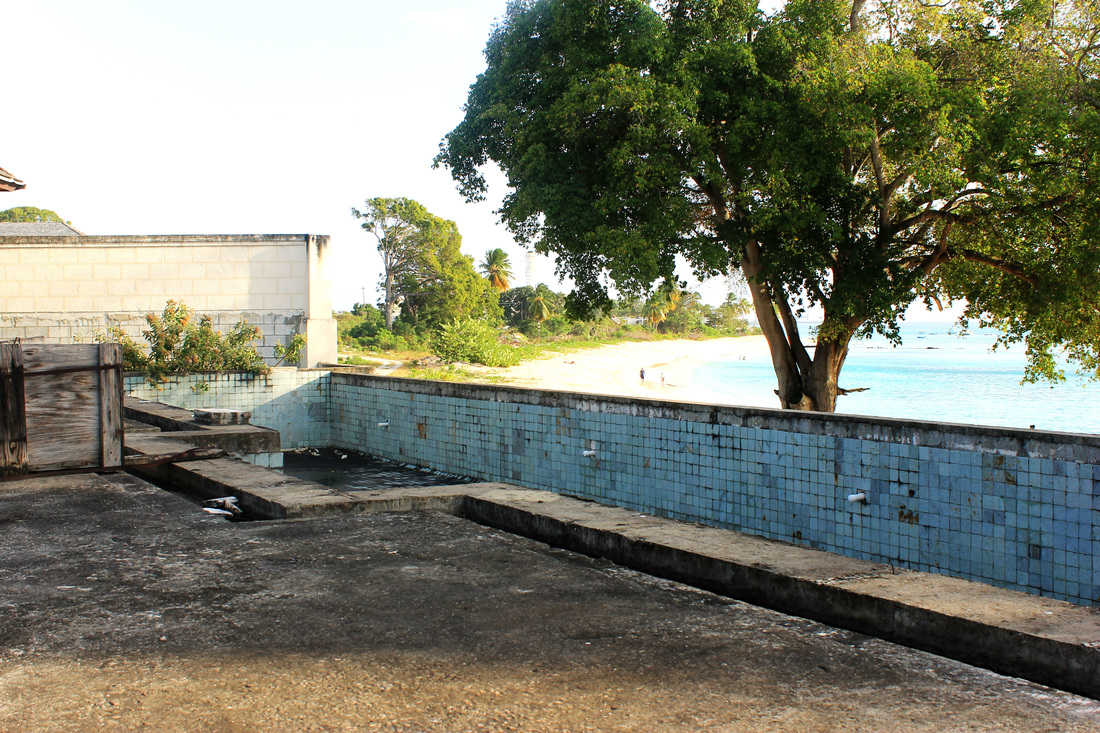
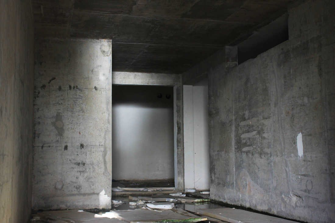
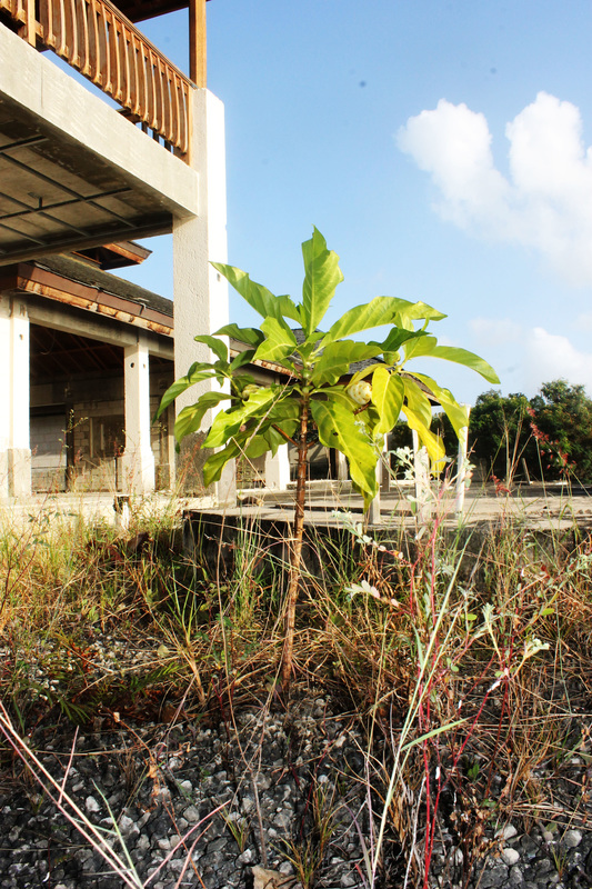
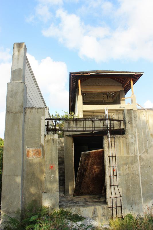
Strand 1 - Derelict Transformation
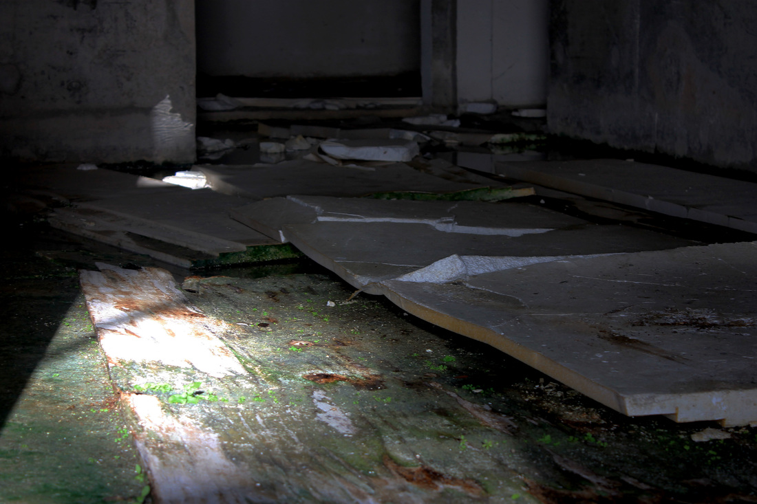
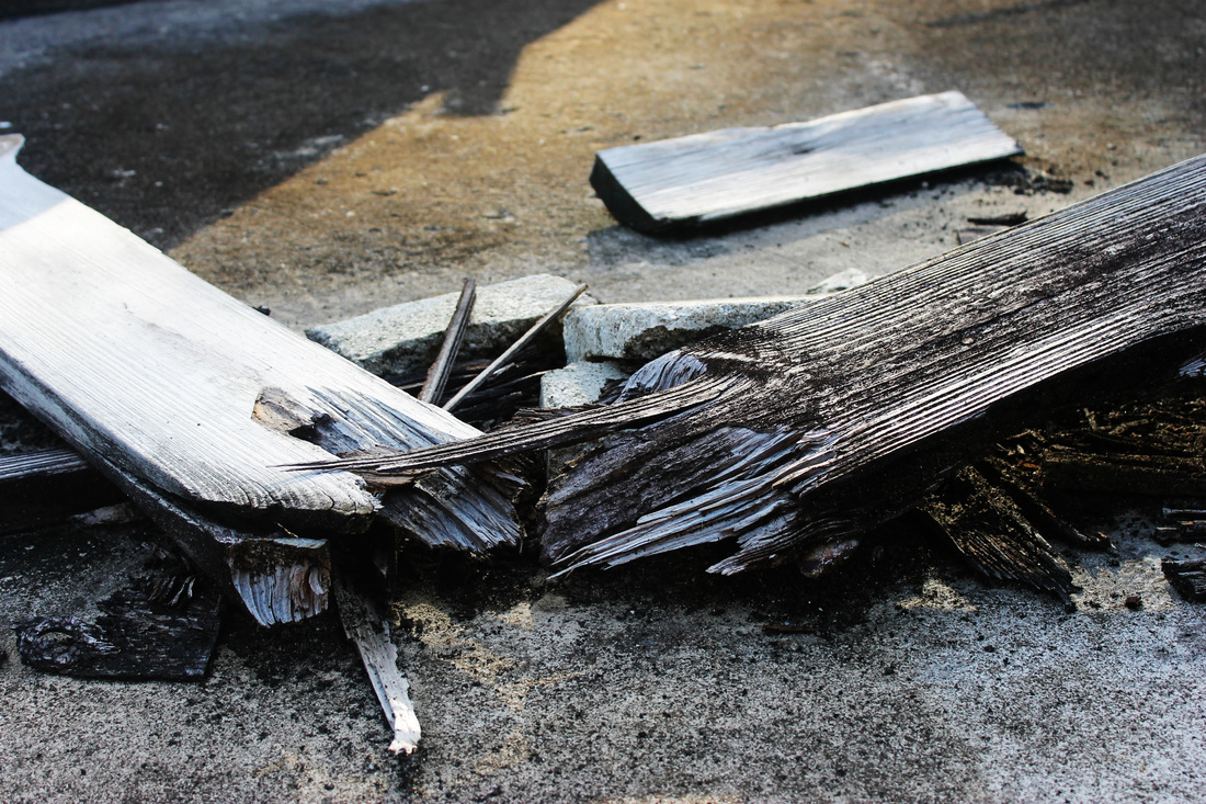
When visiting Barbados I came across a derelict Four Seasons hotel, that a local man told me had been given up on during the recession in 2007/2009. I ventured inside the abandoned hotel where there were empty pools, half constructed walls, ceilings and floors, flights of stairs and many different rooms. Below is a collection of all the images I took , looking at the transformation of the building over the years after it had been deserted; nature weaving it's way in, and the stark, quite ugly building against the stunning light blue sea and white sands of the beach.
WWW: I captured the theme of 'derelict' well and created a strong contrast in my images between nature and manmade which gave more depth to my images. Also I created a contrast between a beautiful scenic background and a quite ugly, decaying foreground. I also used a variety of angles and shots to create differentiation between each image.
EBI:I could have focused more on texture to make my images stronger or applied the rule of thirds to my composition.
Edited Favourites
|
|
|
|
Contact Sheets
|
Urbex - Urban Exploration
|
Anna MikaFor this collection of images Mika (from Poland, aged 25) visited many abandoned buildings such as old mills, churches and factories. Through this photography she has managed to capture many different decaying rooms and structures, using lens' such as a fish eyes lens. In this collection she has managed to include so much in one shot, such as decaying ceilings, walls and objects. Untouched for many years, ruined by age yet still Mika has managed to capture the beauty within these derelict buildings. The Daily Mail calls Mika's work 'Haunting photos reveal the beauty of abandoned buildings before nature reclaims them.' This statement and observation shows a clear difference between mine and Mika's images, for a main focus in my photographs is the idea of nature weaving itself back into what was formerly there's, where as Mika has avoided this element. Her images have a darker undertone to hers, which mine of the surface do not yet the context behind my photographs give it an emotional element. For example through the derelict hotel, you see the side effects of the recession, the loss of jobs, the loss of extra tourism that would come to an island so reliant on it and how the recession even effected those that you would assume were so rich the recession wouldn't have affected them i.e the franchise Four Seasons. Mika has captured photographs of buildings that were used and complete at one point in their life, yet the Four Season's Hotel never was complete or used, creating a sad, depressing element to my photographs despite the bright colours and scenery within them.
|
|
Ten Ten / Graduation Work
|
I've decided to respond to her work because I like the alien feel to these images, giving people features they would never normally have. Her style of photography gives the images an obscure, unnatural feel to them, via the angle of her photographs, the positioning of the dots on her subject's body, the lighting and the way she has composed multiple people in a photograph. This use of mixed media gives her photographs an otherworldly, supernatural feel that appealed to me.
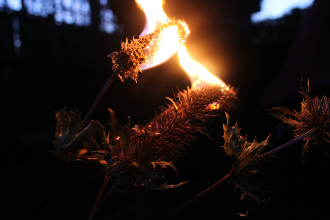
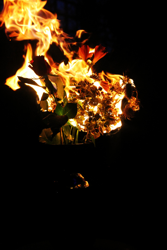
Strand 2 - Nature Transformation
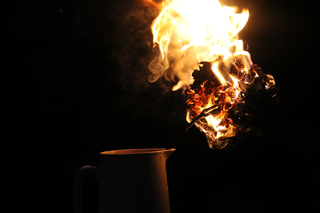
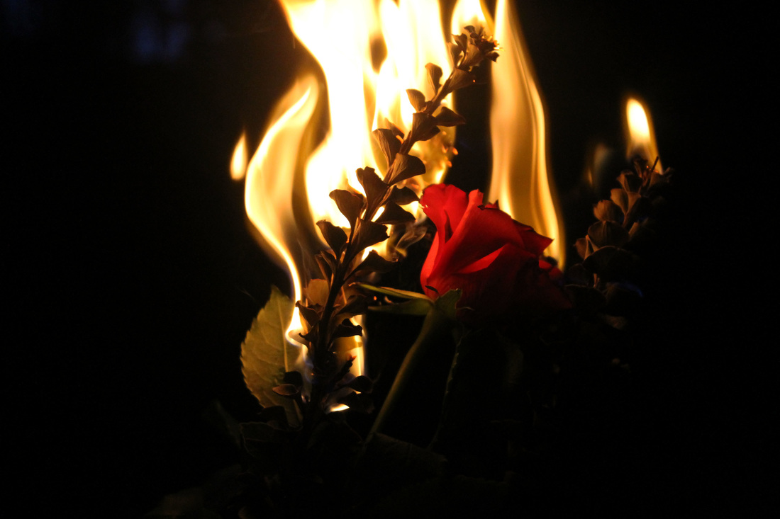
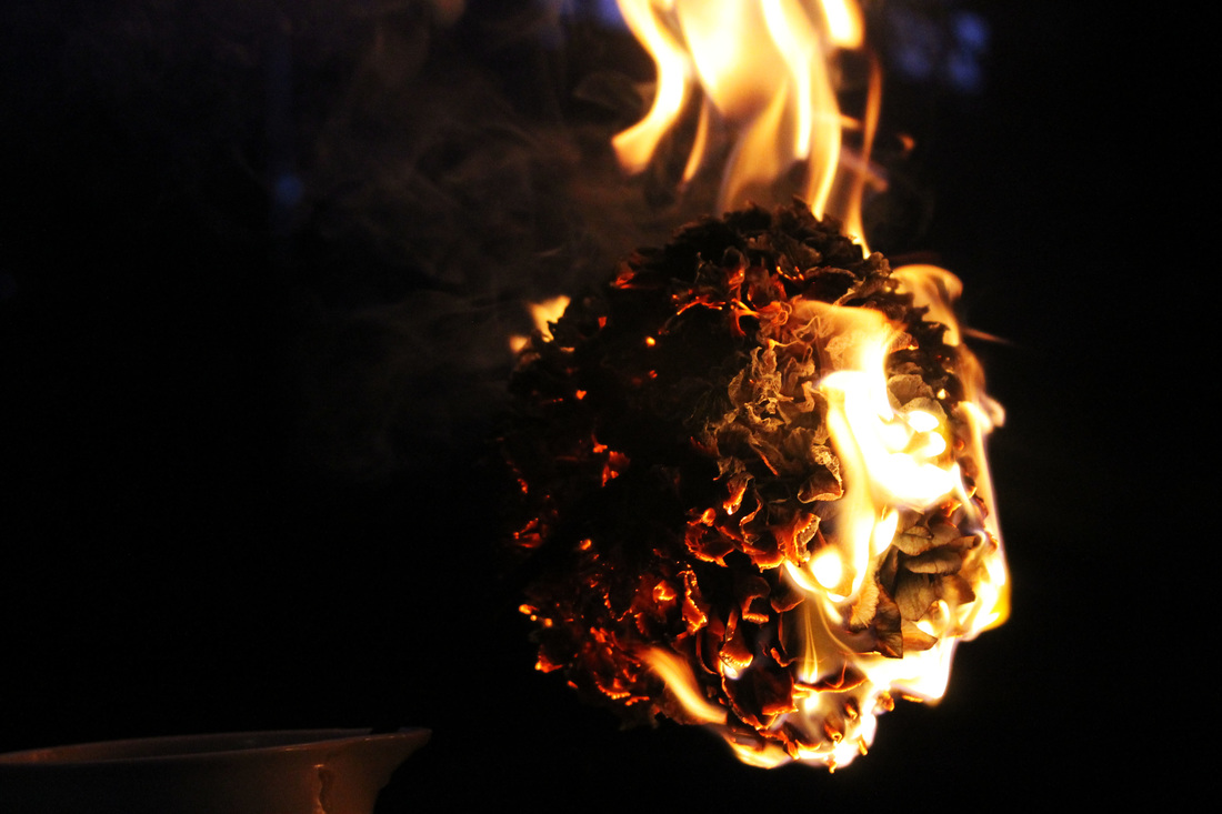
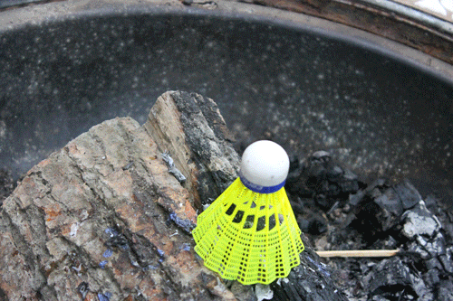
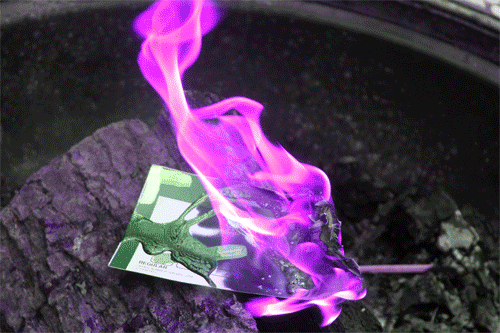
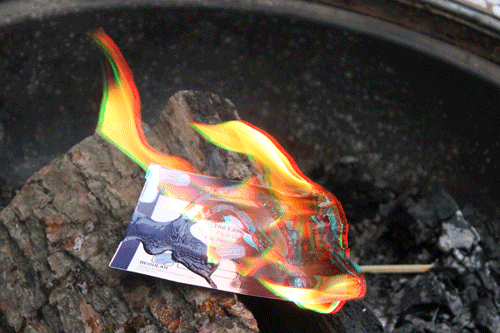
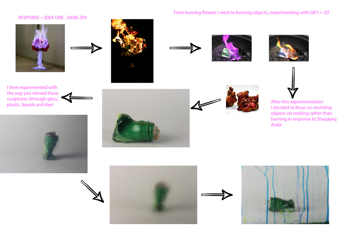
For this strand I responded to Chinese photographer Jiang Zhi's collection 'Love Letters'. When photographing and constructing this shoot I tried to incorporate elegance via the use of difference vases, yet I became more infatuated with the movement and destruction of the flames to the flowers, thus taking more zoomed in shots. I composed the bouquets of flowers with a mixture of dry and moist flowers, as the moist, more alive flowers were incredibly difficult to burn, so by putting them together it allowed both to ignite. The dry flowers burst into flames almost immediately, whilst the dry flowers burnt immediately they would go out quickly, so by using lighter fluid I managed to created a path and larger ignition for the flames. Using contrast and brightness I managed to enhance the flames and darken the background to make the flames the sole focal point. Whilst I side-stepped the elegance of Jiang Zhi's work, I think I still managed to evoke the same power and beauty as he did, and I think the emotional undertones still remain, especially in the close up pictures as the image looks less structured and more natural.
WWW: Capturing the movement and the extravagance of the flame is a strong point in these images, my use of a fast shutter speed and continuous shooting being the reason for this. I also think I caught the correct moments as the flame hadn't completely overwhelmed the flower(s) yet, so they were still visible.
EBI: These images would have been better if I could have managed to capture and compose the same elegance and colour of Jiang Zhi's work, which I found very difficult to recreate. Also having a more elegant and contrasting background would have improved these images.
Edited Favourites
Contact Sheets
|
Love Letters
"Beautiful things and objects themselves will ultimately disappear, but the beauty itself will live on, as well as love. Perhaps this is what I am trying to express. This series of works is actually just that, a series of "Love Letters". Beauty, pain, transience and eternity, blossoming and wilting, passion and grace, dedication, giving and sacrifice ……These are all about love.” - Jiang Zhi
|
Jiang ZhiJiang Zhi is considered one of China's most diverse and avant-garde artists of his age, born in 1971 in Yuanqiang, he then went on to graduate from the China Acadamey of Fine Arts in Hangzhou. Zhi experiments with oil painting, video, installation, sculpture and photography, giving his artistic practice a wide range. So far Zhi has won many awards and prizes such as:
I have decided to respond to Zhi because of the power of his images and also the beauty, whilst I think a challenging form of photography I think I will be able to find a way in which I can respond to it and create the same beauty and strength. Zhi's combination of colours is daring but effective, and the emotional undertones to this collection of photographs is relatable, yet he enhances it using fire of differentiating colours. The composition of his photographs call for elegance and decadence with his use of beautiful flowers in their stylish vases; yet this is opposed by the colours created by the flames swallowing the flowers. |
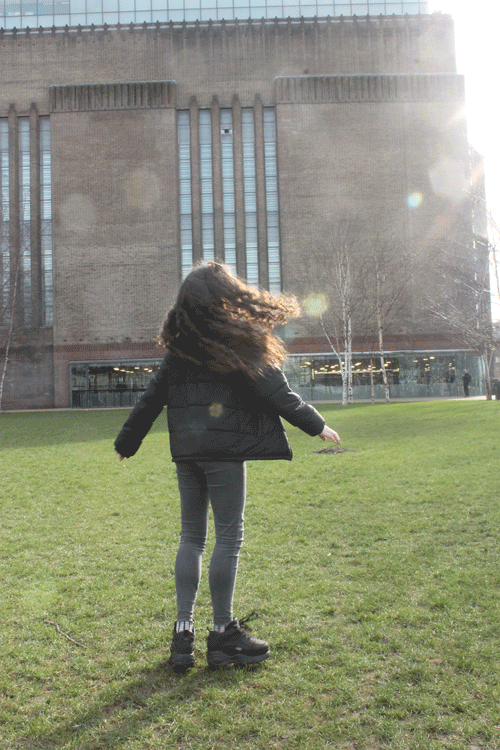
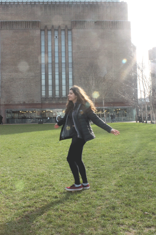
Photographs Taken at The Tate
When visiting The Tate I took photos of my classmates spinning, I took multiple photos that I then made into GIFs. In relation to transformation these photographs allowed me to observe the change in the structure and shape of a persons body as they spin, and also capture their altering facial expression as they continuously rotate their whole body. From these GIFs you can also see who spins in the same circle and who seems to flail about. It was interesting to see all my images in a moving image as you can see the direct changes (transformations) that happens to a person as they do something like spinning.
GIFs
|
|
Contact Sheets
Exhibition - Performing for the Camera
'Performing for the Camera' had over 50 photographers on display, exploring the relationship between photography and performance, commenting on a variety of topics, some serious, some more humorous. Photographers that have captured performances such as Yves Klein, Yayoi Kusama, Francesca Woodman, Cindy Sherman, Hannah Wilke and Marcel Duchamp were on display.
From marketing and self-promotion, to the investigation of gender and identity, to experiments with the self-portrait, 'Performing For the Camera' is a wide-ranging exploration of how performance artists use photography and how photography is in itself a performance.
My favourite piece of work was by Tomoko Sawada who over the space of 4 years took 100 2x2 monochrome self portraits in a photo booth. Nearly all of the work that was displayed at this exhibition related to transformation, but the way Sawada managed to reinvent herself for every portrait was amazing and interesting, almost every portrait looked completely different from the one after and the one before. The way Sawada framed her final images gave it a stronger typology style, but the fact that she had kept at this idea for 4 years, showed dedication on her part and also something new that I had yet to have seen in typology.
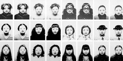
Snippet of Sawada's larger print
Booklet
Development 1 - Object Transformation
To respond to Jiang Zhi in more depth I tried to use a variety of flammable liquids to change the colour of the flame. I experimented with nail varnish remover, rum punch and nail varnish, the nail varnish remover and rum punch failed to create much of flame, only making the objects I put them on unable to actually ignite. Using nail varnish allowed the objects to ignite, however the flame colour stayed the same; therefore I progressed to changing the flame using photoshop.
Instead of just having images like my first response, I chose to develop this idea by making my images into GIFs, allowing you to see the movement of the flame and the process of the burning. I think this approach gives the viewer a more detailed, logical interpretation of the idea of burning things. By capturing the burning process I thin this hones in on Jiang Zhi's themes of strength and beauty, as you see this wild but elegant flame devour objects, turning them to ashes or leaving them scarred.
Instead of just having images like my first response, I chose to develop this idea by making my images into GIFs, allowing you to see the movement of the flame and the process of the burning. I think this approach gives the viewer a more detailed, logical interpretation of the idea of burning things. By capturing the burning process I thin this hones in on Jiang Zhi's themes of strength and beauty, as you see this wild but elegant flame devour objects, turning them to ashes or leaving them scarred.
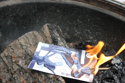
The Libertines' Concert Ticket
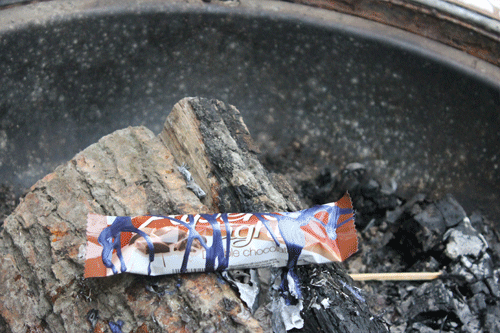
An Alpen Bar
A Shuttlecock
Experimentation
When it came to experimenting with my images I decided to focus solely on the flames, changing their colour and making them stand out. The fluorescent flames I created by duplicating the same image, quick selecting the flame and then changing it's hue and saturation. This process allowed me to make the flame brighter and louder, making the fire the focal point of the image, I then made these collection of images into a GIF. Despite the images used being duplicates the changing of colour created movement within the GIF. I also made a 3D GIF, which to an extent changed the colour as I had to move around the red, green and cyan parts of the image, but unlike the previous GIF I used several different images. This allowed movement but also made the flame bolder in an alternative way to the previous GIF, as the 3D effect makes the flame stand out when 3D glasses are worn. There is a video below (that I used to guide me) explaining majority of my process in detail, with a visual aid.
When it came to experimenting with my images I decided to focus solely on the flames, changing their colour and making them stand out. The fluorescent flames I created by duplicating the same image, quick selecting the flame and then changing it's hue and saturation. This process allowed me to make the flame brighter and louder, making the fire the focal point of the image, I then made these collection of images into a GIF. Despite the images used being duplicates the changing of colour created movement within the GIF. I also made a 3D GIF, which to an extent changed the colour as I had to move around the red, green and cyan parts of the image, but unlike the previous GIF I used several different images. This allowed movement but also made the flame bolder in an alternative way to the previous GIF, as the 3D effect makes the flame stand out when 3D glasses are worn. There is a video below (that I used to guide me) explaining majority of my process in detail, with a visual aid.
3D Process
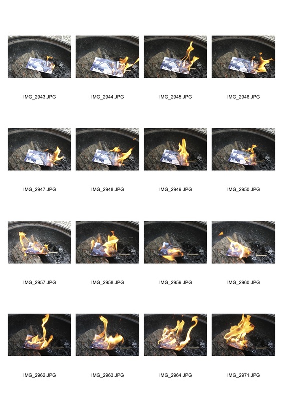
Contact Sheet
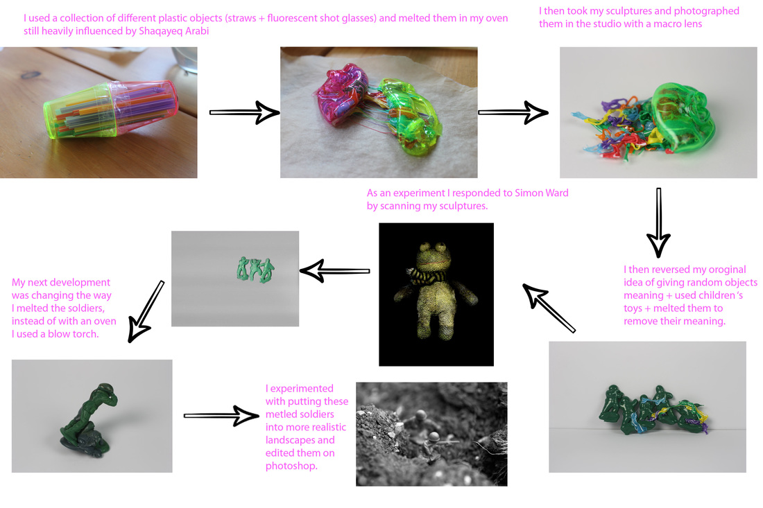
Shaqayeq Arabi
|
Shaqayeq Arabi is a painter, sculptor and installation artist, her work is fundamentally abstract coming from her beliefs that art is a form of spontaneous personal expression, as well as an exploration of her past and present memory. Her work was a massive influence when starting my development as i ws able to take smaller details from her bigger sculpture and use them in my smaller scuplture. Whilst I only used one plastic object I filled it with a multitude of objects to give my object more texture. I feel my use of colour isn't as varied as Arabi's but that I have managed to photography my sculpture in a multitude of ways.
|

|
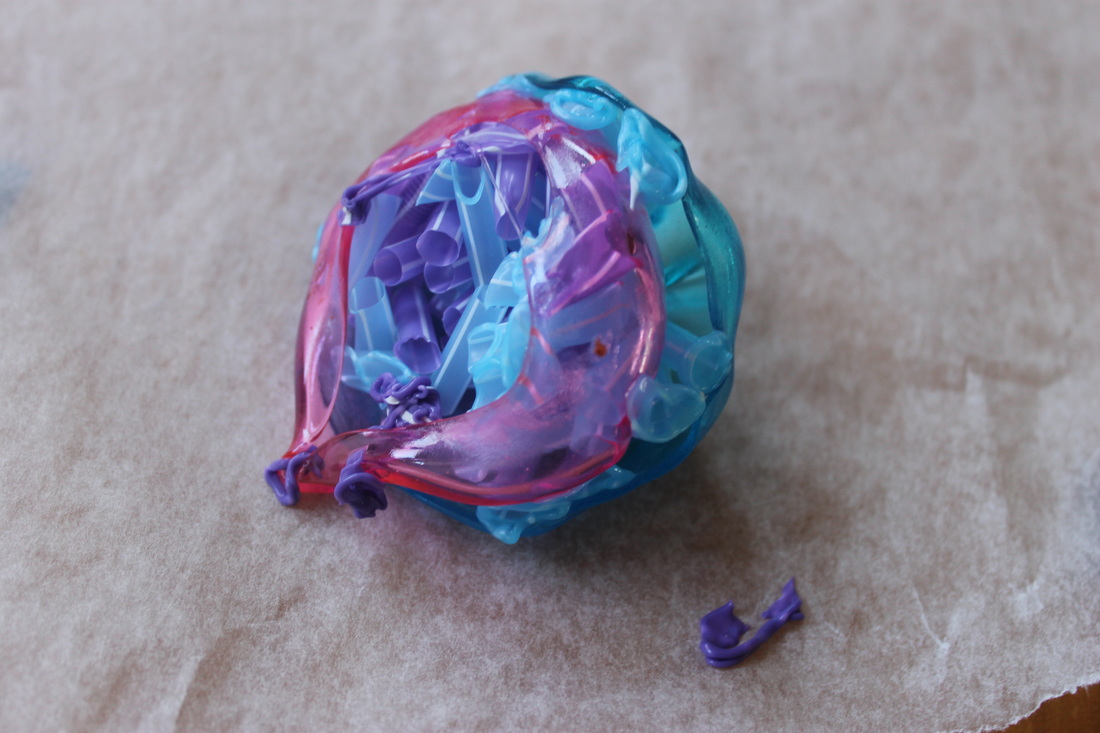
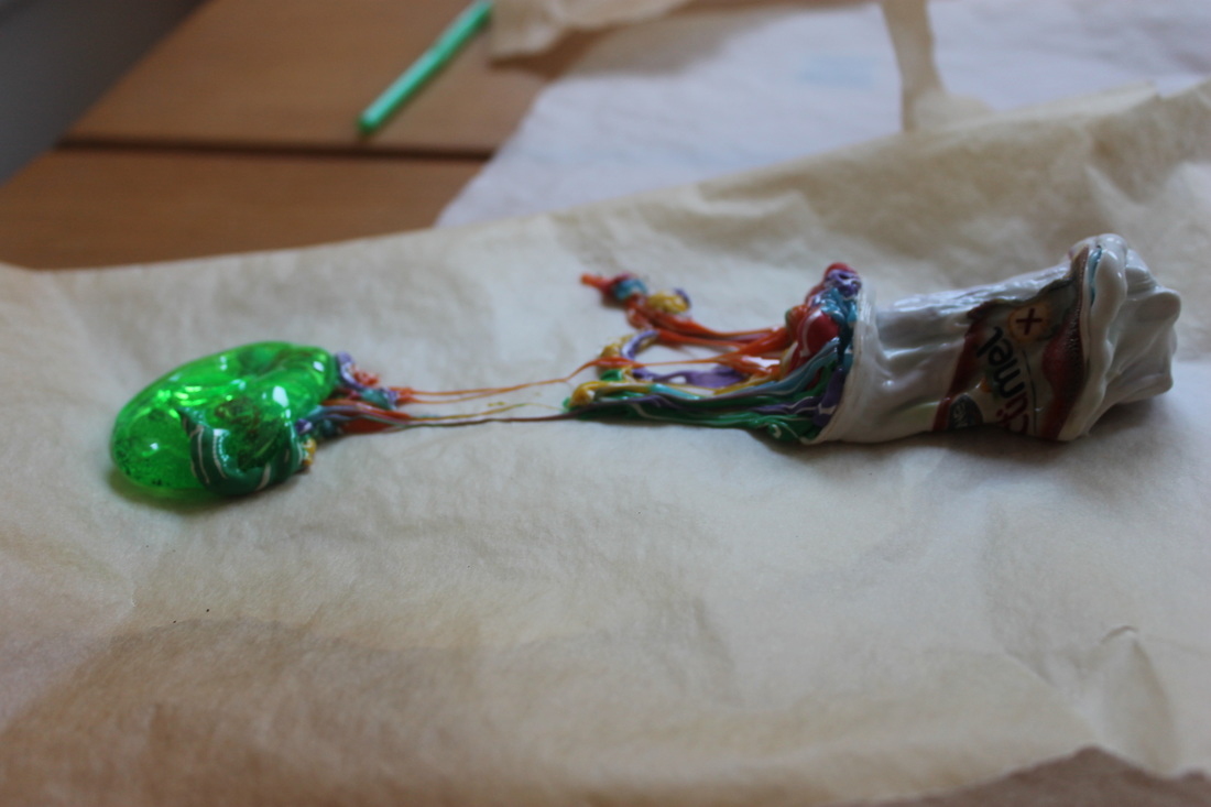
Development 2 - Object Transformation
Step 1:
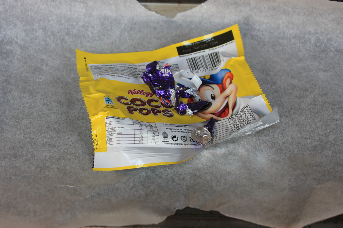
I set my oven to 250 degrees Celsius and got a tray and baking paper, I then placed a coco pops wrapper on top and put it in my oven for about five seconds before taking it out, at this point the wrapper had shrunk in size.
I set my oven to 250 degrees Celsius and got a tray and baking paper, I then placed a coco pops wrapper on top and put it in my oven for about five seconds before taking it out, at this point the wrapper had shrunk in size.
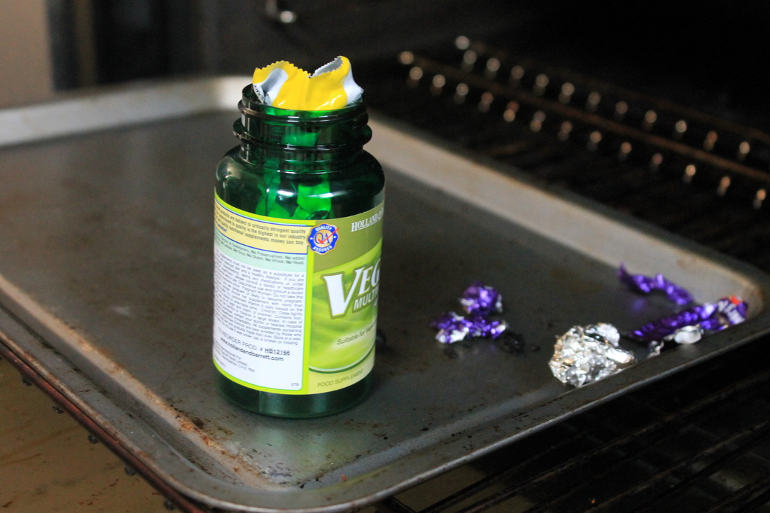
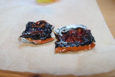
Step 2: I then put the wrapper inside an empty multivitamins pot and put that in my oven. After around five - ten minutes I was presented with a green distorted mess, which I then went on to photograph in the studio.
Step 3: I took photographs of the mutated green pot in the studio and edited my favourites.
Contact Sheets
Experimentation 1
My first experiment was to photograph the sculpture through different materials such as frosted glass and plastic, this changed the effect of my images, transforming them to look older or more abstract and illusive. I also played around with lighting to change the mood of the images, to something a bit colder in colour and dimmer.
My first experiment was to photograph the sculpture through different materials such as frosted glass and plastic, this changed the effect of my images, transforming them to look older or more abstract and illusive. I also played around with lighting to change the mood of the images, to something a bit colder in colour and dimmer.
Contact Sheets
Experimentation 2
For my 2nd experiment I got a pane of glass and dripped washing up liquid on it, and placed it in between the camera and my sculpture. Using a paint brush, I created texture on the glass by moving around the washing up liquid with the paint brush. Following this I dripped food colouring onto the pane of glass which then merged with the washing up liquid. I used different shades of blue colouring and green and yellow. When washing up the pane of glass I found it created interesting coloured bubbles and foam, so I also took photos using this half washed pane of glass. I found these methods transformed my photographs, in the sense that it gave more layers to the photo and created variety in the focal point of the images, from the sculpture to the pane of glass and back and forth depending on my depth of field.
For my 2nd experiment I got a pane of glass and dripped washing up liquid on it, and placed it in between the camera and my sculpture. Using a paint brush, I created texture on the glass by moving around the washing up liquid with the paint brush. Following this I dripped food colouring onto the pane of glass which then merged with the washing up liquid. I used different shades of blue colouring and green and yellow. When washing up the pane of glass I found it created interesting coloured bubbles and foam, so I also took photos using this half washed pane of glass. I found these methods transformed my photographs, in the sense that it gave more layers to the photo and created variety in the focal point of the images, from the sculpture to the pane of glass and back and forth depending on my depth of field.
Contact Sheets
Visual Mind Map
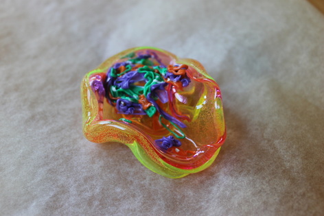
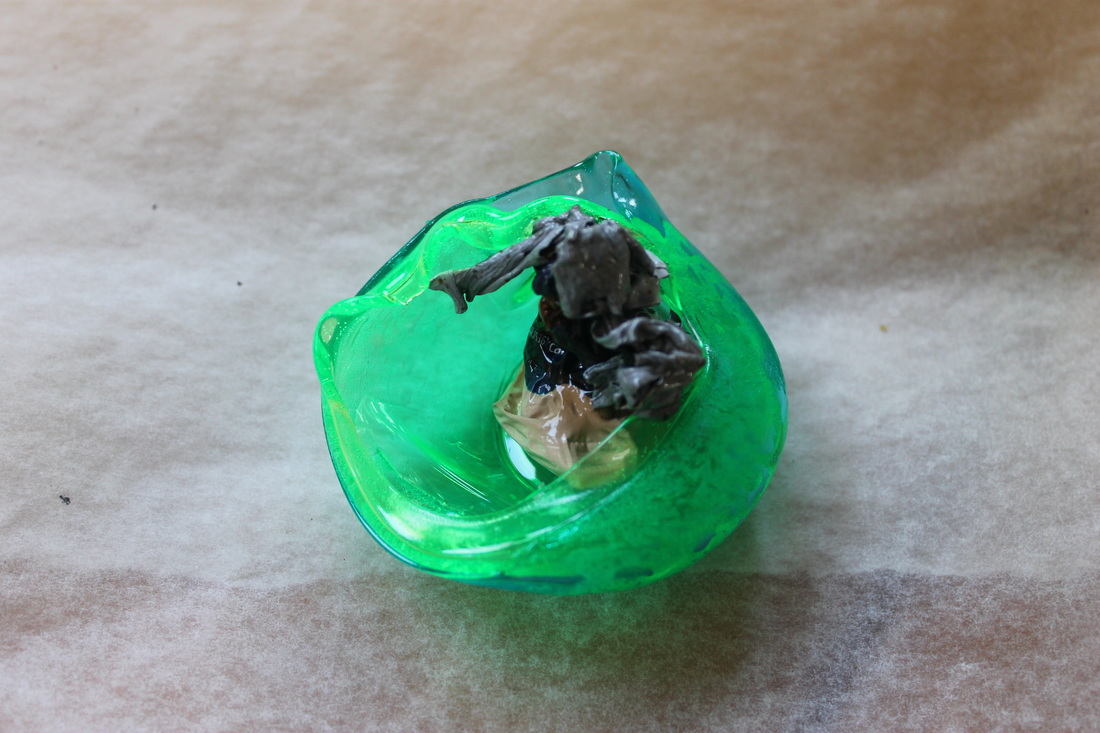
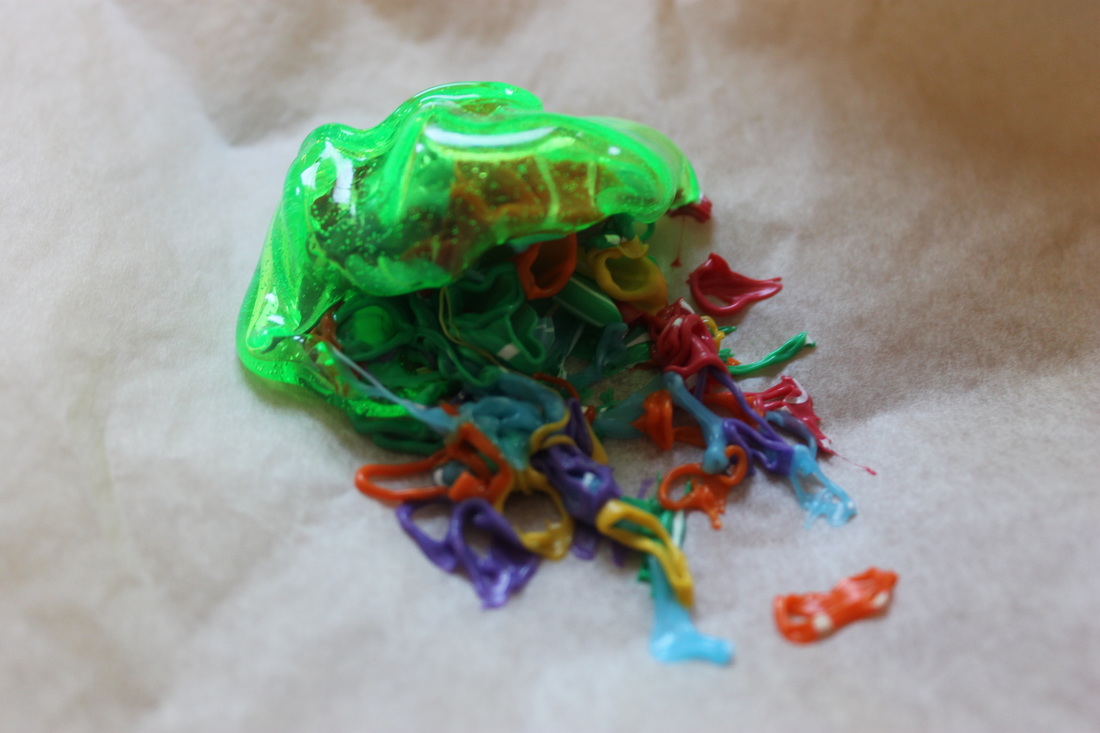
Development 3 - Object Transformation
|
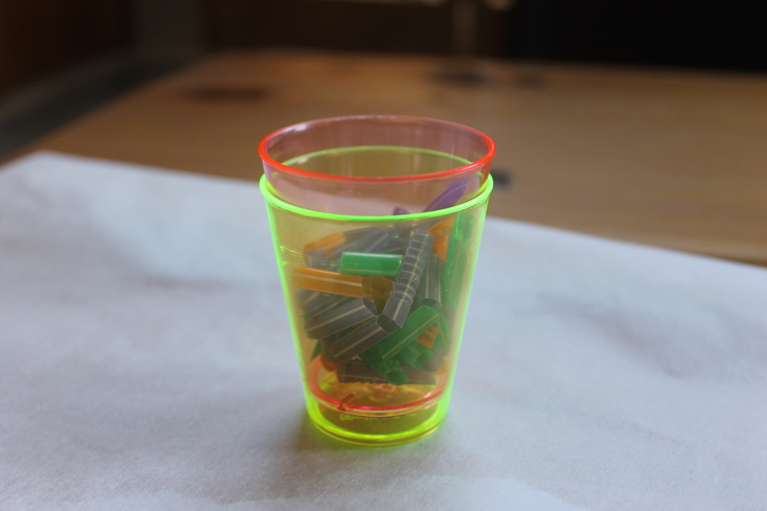
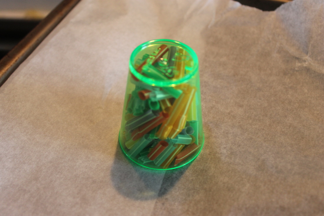
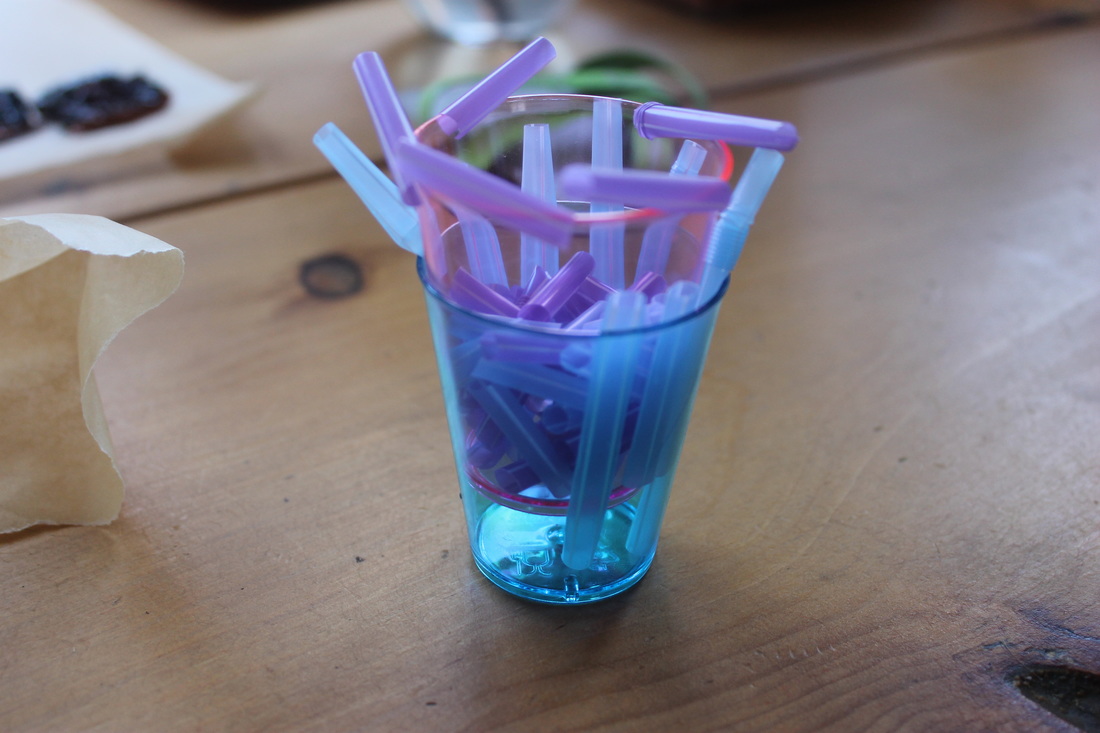
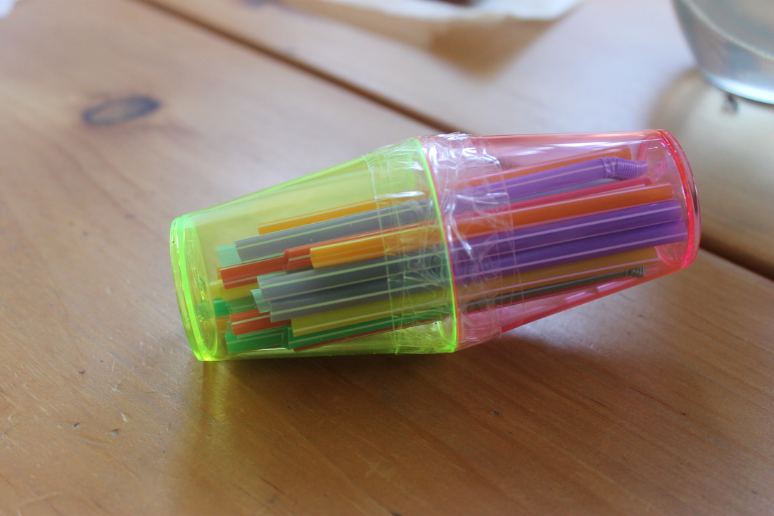
Step 1: Pre-heat oven to 250 degrees celsius, compose items you want to melt (in this case 2 neon shot glasses filled with cut up multi-coloured straws) and place on baking paper and tray.
|
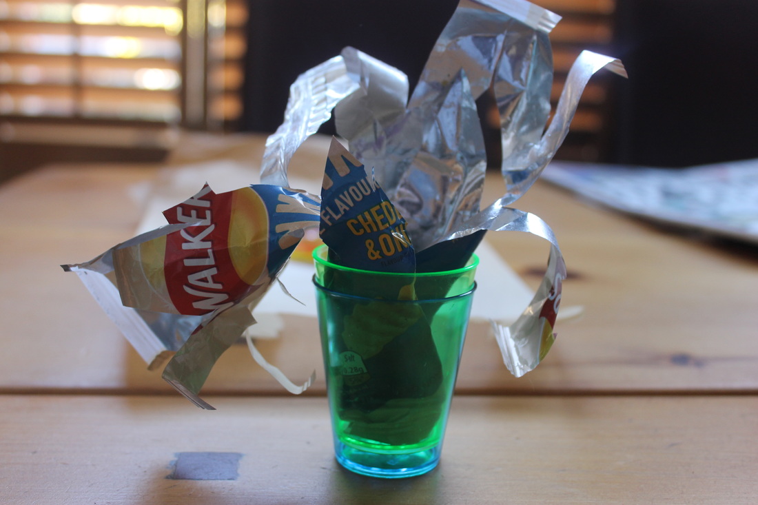
Step 2: Place items in oven, leave them to melt for about 2-5 minutes (depending on how melted you want them and how big the item is), then take the sculpture out of the oven and leave them to cool and harden.
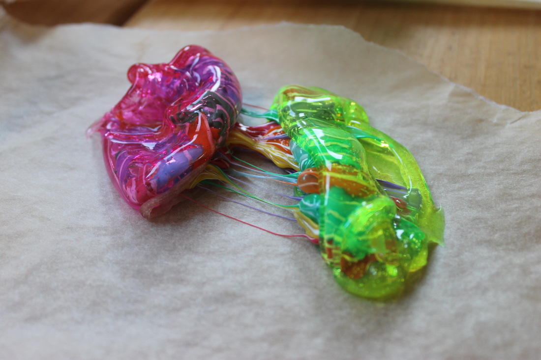
|
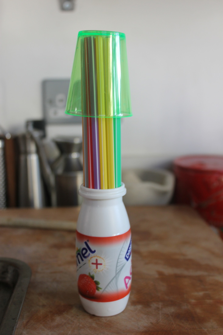
The images below are of the sculptures I created, shot in the studio using a macro lens. The way in which these objects distorted was incredible to observe and photograph as every angle from which I shot revealed a new way in which the objects had melted. Through this process they became incredibly fragile objects that could now easily snap or fall apart. Using a macro lens allowed to be to really expose the fragility, textures and bold colours this process had created. Whilst using random objects and combining them I managed to in my opinion create something new and different, much brighter than the work of Shaqayeq Arabi, who used objects with much harsher and darker tones, whilst mine I felt exuded vibrancy and fluorescence and vitality, despite them being inanimate.
Contact Sheet
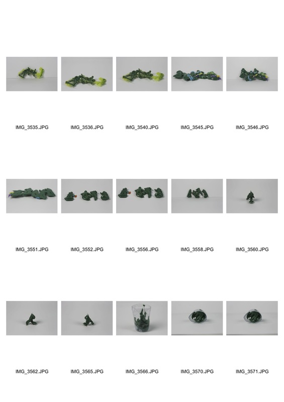
Development 4 - Childhood Destruction
For my 4th development I decided to once again change what I was melting, this time round I decided to melt army figurines. This was an interesting process due to the fact that even though I was melting smaller objects they seemed denser than my previous objects, meaning they took a longer times to burn. Yet this longer process did mean that you could decide when to stop melting, so I decided to take them out of the oven when they were melted so much that parts of their bodies were no longer recognisable, but the figurine as a whole was comprehensible. It was strange how previous objects I had seemed to get thinner and wider, yet with the toy soldiers they seemed to just expand and become shiny on one side and matt on the other.
Contextually, I've moved away from the idea of brining innate objects into the stuido and making them into art pieces as Iriving Penn did, and I've progressed to bringing in more universal symbols of childhood, such as toy soldiers. By melting them I'm destructing this universal representation of childhood, removing their meaning, the reverse of bringing innate objects into a studio and giving them meaning. I feel like I've carried on the main theme of transformation but I've began to reverse my initial idea of giving objects meaning to removing it. By melting these soldiers I've made them difficult to ever use as toys every again, removing their main purpose and meaning behind their initial invention.
Contextually, I've moved away from the idea of brining innate objects into the stuido and making them into art pieces as Iriving Penn did, and I've progressed to bringing in more universal symbols of childhood, such as toy soldiers. By melting them I'm destructing this universal representation of childhood, removing their meaning, the reverse of bringing innate objects into a studio and giving them meaning. I feel like I've carried on the main theme of transformation but I've began to reverse my initial idea of giving objects meaning to removing it. By melting these soldiers I've made them difficult to ever use as toys every again, removing their main purpose and meaning behind their initial invention.
Contact Sheet
Experimentation
This process was in response to Simon Ward, who scanned toys such as teddy bears that had been damaged or discarded. In this case I have scanned army figurines that have been melted. Unlike Ward I incorporated things into the background such as my moving hand and an image, but I found that didn't turn out so well. Whilst an interesting concept I found that they look better when photographed in a studio using a macro lens.
This process was in response to Simon Ward, who scanned toys such as teddy bears that had been damaged or discarded. In this case I have scanned army figurines that have been melted. Unlike Ward I incorporated things into the background such as my moving hand and an image, but I found that didn't turn out so well. Whilst an interesting concept I found that they look better when photographed in a studio using a macro lens.
Contact Sheet
Artist Link - Simon Ward
|
|
Simon Ward collected toys left at children's memorials, which he then scanned and returned to their original position. This process consisted of placing each toy in direct contact with a clean transparent surface on a scanner, working at night in a room illuminated by a projection of light. This scanning resulting in a meticulously detailed and clarified image suspended in darkness. Ward's aim was to position these emotionally charged objects in a such a way that it was like they were floating in a black void, reflecting the mourning and detachment behind these objects. These faded and weather objects mirror my burnt figurines, however the difference being that Ward's objects have begun decaying through time whilst I forced this decay and destruction upon mine. The finesse and clarity of Ward's images is no where to be seen in my images thus I chose to leave this experiment behind me, despite being incredibly moved by Ward's work 'Guardians'.
|
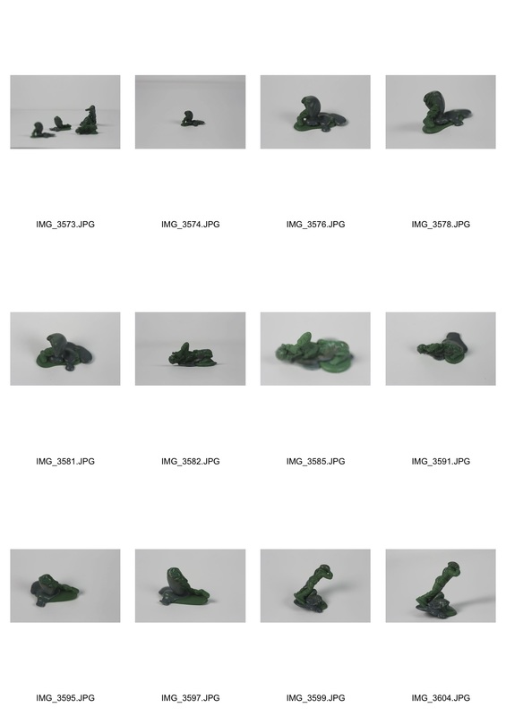
Development 5 - Object Transformation
To progress using toy soldiers I used a blow torch instead of an oven to melt them. I found this allowed me to be more specific with which parts of the soldiers I was melting, and it also meant that the whole soldier didn't melt completely allowing me to leave some parts untouched and others melted beyond recognition. I think that for toys using a blow torch is a good idea (small objects) but for when I was melting cups and straws and larger objects using the oven was the most appropriate idea.
Contact Sheet
Experimentation
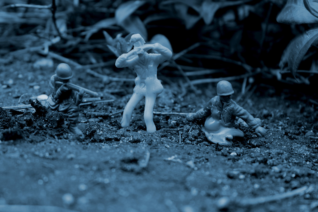
For this experiment I placed the melted toys and some normal toys in different environments, to make them look like they're in a battlefield. I took these photos using an aperture of 2.5, ISO of 400 and shutter speed of 1/8000 using a macro lens , allowing me to focus on the soldiers and not the background. I tried not to get the bases of the soldiers in to make them look more realistic but this was quite difficult, however I feel with a few shots I succeeded in this task. I edited the images on photoshop, lowering the exposure to give the images a more sinister tone, increased the contrast to make the soldiers more defined and changing the saturation and hue of the images after I made them black and white, to give them a more old fashioned flare, like images of WW1 and WW2.
Contextually, via this experiment I've given these toys a narration, by mixing the normal soldiers with the melted soldiers it appears that the melted soldiers are the injured soldiers on this battlefield. Putting these soldiers side by side I've created a contrast, removing first the toys original purpose, and then trying to make them more sinister by putting them in environments to rein-act a battlefield. Whilst a common game children played with these toys, by melting them I've given this childhood game a morbid undertone.
Visual Mind Map
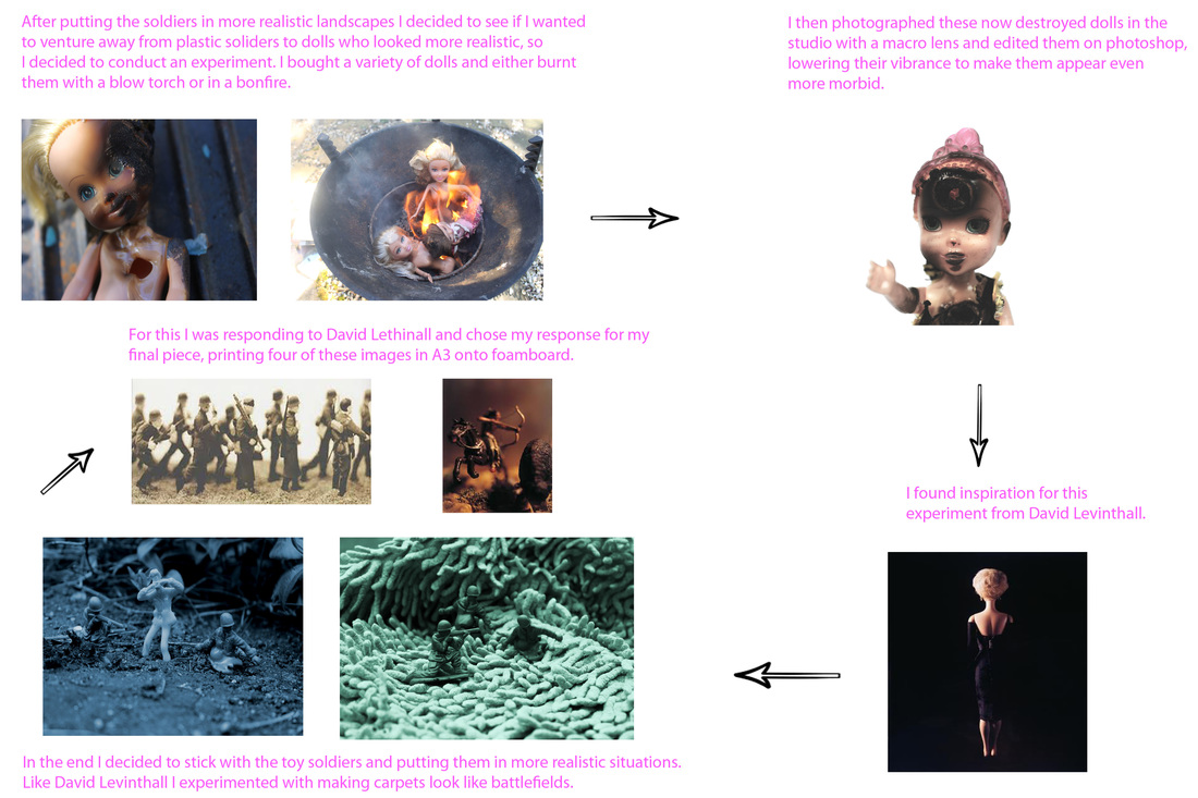
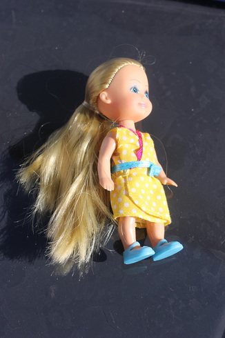
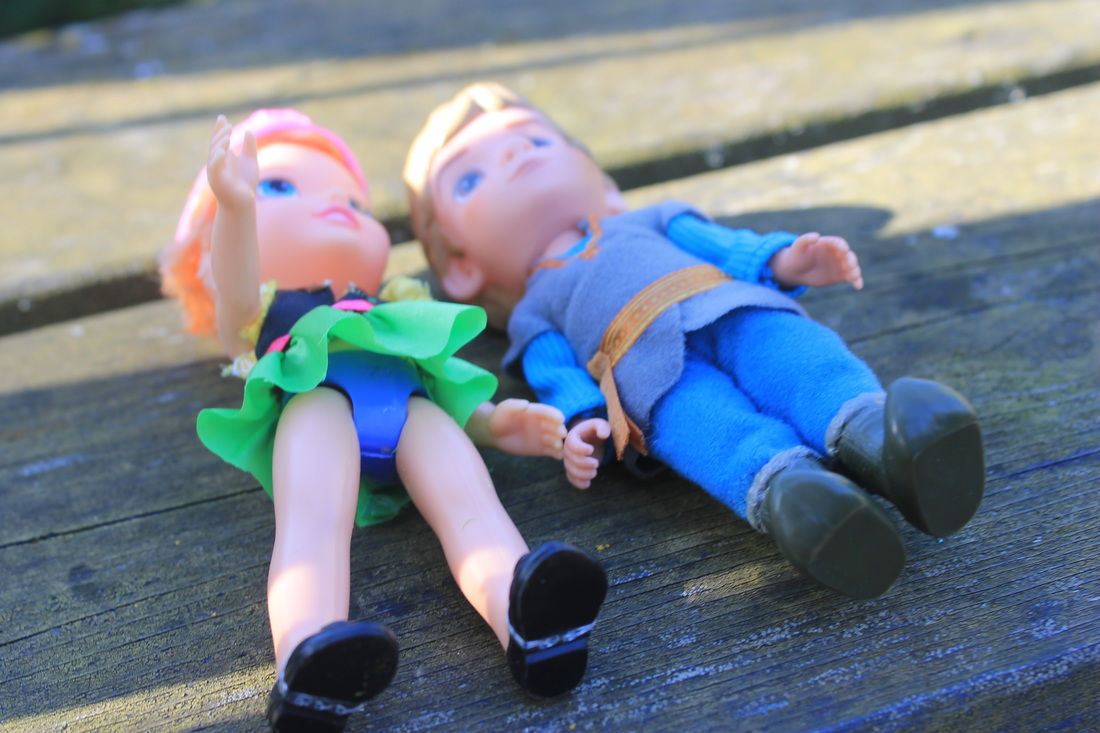
Development 5 - Childhood Destruction, Dolls
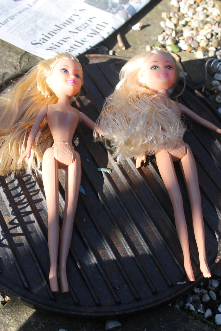
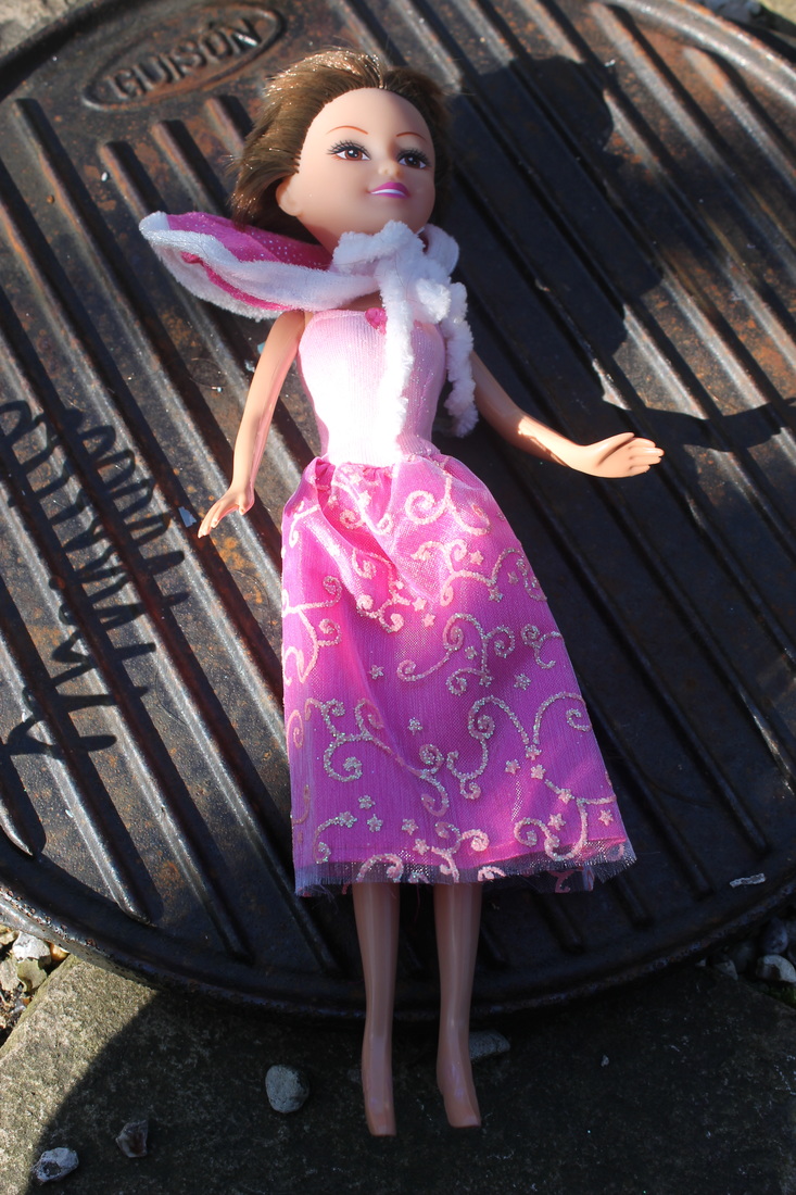
This development was an experiment to see whether or not I wanted to stray away from soldiers and move on to dolls. Ultimately I chose the soldiers but found this development really fun but quite morbid. I bought seven dolls from a toy shop, took them home and cut off their hair and removed their clothes. Following this I either burnt them with a blow torch or put them in a bonfire, each created different effects - the bonfire charred the dolls heavily and the plastic gathered up creating lumps and strings on the dolls, the blow torch left the dolls slightly charred but the burning was much more specific and creative compared to the random burning of the dolls in the bonfire which I couldn't control. I then took the dolls into the studio and took photos of them on a macro lens to be able to capture the minuscule details of the dolls. Following this I edited them on photoshop, upping their contrast, lowering their vibrance and editing the levels to achieve images with dark undertones and a morbid feeling to them, as dolls look incredibly realistic so seeing them destroyed and burnt like this is quite revolting but also intriguing once you accept that they're not real. I thought the outcome of this development was really good and fascinating but I did feel a bit at loss, as I wasn't sure where to go from there in relation to the dolls, feeling that it was a tad repetitive. As I came across this idea late in the development phase I feel if I had started with it I would have been able to develop it a lot further, so I chose to stick with soldiers as I felt it was a lot more flexible and more of an interesting and challenging task to bring them to life.
Contact Sheet
|
Normal
|
Hair cut and clothes removed
|
Burnt with a blow torch
|
Normal
|
Clothes Removed and Hair Cut Off
|
Burnt with a Blow Torch
|
Normal
|
Clothes Removed / Hair Cut Off
|
|
|
|
|
Burned in a Fire Pit
|
Normal
|
Clothes Cut Up and Hair Removed
|
Burnt with a Blow Torch
In the studio
Contact Sheet
|
|
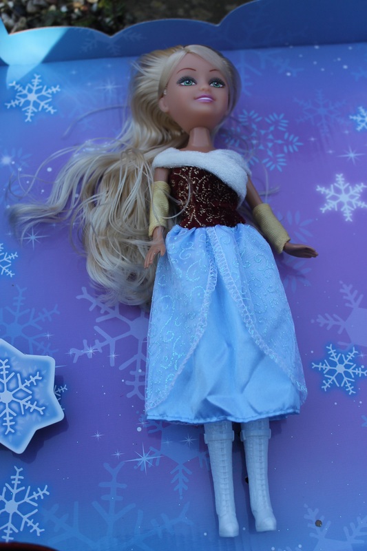
Artist Link - David Levinthal - Barbies
|
|
David Levinthal is a photographer from San Francisco, but lives and works in Manhattan, New York. Charles Hagen from the New York Times says: "What distinguishes Mr. Levinthal's work is his interest in emotionally charged historical matter. But the real force of his images comes not from his choice of subjects but from the way he tells their stories." However in this case I am not responding to his historical work but his work with Barbies. From my perspective Levinthal is making these Barbies into real people however my interpretation was destroying these beautiful dolls, that society deems perfect and accepts as the goal for a woman's body. I destroyed these 'perfect' dolls by putting them in a bonfire, by doing this they lost limbs, hair, clothes and identity. Before burring them I either removed their hair, clothes or both to test out the different ways in which the dolls would burn. I also burned other types of dolls which were less the traditional Barbie doll, I burned these ones using a blow torch which allowed me more control over how the dolls burnt and where they burnt, making it my decision when I felt like they were finished or not. Burning the dolls with a blow torch also gave them a nicer outcome that left the dolls slightly charred but not as bad as the dolls in the bon fire, which did look nice but I thought was too much. Whilst I enjoyed melting/destroying these toys and photographing them in a studio and editing them on Photoshop to make them look scarier, I decided to go back to the soldiers as I felt there was more you could do with them when it came to composing my images
|
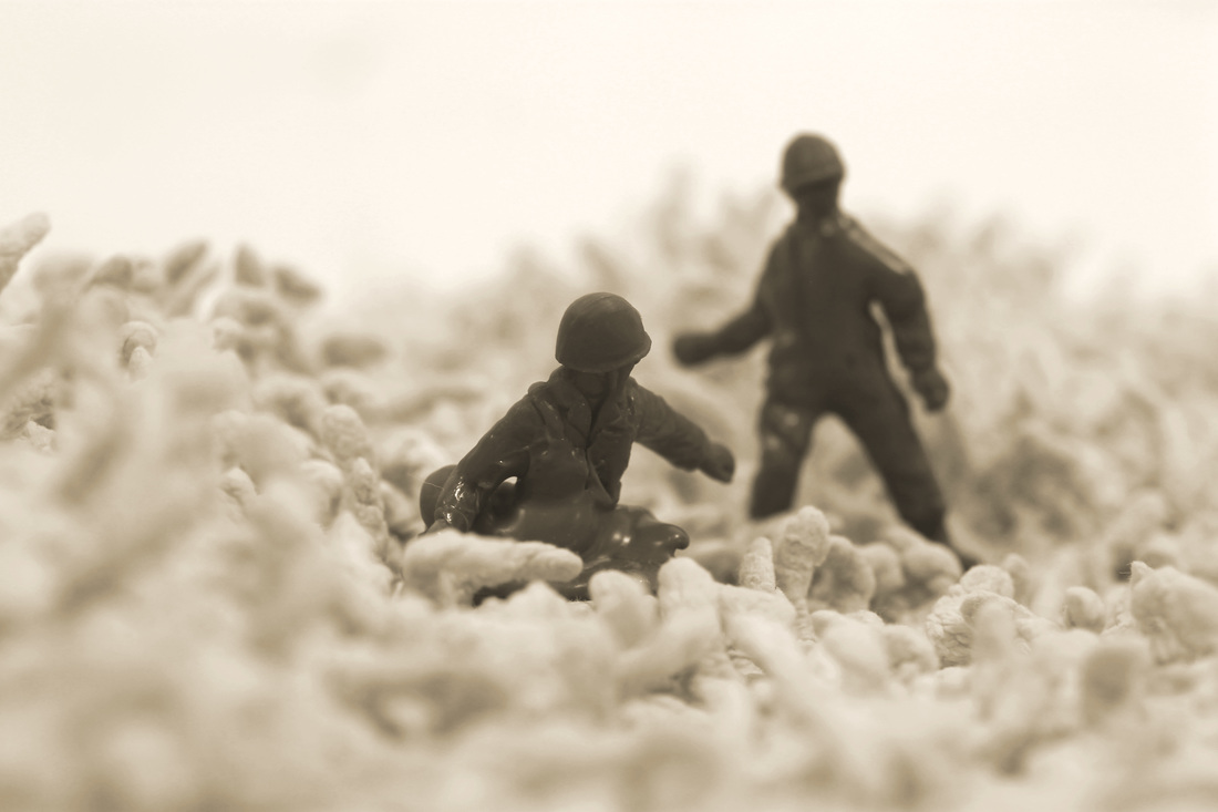
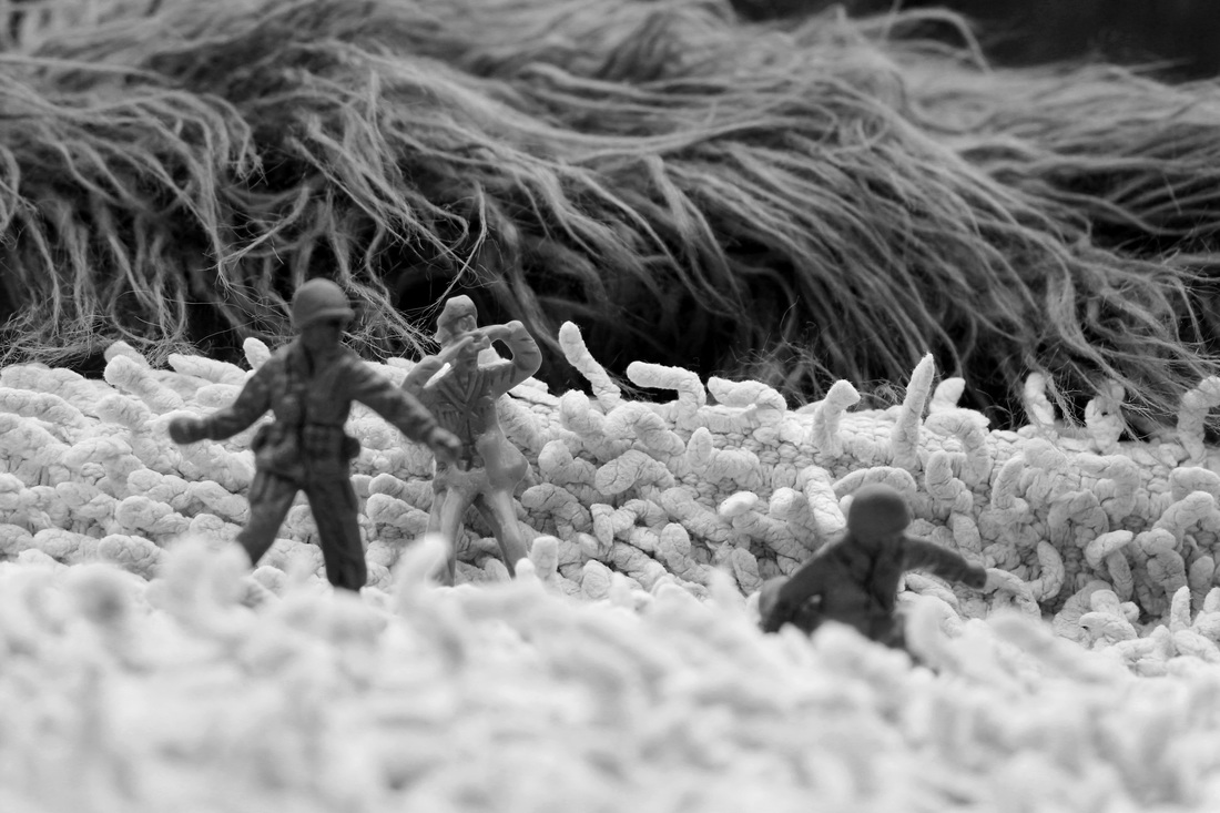
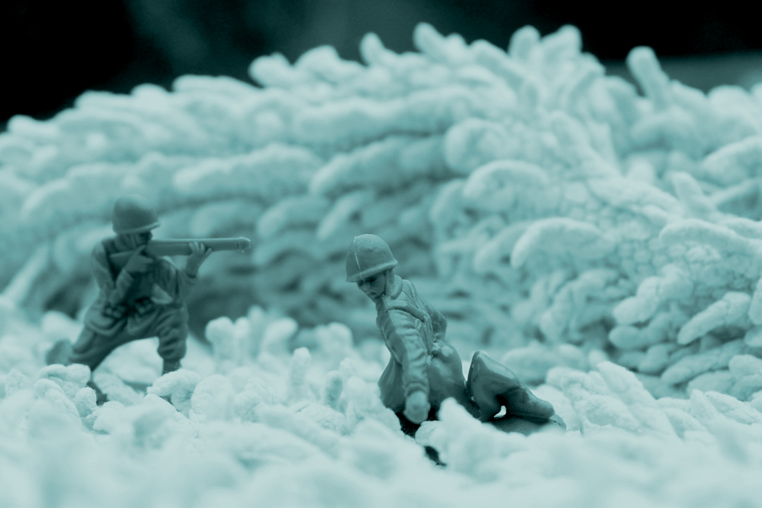
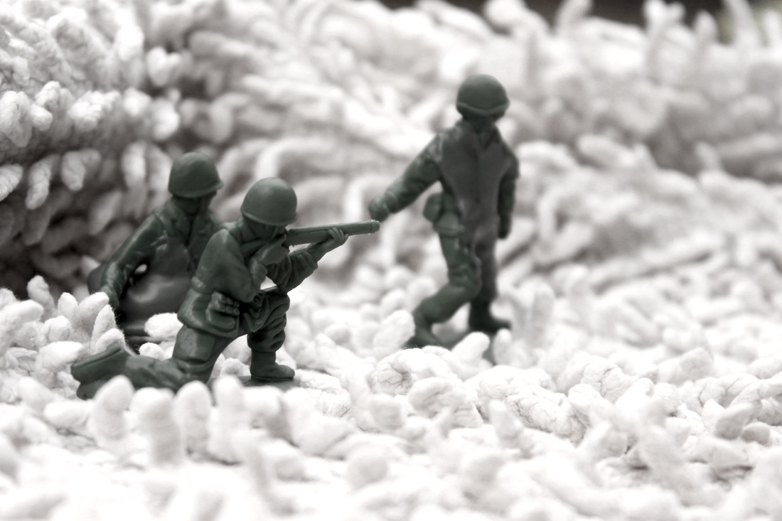
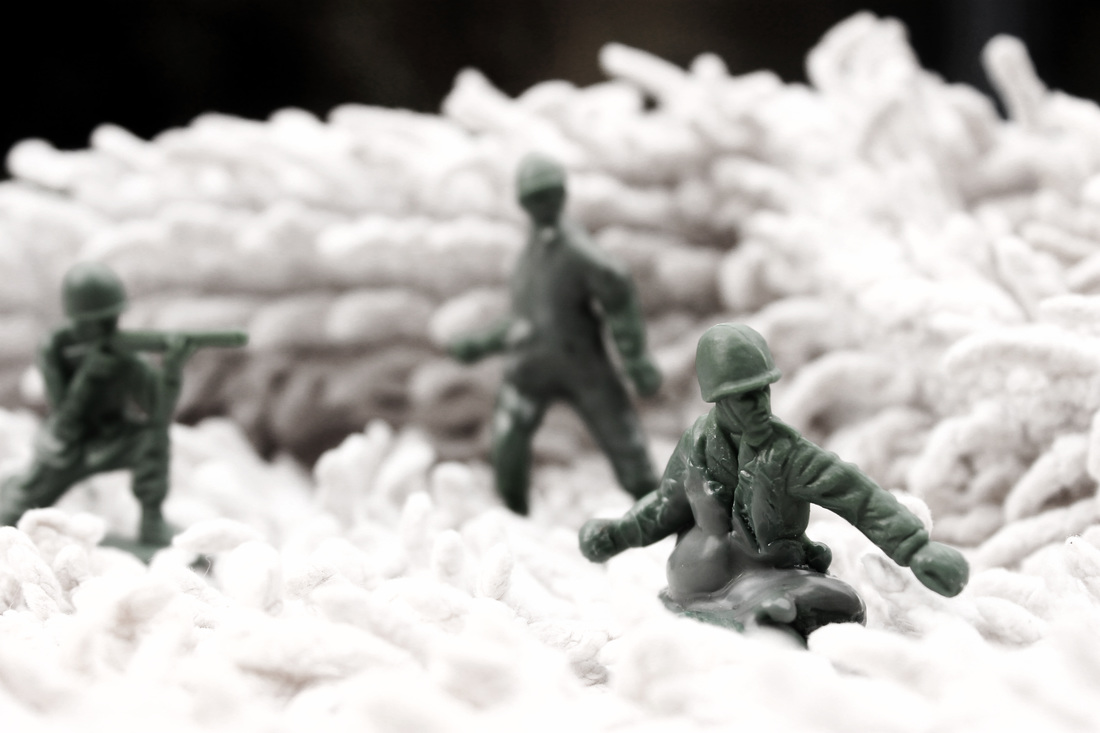
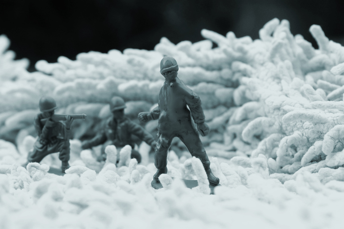
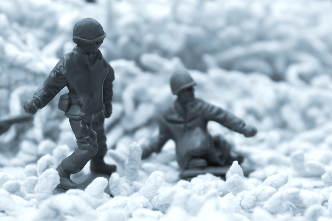
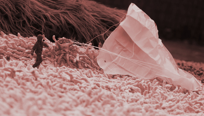
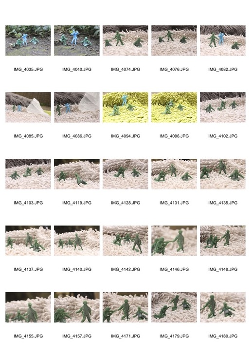
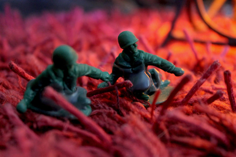
Final Piece - Childhood Soldiers brought to Life
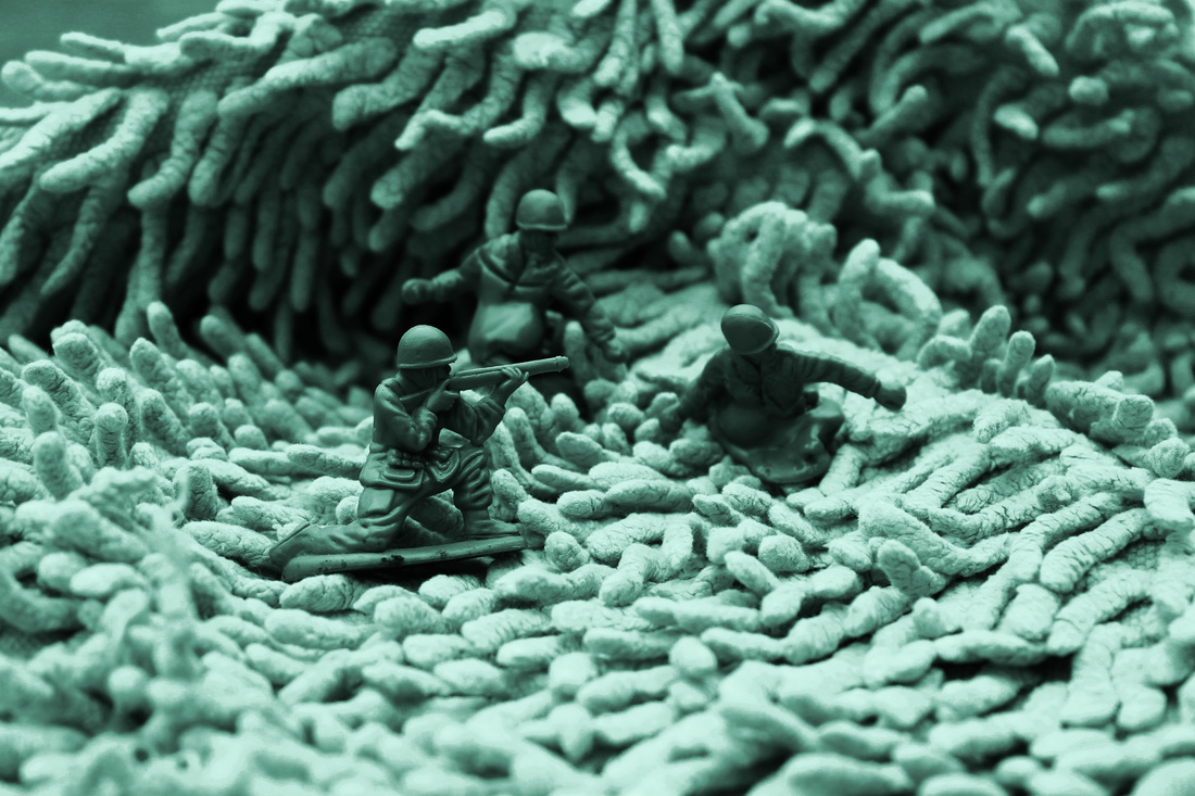
For my final piece I decided to go with the soldiers, melting them with a blow torch and using bath towels to create a different landscape. Using photoshop I tried to age the photos and give them a jaded atmosphere like a battlefield. I was heavily influenced by David Levinthal for my final piece, trying to bring figurines to life. On photoshop I played around a lot with levels, contrast, vibrance and colourising (saturation) to create a mood that mirrored a war. I varied between using a macro lens and a normal lens, creating variety in my shots; my depth of field also varied depending on the amount of figurines in the image and what I wanted to focus on. I find my piece incredibly interesting because I feel like I succeeded in transforming a bath rug into a landscape, by using objects and putting them underneath the rug to create mountains for example and folded parts of the rug to create more texture. If I could I would have used more detailed figurines that didn't have bases to make them even more realistic, nevertheless I feel that my final piece is strong and succeeded in fulfilling the brief of transformation through my developments leading up to my final piece.
|
|

|

|
Contact Sheet
To Print

|

|
Artist Link - David Levinthal - Soldiers
|
|
David Levinthal is a photographer from San Francisco, but lives and works in Manhattan, New York. Charles Hagen from the New York Times says: "What distinguishes Mr. Levinthal's work is his interest in emotionally charged historical matter. But the real force of his images comes not from his choice of subjects but from the way he tells their stories." Before I responded to Levinthal's work with barbies as one of my experimental developments but I specifically for my final piece responded to his work on war, photographing on carpets and rugs as Levinthal did to make small figurines life size, giving plastic toys real life. Levinthal's work has toured all around the UK, the US and Canada, winning awards and he has even co-written a book with Gary Trudeau called 'Hitler Moves East.' Levinthal's series 'Wild West' (1986 - 1988) and 'Hitler Moves East' were the most influential when it came to composing my images. The figurines in my images mirrored that of 'Hitler Moves East', however my use of lighting was heavily influenced by 'Wild West', as it uses dark tones, shadowing and a high contrast. Whilst the colours are a deeper red in 'Wild West' I didn't feel they fit with my soldiers who needed a more jaded atmosphere, therefore I stuck to light blues, whites and a low vibrance similar to 'Hitler Moves East'. I used a high aperture which I can assume Levinthal also used to keep the small figurines in focus and the background out of focus, to keep up the illusion of a battlefield for example even though in my case it's a carpet. The idea of transforming a small toy and a carpet into a soldier and a battlefield was quite an interesting task as you had to work quite hard at keeping up this illusion; I thoroughly understand why Levinthal has created some many different types of images using this trickery, as the act of deception and transformation in this type of photography is addictive and fulfilling when you are successful.
|
Visual Mind Map