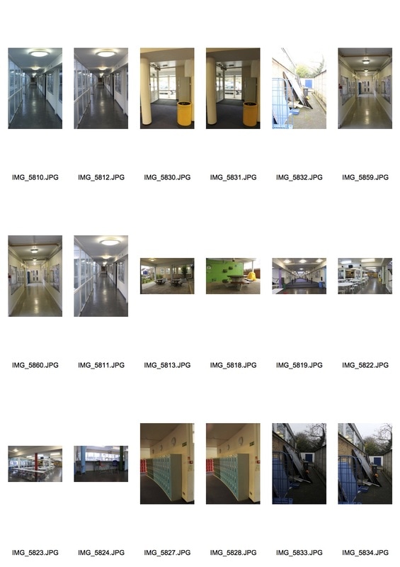
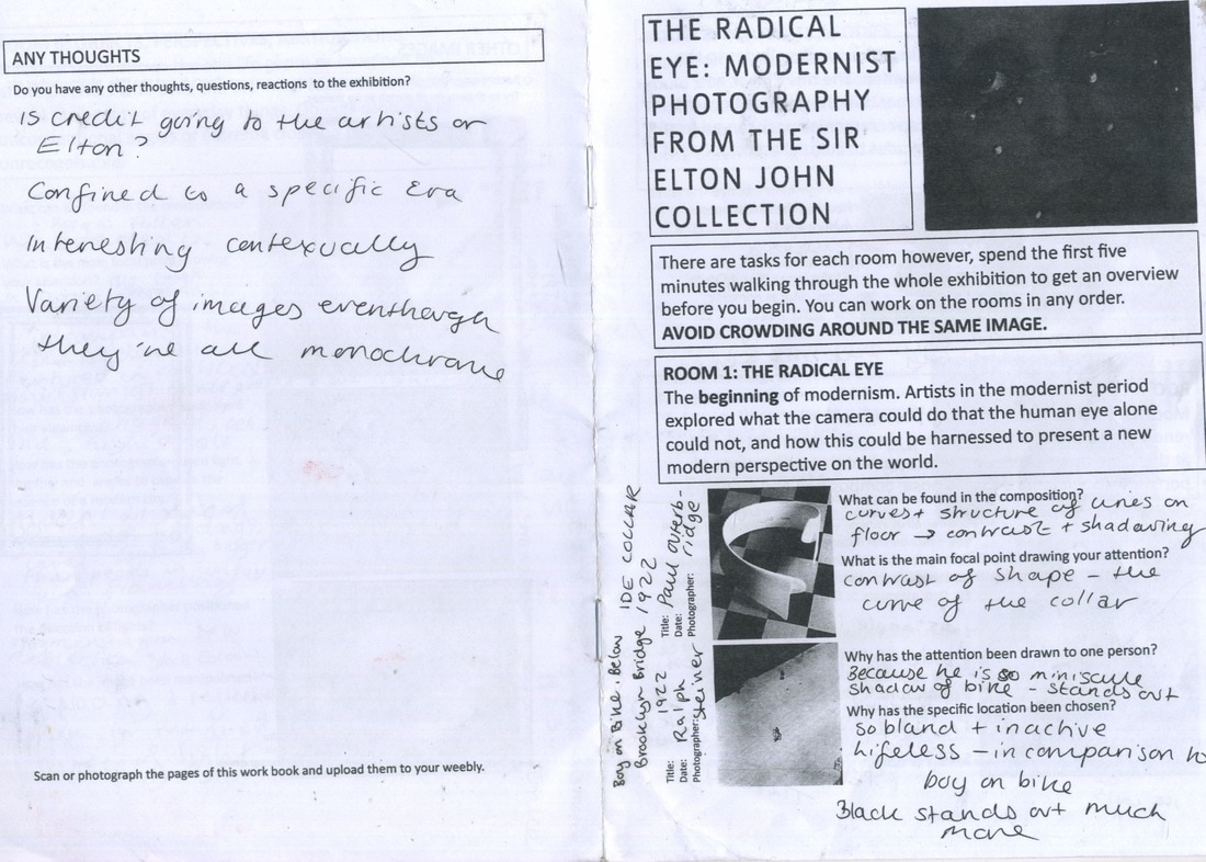
Public Places
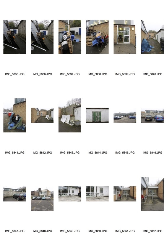
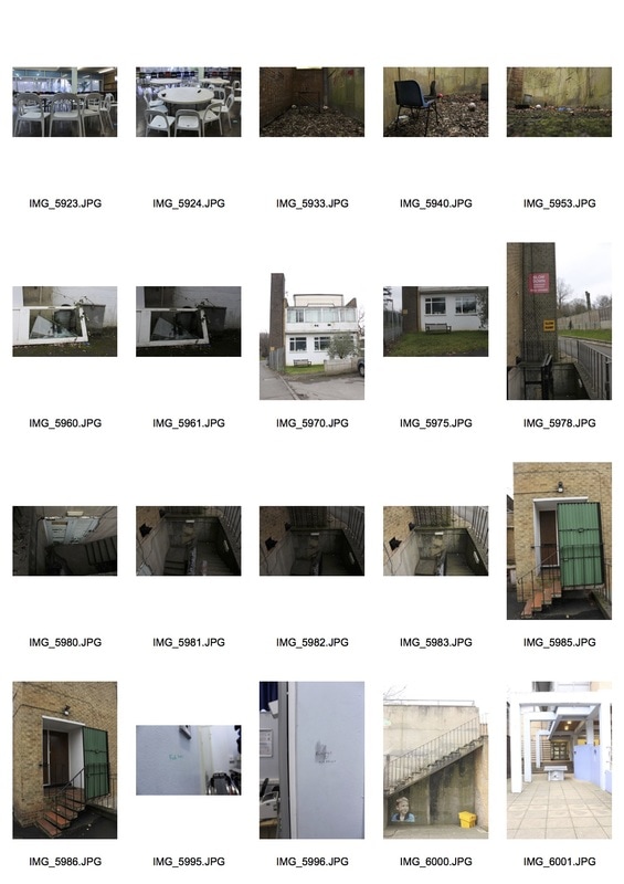
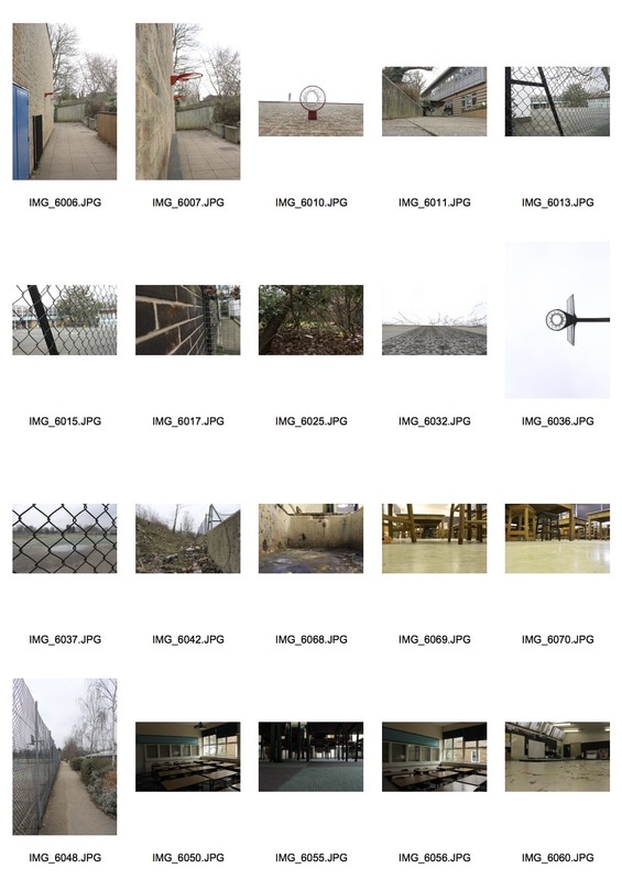
Through this set of images the aim was to portray an empty public space that would usually be full of people. In contrast, I also chose spaces that should have people in but don't due to the grim nature of the location. By shooting in a school you would assume every part of the school would have a purpose however I discovered this was not the case in all the locations I shot. For example, behind the back of our DT building and around the sides there was a lot of rubbish and discarded footballs and art pieces. Whilst these spaces held objects that had been formerly used no one would normally inhabit them. In contrast I photographed public spaces that would generally be buzzing with people such as corridors, the lunch hall and classrooms. However, shooting between lessons meant that much of these spaces were empty, perfect for the images I wanted to capture.
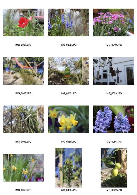
Contact Sheets
|
|
Edited Favourites
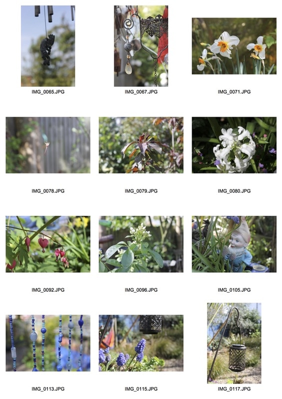
Contact Sheets
|
|
Edited Favourites
Black and White Edit - Rule of Thirds
Artist Link - Scott Fortino
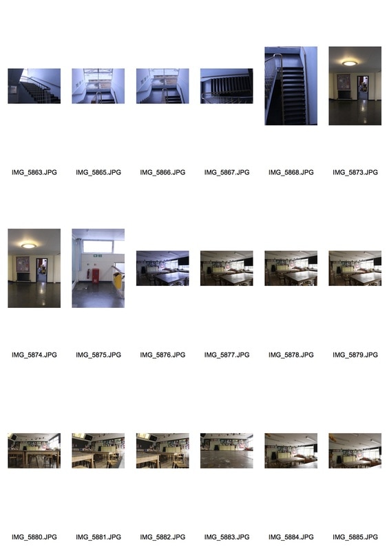
Fortino was a Chicago Police Officer, and a lot of his photography was directly inspired by this. For example, his set of images under the label 'Institutional' pictures 'impersonal architectural spaces' such as prisons and schools. As a man with a BA and an MFA schooling institutions were obviously included in his set of images. By photographing these places when empty removes the purpose of them in my opinion. The reason for these institutes is to discipline and hold criminals whilst schools are built to educate and help children grow into intellectual and decent human beings. It is ironic as prisons are the result of educational institutes failing, as this is where the less decent, immoral and unjust people of the America end up. To put these settings side by side in images and under the same title is powerful whilst also creating a strong irony. My images under the title 'Public Spaces' is a direct response to Fortino's work as I photographed parts of my school in between lessons as this is when the school is incredibly quiet and empty. Whilst most classrooms are full some aren't, so by photographing them you focus on the shape and size of the room as it is not full of the children and teachers it should be. By photographing locations throughout the school empty leads viewers to focus on parts of the location that they wouldn't if there was children in the shot. For example, if I had photographed the basketball court with kids playing on it, you naturally would focus on their facial expressions and the movement of their bodies, rather than the actual basketball court itself. By removing the kids from the image you perceive the image in an entirely different way.
Public Spaces - High Contrast
Using photoshop, I took my images of public spaces and simply altered the threshold for each image. This create a high contrast and turned all of the images colour to black and white. I think this really helped some parts of my image become focal points but at the same almost take too much away from the image due to there being too much white or black. Overall, on photoshop I think this process helped define my images, by enhancing the structure of the objects within the images with dark and bold lines being created alongside also highlighting shadows that were originally not as obvious. This process clearly added a tonal depth to my images that wasn't before present, elevating my images into something more different and textured.
Edited Favourites
Process on Photoshop
Artist Link - Jean-Marc Bustamante
Apprentice to William Klein, Bustamante is a painter whom explored more into photography after his working alongside Klein. The set of work below is from his collection Lumiere which he began creating in 1989. He used large photographic images silkscreened on Plexiglas and mounted about two inches from the wall on metal brackets, making them partially transparent. Through the slightly translucent effect he creates through the strucuturing of his images, Bustamante aimed to reflect memories of all those who were part of Western Education, removing the rigidity and structure of educational insitutions by physically blurring the lines of the structures that house these institutions. Bustamante himself has always been interested in the contrast between inner and outer realities, thus through his use of light he hoped to create a more human presence in the public spaces he photographed, through the almost hovering of light within the rooms or places he took pictures of. The use of contrast and light here, I tried to mirror in my images above, however the contrast I used is a lot more harsh and definite in comparison to Bustamante's images that have a more ethereal and less defined element to them.
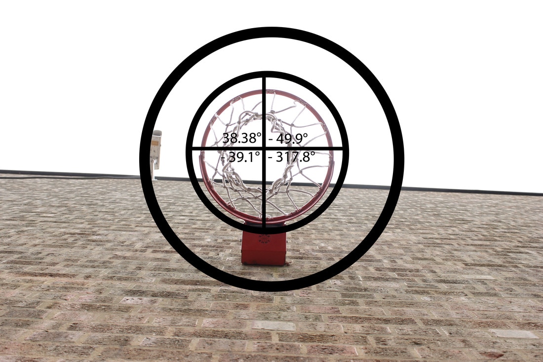
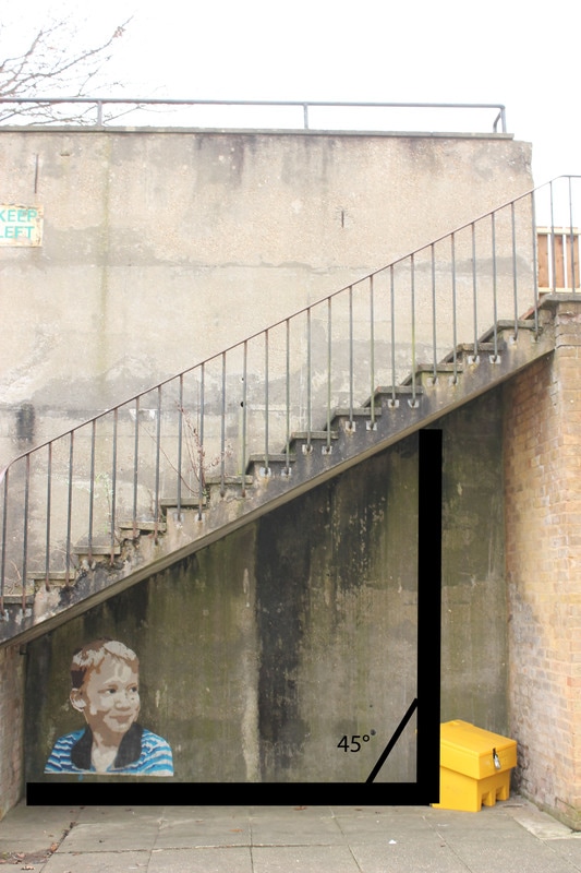
Public Spaces - Measurements and Angles
Another development of my photographs of public spaces was to focus on the unseen measurements and angles within my photos, and bringing them to the forefront of the image. Through the use of shapes and the ruler tool on Photoshop I was able to hone in on some of the angles and measurements not directly prevalent to the naked eye. Whilst a tedious task due to having to figure out the angles, it was interesting to reveal the mathematics to the observer, within an image that most people wouldn't even think mathematics was involved in.
Artist Link - The Beauty of Mathematics
This video explores how mathematics can be and is relevant nearly everything from a game of backgammon, the movement of clouds to the stirring of a cup of tea. Like my images above both me and this artist attempt to reveal the mathematics that is prevalent in instances or even images that most wouldn't think they would be. In this video the equations are elevated from just a load of numbers and letters as they transition to moving animations and then the real thing. The name of this video is fitting as a hater of maths even I can see the beauty in these instances that we couldn't understand or comprehend if it were not for mathematics. By compiling reality, written words and mathematics into one video it turns academia into an expression of creativity, which is unexpected but engaging at the same time.
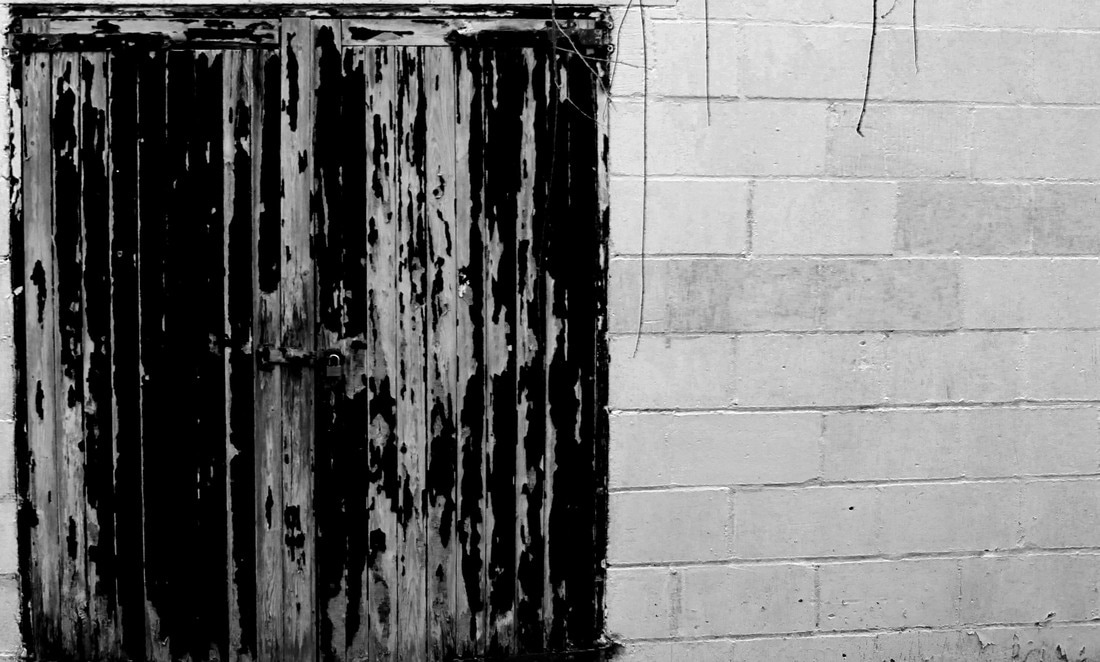
Public Spaces - Dissect
During this development I removed the negative space on Photoshop to make the structure in my photograph the focal point therefore elevating its status as it becomes the only object / building in the image. I think this quick and easy process can really help bring desired parts of an image to the forefront and under the spotlight. I also think it enhances the structure of the buildings as the lines and shapes become more clear cut and stark in contrast to the white background.
Process on Photoshop
People in their Environment
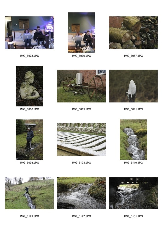
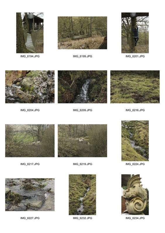
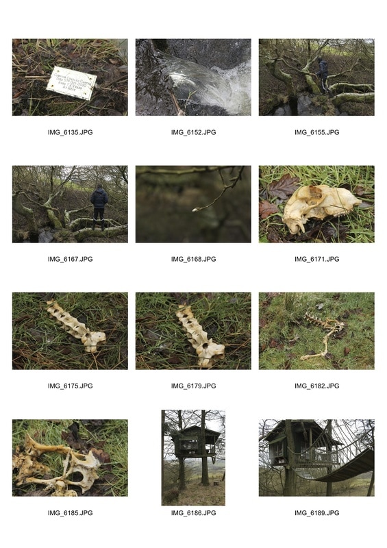
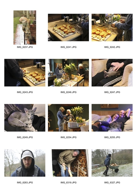
When visiting North Wales I shot a multitude of images from people in their environment to the environment itself. Having vast acres of land some of it uninhabited resulted in in a variety of images, from the inhabitants of the home we were staying in from rivers, dead animals and nature itself. Taking the brief 'people in their environment' in interpreted it quite literally but also metaphorically. For example, I photographed the plaque signifying where a relatives ashes had been scattered. I took an image of this because this man was literally in the environment in the form of ashes. Similarly I not only photographed people but animals also dead and alive. Additionally, I couldn't help but photograph the vast beauty of the countryside I was surrounded by so photographed it without people in front of the camera.
Contact Sheets
|
|
People in their Envrionment
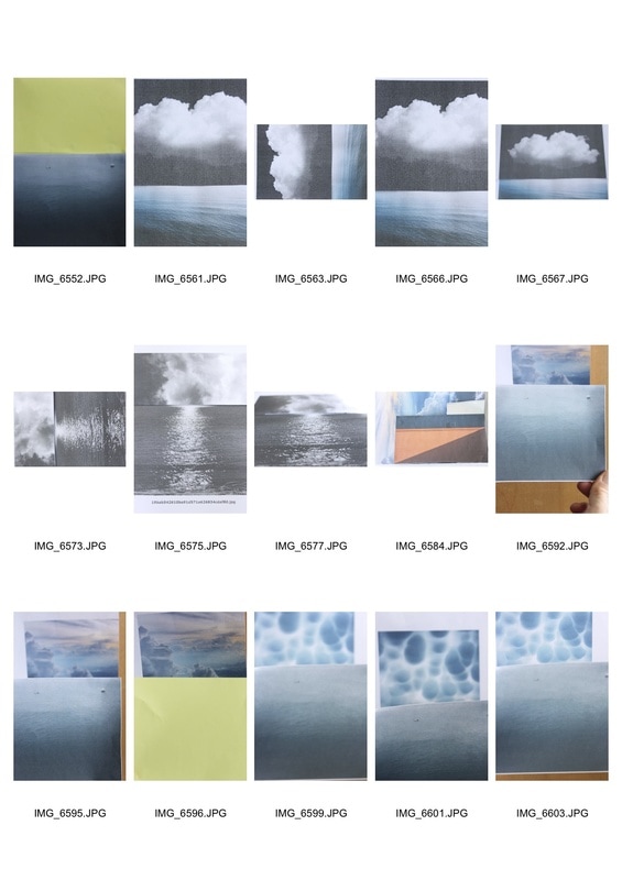
The Environment - Faraway
Perspective
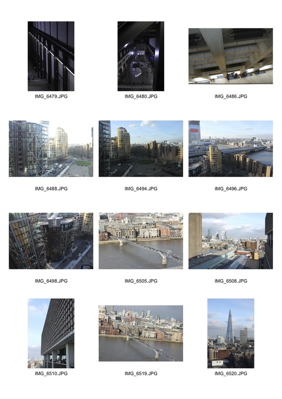
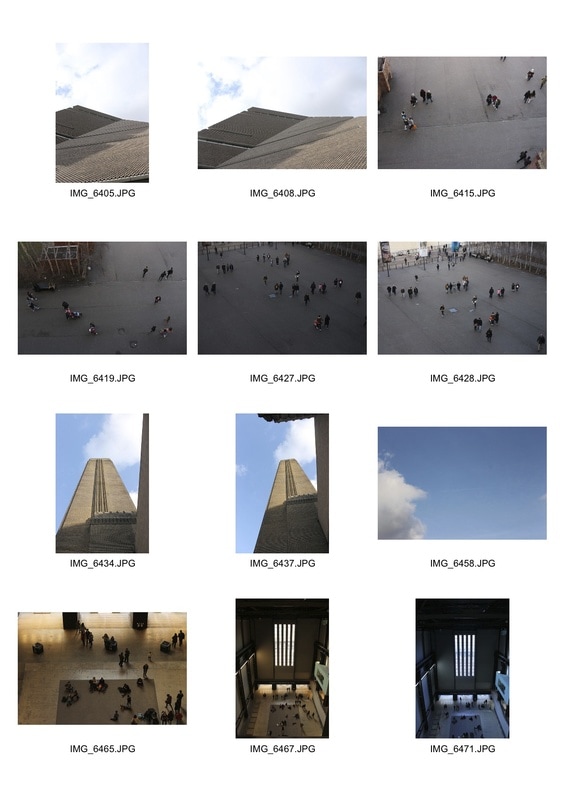
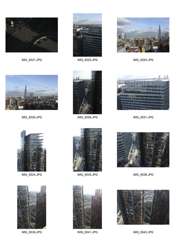
When visiting the Wolfgang Tillmans exhibition I also photographed from the viewing point on the Tenth Floor of the Tate Modern and also around central London. Whilst a generally straightforward task I took into account people, architecture and landmarks. This allowed for a variety of images shooting from below and above. Photographing people was interesting as the use of perspective turned them into small, insignificant objects against a vaster landscape. Also by working alongside architecture I took into lines of the buildings and the way they were shaped, dictating the focal point of my image. By including landscapes this gave a more obvious focal point to my images, and my editing them on photoshop I enhanced the focal points and lines of my images and made smaller segments of the images such as people stand out more.
Contact Sheets

|
|
Public Places Cont.
Wolfgang Tillmans
This exhibition was incredibly innovative and interesting as each room had a different context and showed the breadth of Tillmans work. I found the environment images especially poignant as they related to my exam title. In addition, the use of people and the context of environment gave me a new interpretation of the exam title environment. When visiting this exhibition you were handed a leaflet that gave a brief outline of each room but also an in depth insight into some of the images. This was helpful but also a tad frustrating as not all images were discussed and there was no outline of the image printed on the wall as seen in most exhibitions. For example, when wanting to know where an image was taken, unless it was discussed in the booklet you weren't told where it was taken. Despite all this each room was different for example, some art work was three metres tall and some 6 by 4 cm. Additionally, in one room all his books were laid out on a table and in another a variety of newspaper articles were displayed on tercel tables. Evermore in one room there was a group of chairs sat infant of a high tech set of speakers playing music that had not been auto tuned. Not every image related to my exam title but was incredibly inspirational in the amount of ideas it supplied me with and considering the wider context when taking a photograph.
Fake Environment
In response to Aaron Farley's fake environments which can be seen under 'Artist Link', I printed out images offline and cropped, cut and rotated them. I then combined them with other photographs of the environment to try and recreate Farley's 'Fake Environment'. This was much more difficult than initially thought due to the strong technique behind Farley's use of depth of field. This was hard to recreate and positioning the images in a way that made them look connected was tedious and tiring. Nevertheless, I feel my response to his work was of a high standard after numerous attempts to get it to a professional or more apt standard.
Contact Sheet
Edited Favourites
Artist Link - Aaron Farley
Farley's set of images below are not real environments, instead they are images of clouds or the sea or any environment, combined with the image of another environment. He crops, rotates, reshoots or reprints his photographs then puts them together to create a 'Fake Environment'. His use of depth of field allows the viewer to not be able to place the two separate locations or realise they are separate locations. Also the use of block colours makes it easier for the images to combine making the environments more believable.
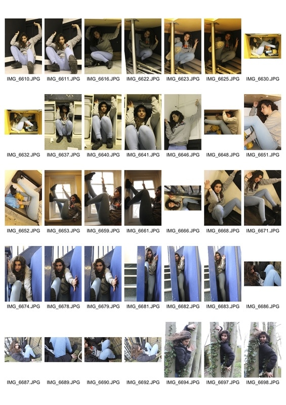
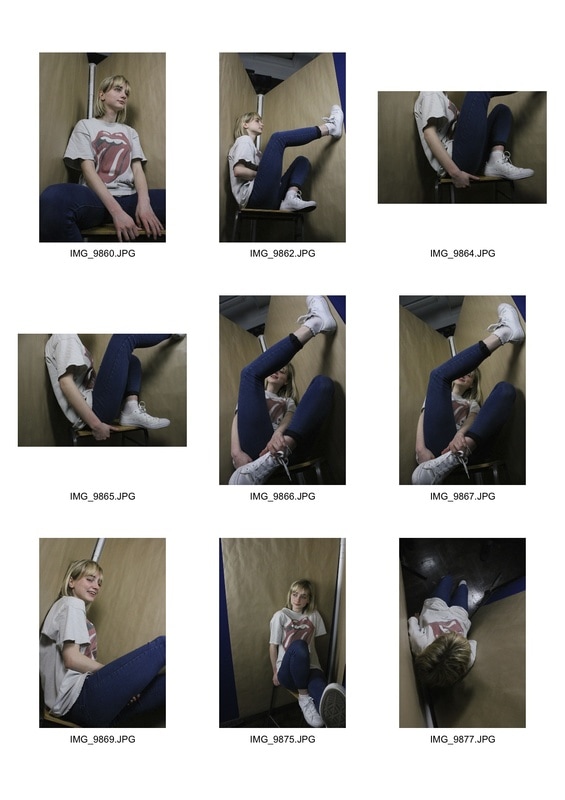
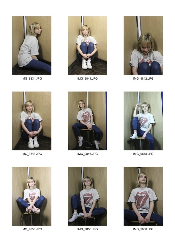
Confined Spaces Around School
For this shoot me and my subject had to find confined spaces that I could get her to squeeze her body into. Whilst most of these locations were uncomfortable to sit in, she tried not to show this on her face to make for a more contrasting image. Despite being confined, being perched looking casually at the camera added an edge of peculiarity to the image, as viewers would assume she would look tense and uncomfortable. Some of the locations we constructed but most of them we located around the school. In addition, only some of our locations were actually confining but through composition I tried to frame the image in a way that made it look confined. For example, by pushing arms against the walls it made my subject look constrained within a location even if it wasn't constraining.
Contact Sheet
Edited Favourites
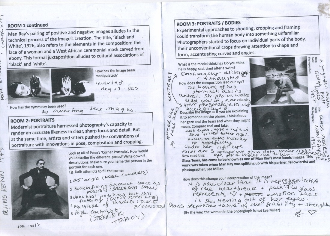
Artist Link - Irving Penn
Irving Penn's set of images below see the likes of famous characters contorting their bodies to accommodate to the space given to them. In comparison to the glamorous shots these celebrities are used to posing for, Penn presents these well known faces in a different and more obtrusive light.The name of these set of images 'Beyond Beauty' is fitting as some of the most iconic people of the era are for once not posed in a fashionable or elegant position. The peculiarity of these images is intriguing and I tried to display the same discomfort that can be seen in the body but not in the face in Penn's images. Penn is known for his breathtaking fashion and portrait photography, but these images show the vastness of his artistic perspective and his ability to move away from his fashion aesthetic.
Elton John - The Radical Eye
"Each of these photographs serves as inspiration for me in my life; they line the walls of my home and I consider them precious gems. I want people to think, ‘I’ve never seen anything like that before, never knew this kind of thing existed’ – just as I did when I first saw these photographs in the 90s."
— Sir Elton John
With the rest of my photography class, I visited the Radical Eye exhibition at the Tate Modern which was Elton John's private photography collection, consisting of classic modernist photographs from the 1920s–50s. It included rare and famous works, ranging from a group of Man Ray portraits, including portraits of Matisse and Picasso, over 70 artists and around 150 rare vintage prints on show from influential figures such as Brassai, Dorothea Lange, and Aleksandr Rodchenko.
It was a unique experience to go and observe Elton John's collection, as a lot of these original and one of a kind prints had never been exhibited before, additionally many art and photography collectors choose to never exhibit their pieces, depriving such influential and impactful work from the public. This exhibition really brought to fruition the importance of Photography as an art form, how it is developing and how important it is to preserve and appreciate such talent and work when it comes to Photography as creative expression. Additionally, it was also a historical documentation of the development of photography in the earlier years to when it was becoming more popular and widely used in photojournalism and merely for experimentation as a creative art form. I found it very compelling and interesting to see such a variety of photographs within one exhibition - a truly unique experience.

|
|
People Watching
At the Tate Modern, I decided to photograph a handful of people reacting to a free exhibition. Whilst inside this exhibition there was a tour going on alongside another group of students my age photographing the exhibition. This allowed for a variety of reactions to the abstract sculptures littered around this exhibition. The way they stood within the sculptures and under them was interesting and their reactions to them throughout their observation was incredibly interesting.
Contact Sheet
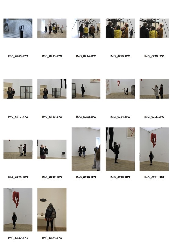
Favourites
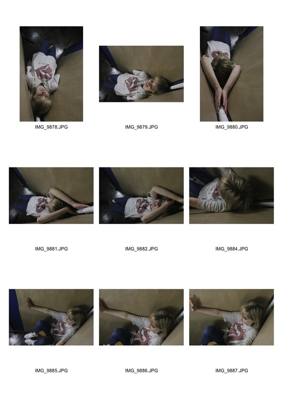
Confined Spaces Cont.
Post The Radical Eye where Irving Penn's confined spaces were exhibited, I decided to photograph one of my friends in a constructed environment where she could sit or stand on a chair and have more freedom to experiment with the space. Before me and my friend were choosing random places to photograph causing for less appealing images. Where as constructing a confined space meant I and the subject could experiment more with angles, positions and direction. I edited them on Photoshop in the same monochrome as Penn had photographed his subjects, additionally I was able to crop my images to add to the claustrophobic atmosphere I wanted to evoke within these set of photographs. I also used the earlier Photoshop process I conducted during my exploration of Public Spaces, where I removed negative space on Photoshop - this added to the confined feeling of my images but also helped to elevate their standard as images.
Contact Sheets
|
|
Edited Favourites
In the Studio...
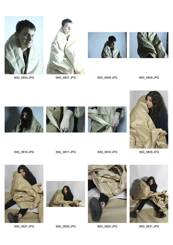
Inspired by activities conducted at the Tate Modern, we decided to reenact them ourselves within our own studio, using a large piece of brown paper. Whilst I was mainly a model in this process, willing to be wrapped up in the large piece of paper, I managed to capture a few shots of other willing subjects. I varied my angles and type of shots, trying to capture an appealing but unusual image, as the subjects seemed to get swamped by the paper, making it difficult to decipher more interesting shapes. Therefore, I experimented with cool and warm lighting, change focus from the subject to the paper, honed in on the texture of the paper and also the subjects facial expressions. This was a difficult situation to photograph but I felt the outcome was successful, strange and original.
Contact Sheet
Edited Favourites
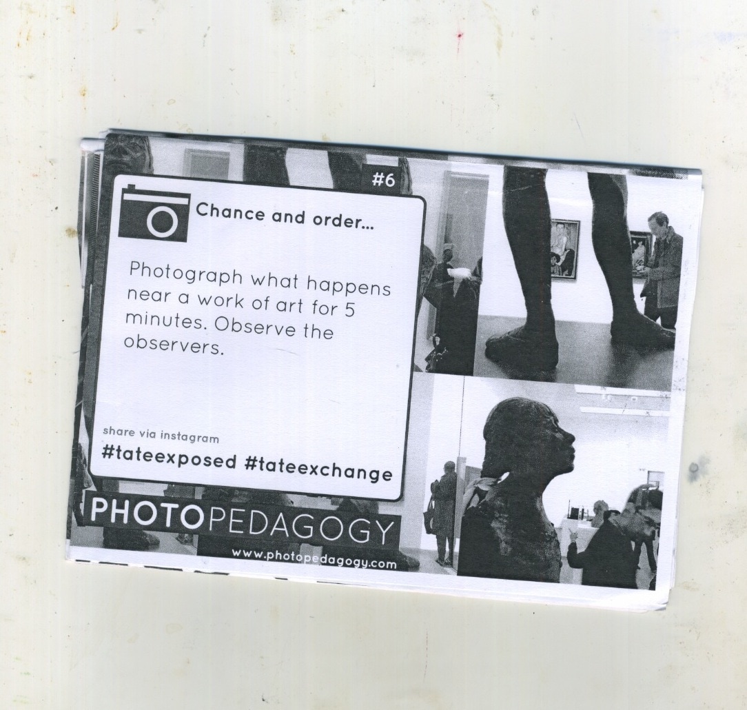
Artist Link - PhotoPedagogy @ Tate Exchanges
Tate Exchange allows different organisations and members of the public to get involved in artistic experiments at the Tate Modern. One experiment in particular was students being creative with backdrop paper experiments, which I tried to reenact in the studio at school. Whilst I was responding to their work they were responding to George Platt Lynes work from 1943. Whilst Lynes use of paper in his images is one of a kind, the element of nudity in his work is a reoccurring factor throughout his art. However, myself and the students reenacting his work removed this element of nudity but really experimented with the use of large pieces of papers, varying our lighting, shapes and angles.
|
|
|
Three Strands
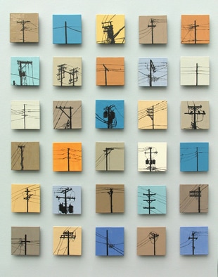
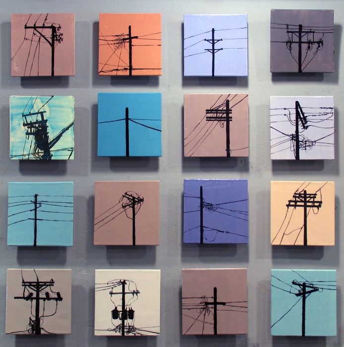
Jason Messinger
Messinger's artwork aims to feed the eye and soul of the viewer through his combination of abstraction and identity - two very different ideas. A piece of his work that appealed to me was his use of typology when photographing silhouettes of satellites on the top of peoples roofs placed in front of a block colour background. This unique interpretation of typology and such a mundane, everyday object I found incredibly interesting. By placing these objects against a painted block colour (some of which are more textured than others) but elevated the status of this mundane objects by turning them into an interesting art piece that I would love to respond to. His manipulation of a common environment relates well to the exam brief and is not the most straightforward interpretations of the title. Messinger printed these images onto tiles making them 3D and also enhanced their elevated status as a piece of artwork. His use of perspective is interesting as he looks up at small objects against negative space, which I could interpret by reversing the colours. For example a black background colours objects, or the objects no longer silhouetted but instead as they are seen face on and then on Photoshop adding a coloured background. There is a lot of different ways to interpret Messinger's amazing set of art pieces that I can do through mixed media but also on Photoshop.
|
|
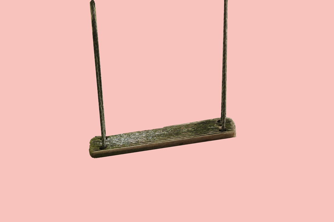
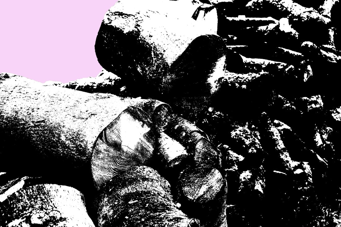
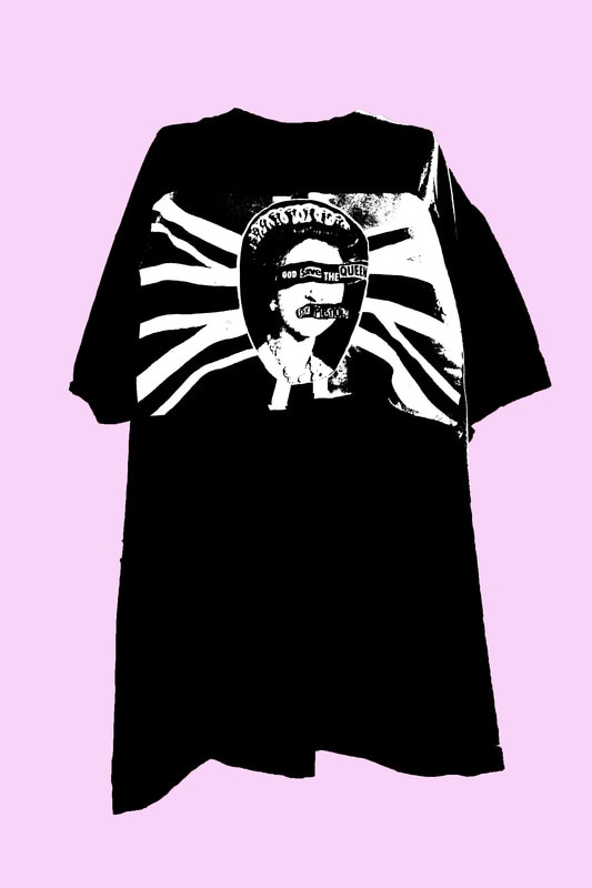
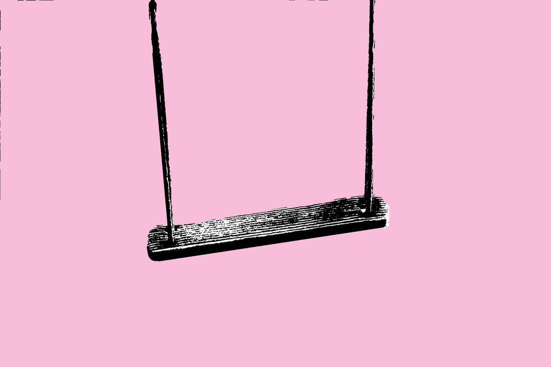
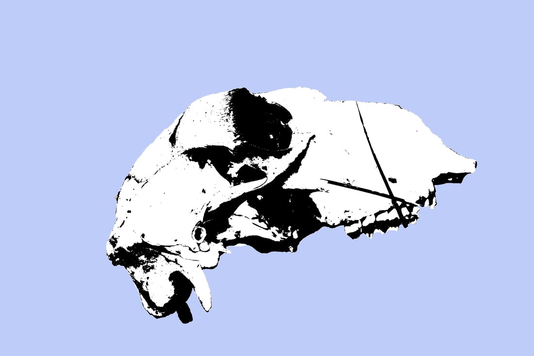
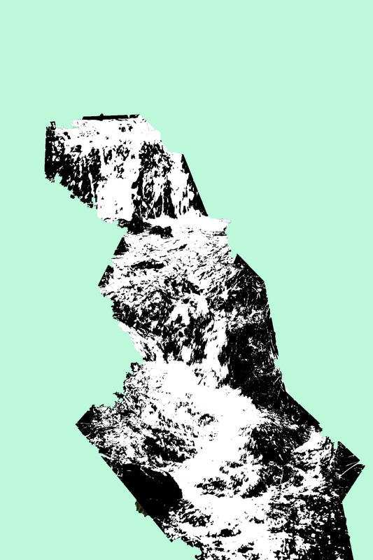
Response
In response to Messinger's work I chose some images I had taken previously, uploaded them onto Photoshop and edited them. Here I played around with colour and threshold combining editing I had done in response to William Klein to strengthen the composition of my images. Whilst they are not in the typology style of Messinger I think this is a good foundation for how to respond to his work and understand the process. I chose abstract objects that may be difficult to decipher straying away from the mundaneness of Messinger's satellites. Instead I chose a river, a swing, a sheep skull, some logs and a t-shirt. Below are my finished images and a brief description of my editing process.
Without threshold used
|
|
Cool Girls Shoot Film - Film Soup
Cool Girls Shoot Film is a unique collective of women who shoot images on film and conduct a 'recipe' of ways to manipulate their strips of film. For example, one recipe reads
- 300 ml hot water
- 1 cap of detergent
- 1 tbsp of vanilla tea leaves
- Leave film roll in this film soup for 48 hours, dried, exposed and cross processed
Response
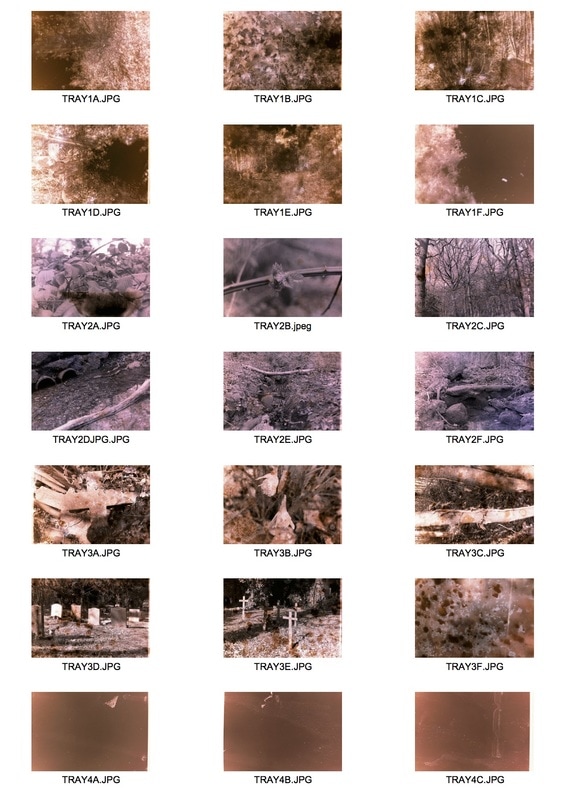
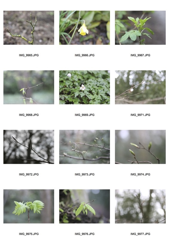
In response to Film Soup I shot a black and white 24 strip of film on a automatic film camera using both a macro lens, 50mm and 35mm. I photographed a local woods and a local cemetery varying my shots from close up to wide shot, photographing a multitude of things such as flowers, vines, trees, gravestones and an old rusted car overtaken by nature. After developing the strips of film I risked all my film strips by splitting them up into four sets of six placing them in trays and experimenting with them.
Tray 1 Recipe:
Tray 1 Recipe:
- Several tea bags of Strawberry, Raspberry and Cranberry Tea (which when tested out at home stained objects a redish pink)
- Two tea bags of Blackberry and Blueberry Tea (which when tested out at home stained objects a bluish purple)
- Around 200 ml of water
- Several caps of Heavy Citrus Bleach
- One tea bag of Yogi Tea (which when tested out at home stained objects a green and yellow colour)
- A sprinkling of Vanish Powder
- Two tea bags of Blackberry and Blueberry Tea
- Around 200 ml of water
- Three tea bags of Blackberry and Blueberry Tea
- Two tea bags of Strawberry, Raspberry and Cranberry Tea
- One tea bag of Chai Tea
- Around 200 ml of water
- Several caps of Heavy Bleach
- One tablespoon of Fairy Liquid
- One cap of Heavy Bleach
- A sprinkling of Vanish Powder
- A sprinkling of Soda Crystals
- A sprinkling of Vitamin C Powder
- Around 200ml of water
Negative Scans
Contact Sheet
Edited Favourites
After using a negative scanner to print my images onto my SD card I edited them on Photoshop. This allowed me to enhance the colour and effects of the film soup of my images. By increasing or decreasing the vibrancy, levels, saturation, contrast and brightness of my film images I could emphasis the effect the film soup had on my images of the environment. Following this I plan to take images with colour film to allow for the experimentation to play with colours of the images and also take pictures using a macro lens on my DSLR to capture the smaller parts of the environment as I have done a few times with the images below.
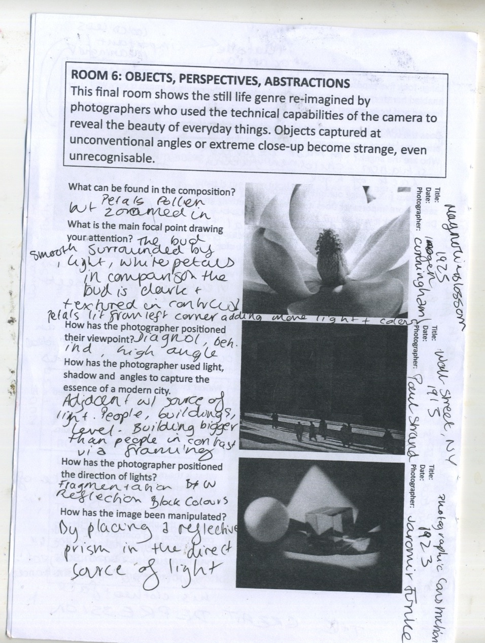
Ralph Eugene Meatyard
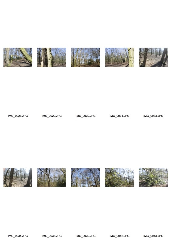
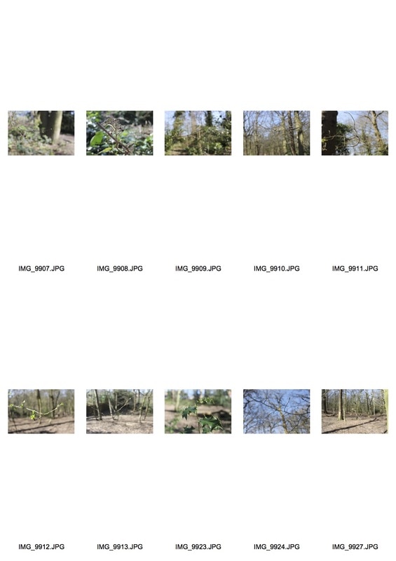
Meatyard was an American photographer born in Illinois in 1925. Whilst most of his photography worked with people, masks and performative imagery, his environment photography is much less abstract and bizarre. His set of images called 'Twigs' focuses on the smaller segments of a vaster landscape or environment. By reducing his depth of field he created a more abstract composition. This also creates a strong mood and atmosphere by focusing on something as small and insignificant as a twig. The use of black and white is quite impactful in enhancing the status of the twig by making it the focal point and making the background evermore difficult to decipher. I really like this simple but impactful photography of environment, that by photographing in woods and parks could be interesting to respond to. In addition, I could photograph more than twigs such as budding flowers, leaves, rubbish hanging from a tree, a single flower amongst an endless sea of flowers - the options are endless. Meatyard's set of image is a good place to start and grasp inspiration from, considering angle, composition, depth of field and filling the frame .
Response
For my response to Meatyard's work I used my digital camera on manual focus and explored a wood where I took close up photographs of branches and twigs. I aimed to have the focus solely on the finer details of my image i.e. a single branch or a single budding flower. This made them the focal point of the image and also was similar to Meatyard's collection of images. I then edited my photographs on Photoshop in a similar style of Meatyard, by making them monochrome and adjusting the contrast within the image to exaggerate and enhance the main focal point of my photographs. In comparison, I kept some of the images in colour but increased the brightness to emphasise the focal point of my image, placed in a slideshow side by side I feel the differences and similarities between the colour and monochrome images is evident, but can also be linked to Meatyard's set of images, in terms of the style of photography and the subjects.
Contact Sheets
|
|
Edited Favourites
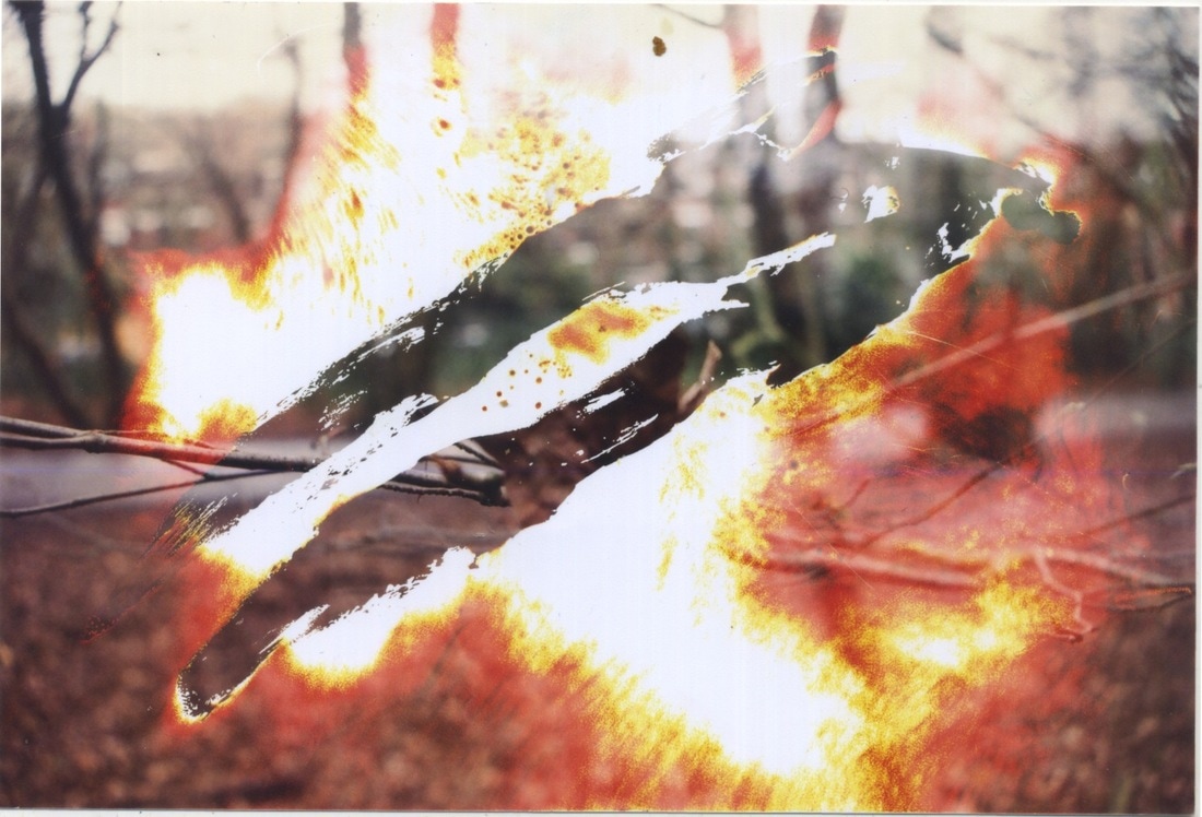
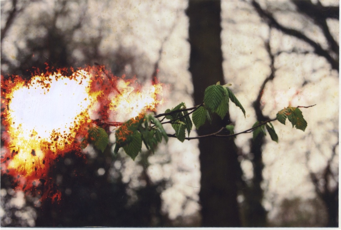
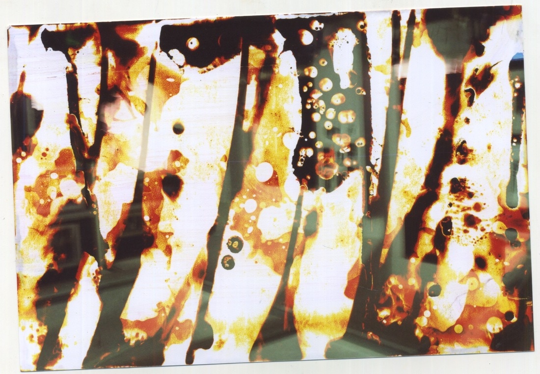
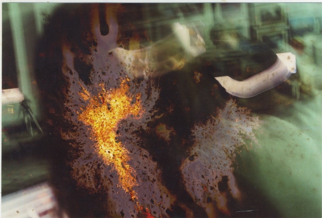
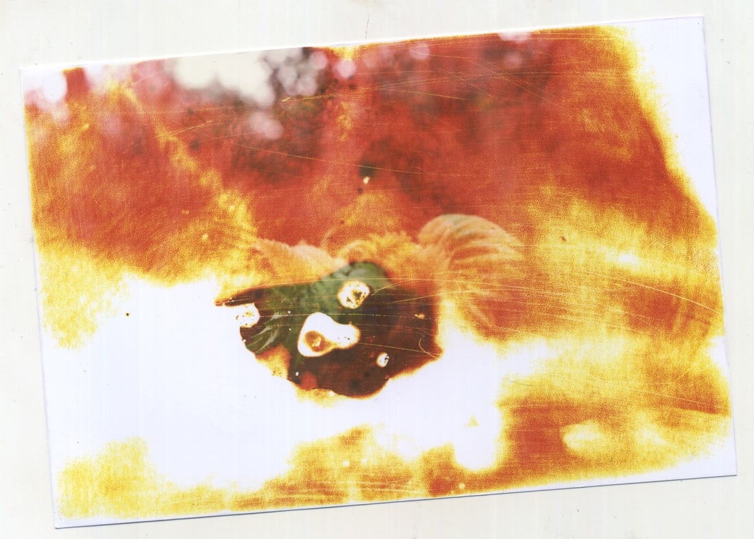
Development - Film Soup
For my first development I decided to further my exploration into film soup. Instead of using black and white film and experimenting with the negative strips, I used colour film and had them printed at a local Snappy Snaps. I then took them back to school and used a variety of different substances to manipulate the images. This allowed for each print to come out completely different. I also felt this was a great response to the exam title as I combined images of the environment and destroyed them with man made products. Thus, highlighting the futility of the environment in the face of the ferocity of man. Despite the context, I think this added creativity and innovation to my images as they went from plain images of the environment, to explosive, colourful and striking images. By altering the time I left my images in the substances for this lead to a series of surprising results which I found was quite an exciting process. I feel depending on the strength of the products I am using for example bleach versus tea, the longer I leave the images in the substance for the more interesting and unexpected the result. This also allows for more time for the substances to effect the images, but if using bleach I don't think I could leave an image in such a harsh substance for a longer period of time as it would completely destroy my image, thus my photography would no longer be visible.
Recipe:
Recipe:
Recipe:
Recipe:
Recipe:
|
Recipe:
Recipe:
Recipe:
Recipe:
Recipe:
Recipe:
|
Buried Images
To progress on from film soup, I decided to bury images I took on my DSLR camera in the style of Meatyard's with a macro lens, using manual focus when necessary. I made sure that I had a variety of focal points when it came to colour, structure and positioning, to create variety across my collection of photographs. By printing these images at school, this allowed for a different type of ink to be used rather than the ink used in Snappy Snaps. This meant that when it came to burying my images the outcome and effect it had on the images would be different, and also would tell me which inks were more or less durable. After printing the images I then buried them where I took them, so the environment I photographed had a direct effect on my images. This is the opposite of film soup, but ties in adequately with my development process, as they are both processes of experimentation, yet one if a natural effect and the other a man made effect. The effect burying the images had I didn't think was powerful enough, as it just left the images dusted with soil, slightly scratched and one or two minorly stained. Due to this I felt I should return to manmade - harsher - experiments, so that I real impact could be seen on my images.
Contact Sheets
|
|
Before - Macro Lens
After being buried for two weeks
Artist Link - Stephen Gill, Buried
Stephen Gill is a photographer who takes pictures of his subjects and environment and buries the images where he photographed them, so that the environment can have a direct effect on his images. Whilst he also takes pictures of people, I am mainly intrigued by his photographs of nature and how he buried them where they were taken. His collaboration with a physical place results in an earthy and conceptual result. The unpredictable nature of the natural environment is just as fierce as the unpredictability of film soup in the sense that you don't know what the outcome will be. All the photos in the collection 'Buried' were taken in Hackney Wick and later buried there, like the time my images were left tin their film soup, the depth at which these images were buried and their positioning also altered for each photograph. Stephen Gill himself comments "Not knowing what an image would look like once it was dug up introduced an element of chance and surprise which I found appealing. This feeling of letting go and in a way collaborating with place allowing it also to work on putting the finishing touches to a picture felt fair. Maybe the spirit of the place can also make its mark." His feeling towards his work is exactly want I wanted to hone in on in both my film soup development and my buried images.
Saturation
For my next development I decided to use my DSLR camera to take more saturated images with more colour and vibrance. Considering the time of year most environments are most dull at the moment, but my granny has a vibrant garden full of plants, colourful plant pots and decorations. Keeping depth of field in the forefront of my mind I made sure that the out of focus background still had structure and colour, rather than rendered indecipherable due to the use of depth of field. Also I had to keep colour in the forefront of the image so to add more saturation and colour I photographed both natural flowers and objects. This photography of bright and loud colours not only uses Meatyard's depth of filed but also the vibrant and saturated colours than can be seen in Gill's work above but also the surreal and extremely saturated colours of Scarlett Hooft Graafland's 'Surreal Encounters.' Then by experimenting with them I am keeping with my previous developments of the futility of nature versus the ferocity of man. By printing some of these images on Photobox I hoped to get a different result from the Snappy Snap prints due to what colour ink they use as their base and the texture of the images thus I ordered them in gloss rather than matt.
Contact Sheets
|
|
Printed on Photobox (6"x4" on Gloss)
Images above after being bathed in their film soup
|
First Recipe:
|
|
|
Second Recipe:
|
|
|
Third Recipe:
|
|
|
Fourth Recipe:
|
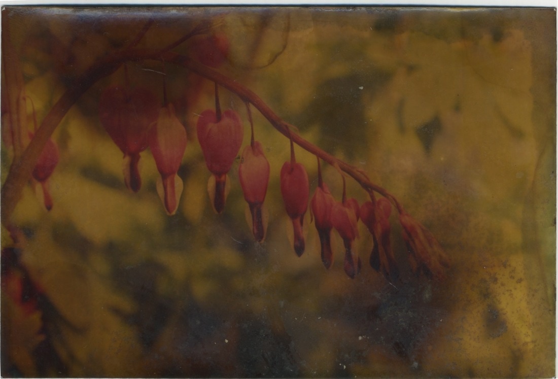
IMAGE 3
|
|
Fifth Recipe:
|
|
Artist Link - Scarlett Hooft Graafland, Surreal Encounters
Whilst her work isn't the most normal artist link, her use of colour and saturation adheres to the main ideas fuelling my photography. Her surrealist photography is bizarre yet compelling due to her choice of setting and her use of colour to enhance the surreal, other worldly elements to her photography. Her use of colour was a main focal point for my photo's above, as I chose flowers that were bright and vibrant. Unfortunately some of the experiments drained the colour, but like Scarlett capturing colour was key to our photographs, with the background being not the focal point but also as vibrant, so overall the images are full of life, colour and vibrancy.
John Mayne
Whilst unrelated to my response to environment, this exhibition was contextually and culturally interesting. Mayne photographed in some of the United Kingdoms major cities post WW2, and captured the environment of which the working class were forced to live and work in when there was no money after the war to rebuild the streets of their everyday lives. Mayne captures the cultural diversity of London and the struggles of the working class in the factories they worked in and the debris left behind by bombs that became the youths new playground. Mayne photographs the societal masses in the United Kingdom in a fascinating and 0 way. Whilst the focal point of these images is the people that environment that are photographed in is what gives the images depth in terms of context and culture. As he photographed over a couple decades it is also interesting to see how the quality of photographs improved. If not a photography student it wouldn't be as obvious to the eye, but as student of photography it was at ease that I picked up the subtle improvements in the standard of the prints as the years passed during this post war period.
Artist Link - Stephen Gill, Hackney Flowers
This set of images by Stephen Gill has been described by Nobody Books as an 'beautiful and evocative series.' In this series Gill has collected seeds, flowers, berries and objects from the environment in which he photographed his images. He then pressed them with the photographs in a studio and re-photographed his images thus creating a multi - layered image that becomes more personal to the environment he photographed in - Hackney. Some of the images he added flowers, seeds, berries or objects he had previously buried in his former series, adding the environmental element to his series with more depth. Critics consider this series 'warm, poetic and visually exciting.'
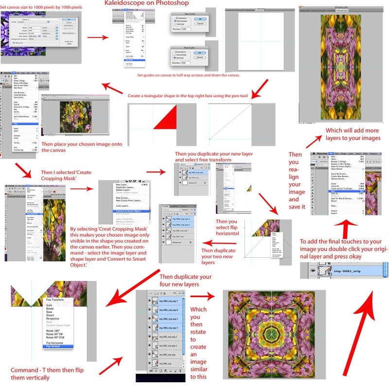
Kaleidoscopes
To follow on from the physical experiments I had been doing on my images I decided to experiment digitally through Photoshop on my photographs. To develop the saturation and bright colours I was trying to enhance in my previous series of images, I thought turning my photographs of colourful flowers into kaleidoscopes would transform and elevate the loud colours of my images. I found a simple tutorial on Youtube to help me with this task and found that the results were as random as the outcome of adding bleach to an image, but still remained interesting and vivd, rather than there being the risk of my photographs being destroyed or rendered in-comprehensive.
Tutorial
Created on Photoshop
Step by Step
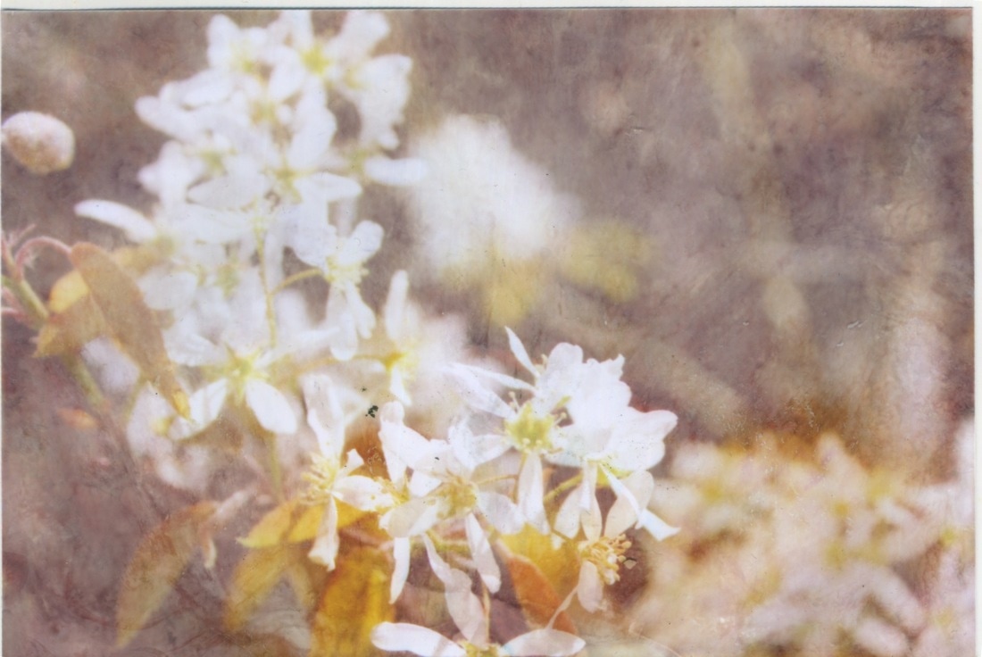
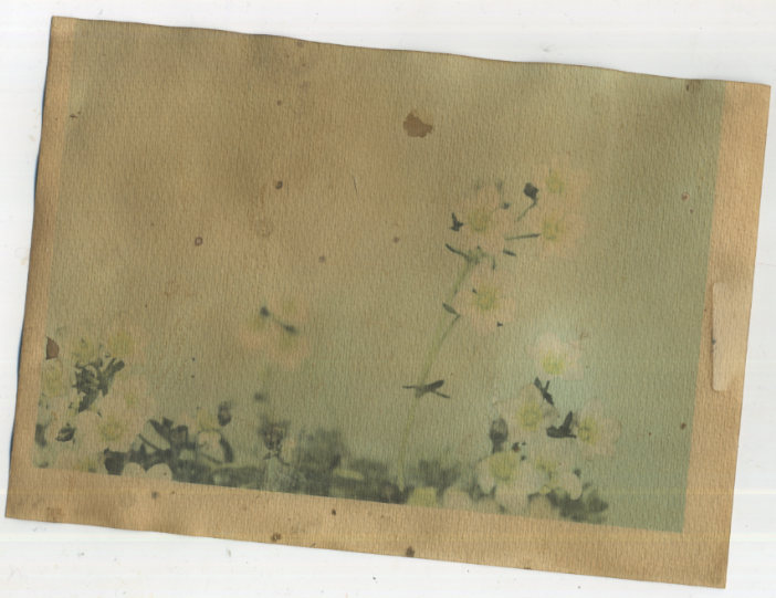
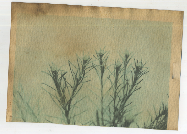
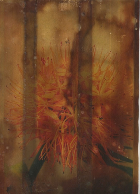
Block Backgrounds
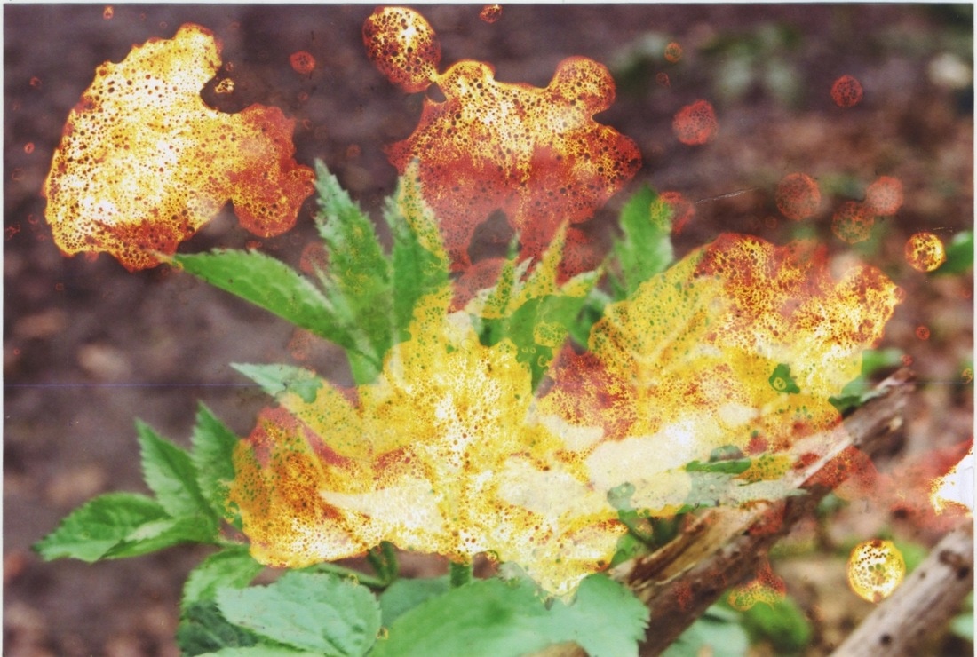
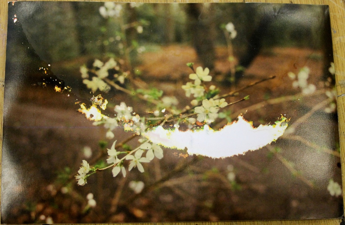
After some reflection on my Kaleidoscopes, I realised I could be moving quite far away from my previous developments. Whilst an interesting change in direction I decided to return to my physical experimentations but with a clearer path foreword. Inspired by victorian botany I decided to respond to Leendert Blok and Hatje Cantz's 'Silent Beauties.' In doing this I got a piece of grey card and placed it behind plants and flowers within my garden. I felt this elevated the status the plants within my photographs and they became more isolated and thus the main focal point of my images. Additionally, when putting them against a block background when printing them out onto paper, dying them with tea and coffee to age the images made it easier, as the background being a block colour dyed more easily and the plants remained the focal point. I printed a few of my selected images on to relatively thick card that was slightly textured, and put each print in either tea, green tea, coffee or a mixture of tea and coffee. I left the prints in these variety of mixtures with boiling water and left them there for several days before removing them. Unfortunately mould grew on the prints that when washed off left some particular staining but I feel this also added to the ageing of my prints.
Contact Sheets
|
|
Prints after being dyed
Green Tea
|
|
|
|
Different Paper
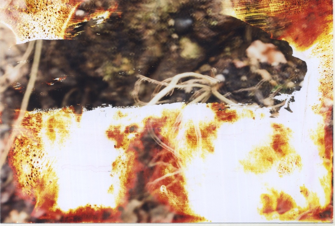
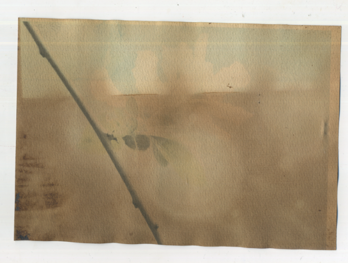
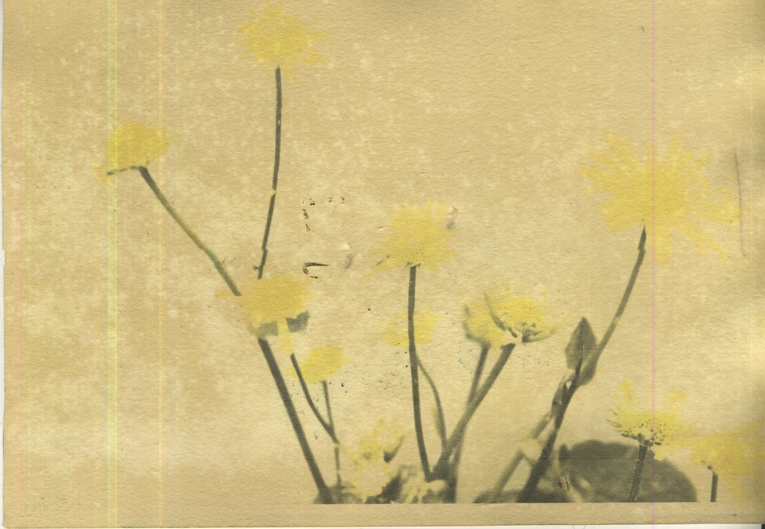
Following this I purchased some slightly thinner and less textured card and put four prints in tea, coffee, green tea and a mixture of coffee and tea. I decided to empty the contents of the tea bags into the boiling water too hopefully avoid the shape of the tea bags staining the prints and mould forming. I left these prints in their contents for only 24 hours. Unfortunately, this type of paper was not durable enough to absorb the amount of liquid I bathed it in, allowing for slight rips on the paper. However, I felt this length of time was more fitting (but may have to be a day or so longer for thicker paper) and emptying the tea bags allowed for unwanted staining on my prints.
|
|
|
|
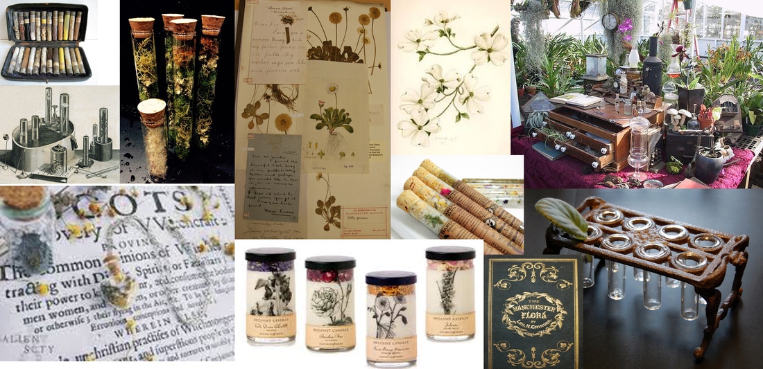
Artist Link - Leendert Blok and Hatje Cantz, Silent Beauties from the 1920s
This collection of photographs are full of muted tones and and soft bronze hues, exposing viewers to a timeless era of flowers, petals and buds, which are elevated as they stand against a plain dark background. The diversity of the flowers is exposed through this collection as their bright colours are dulled, yet this creates an aged element to the prints, giving them historical context. These living plants are frozen in time through this representation of floras. reflective of the botanist era, where each flower was a specimen, something new and exciting. This investigative atmosphere is encapsulated by the way that these flowers become immanent structures through the way these prints are framed and the use of bronze tones. In the photographs above I tried to mirror these muted tones and aged hues of bronzes and browns through using tea and coffee to give them this timeless element. However, I did feel I lost some of their vitality through a dulling of colour almost too much, but I do still think this type of framing turns these flowers into structures, art pieces in themselves, as you capture them singularly able to hone in on the smaller details that make each flower so unique.
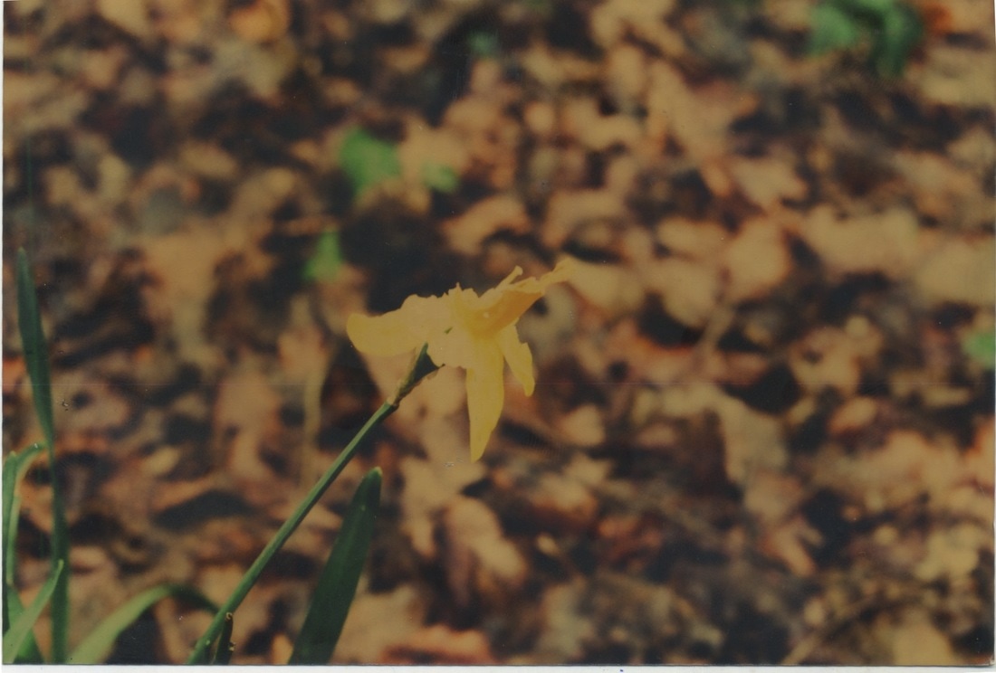
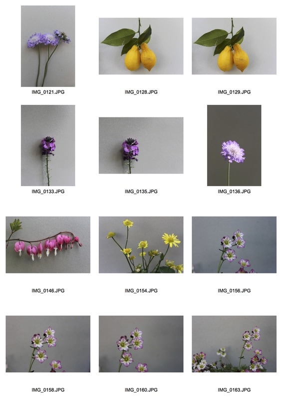
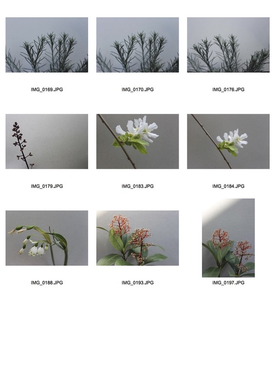
Kew Gardens
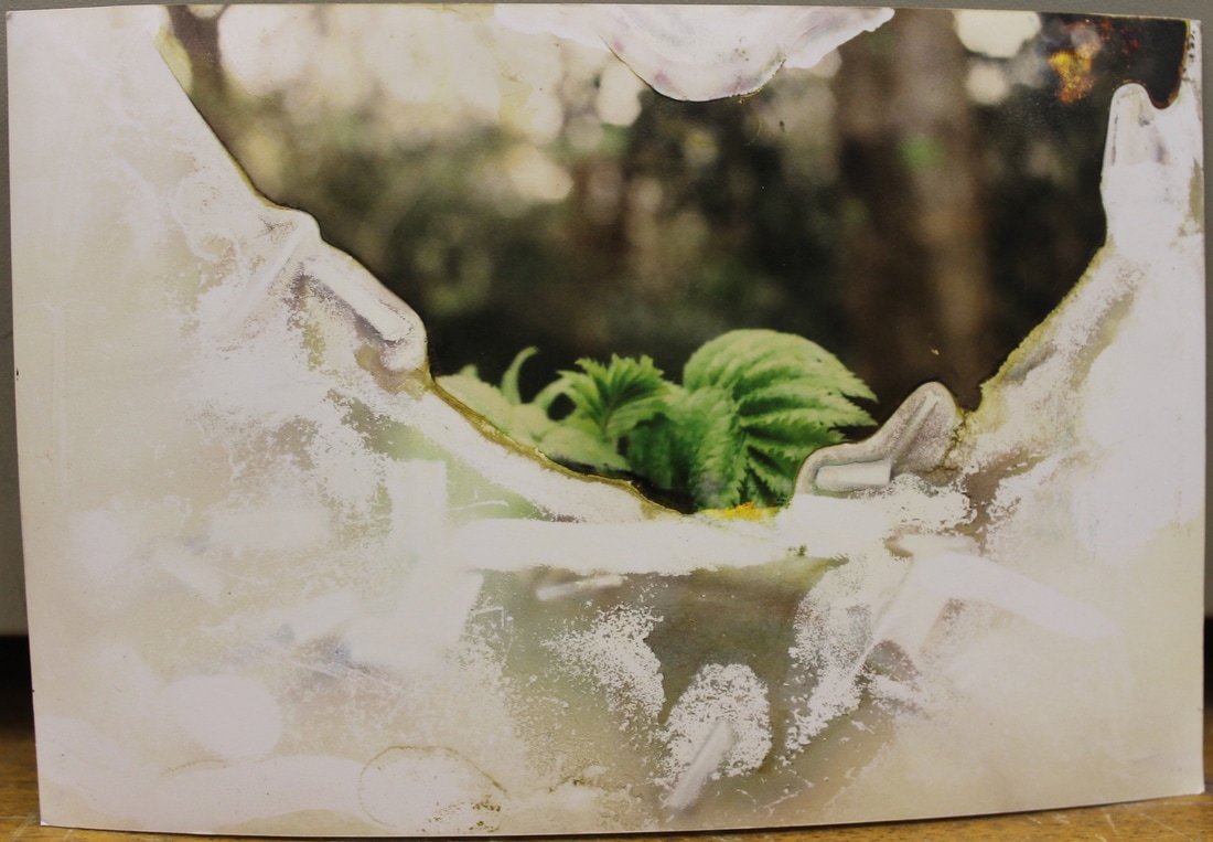
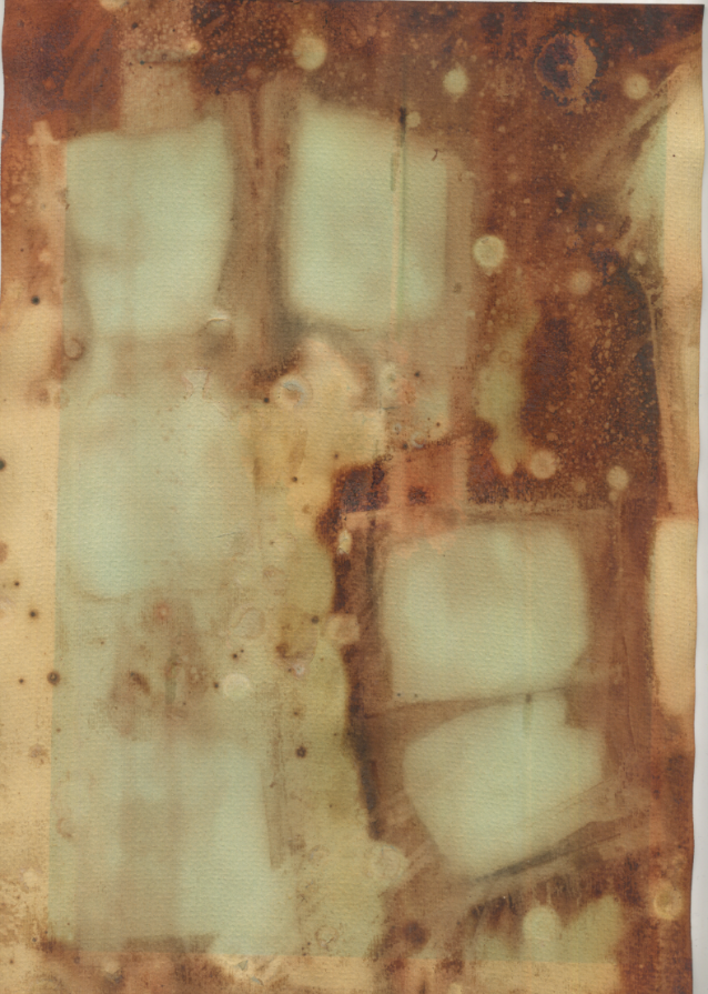
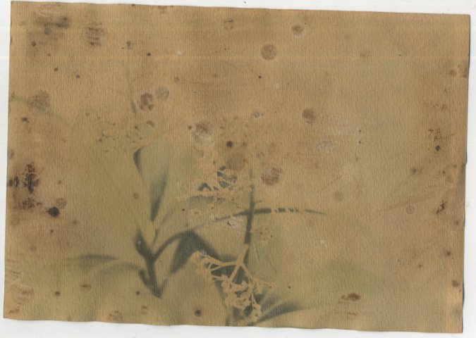
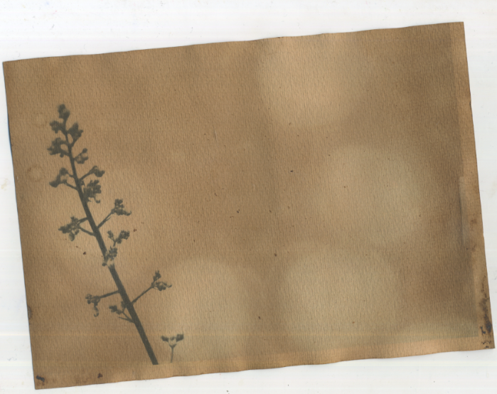
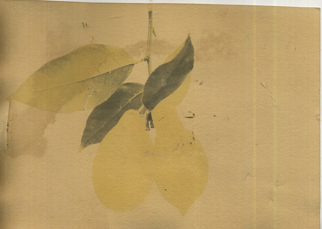
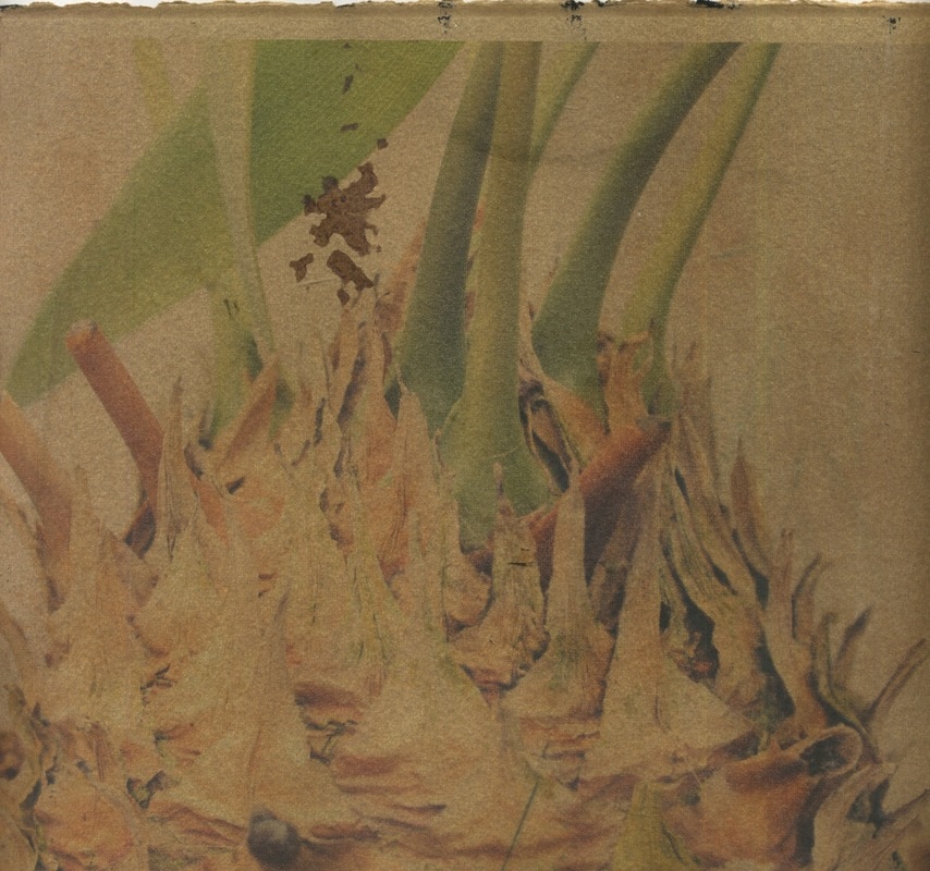
To take more photographs of flowers and plants I chose to go to Kew Gardens to acquire a range of more exotic and unusual plants, more realistic to the kinds of plants botanists would have been interested in. I used a piece of white card to elevate the status of these plants but also make it easier when dying the images. In preparation for my exam I left multiple prints on different types of paper to dye for four days. However, this amount of time meant some prints lost their colour, strange staining had occurred or the image was destroyed altogether. However, with some of the prints that were rendered useless I printed images onto the dyed paper to see what effect this created. Below is both the reprints and the original images post four days of dying.
Contact Sheets
|
|
Favourites
Post Four Days
Favourites
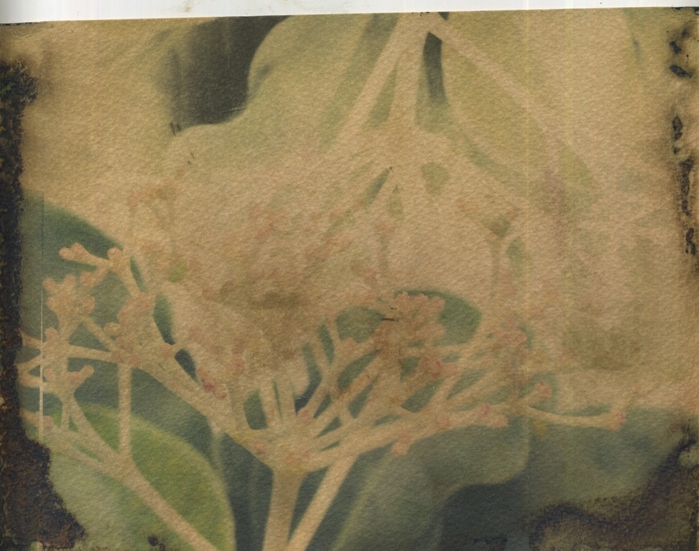
Reprints
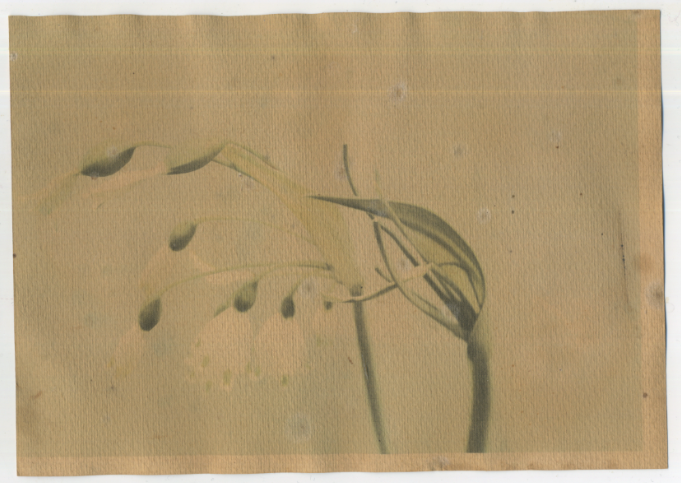
As some of my prints were rendered indecipherable after the dying process, I made the most of a bad situation, and decided to reprint some of my favourite images onto the already dyed prints. I felt this worked well and was more similar to the work exhibited in 'Silent Beauties' as the colours were stronger but did at the same time look slightly detached from the whole timeless feel I wanted to create through these images. At the same time however I felt the prints below were still appealing and engaging to observe, due to the tones and the contrast created.
|
|
Final Piece
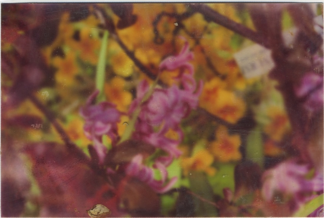
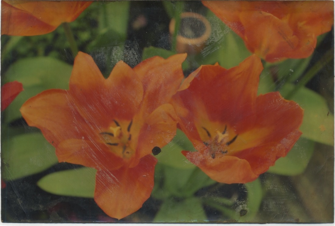
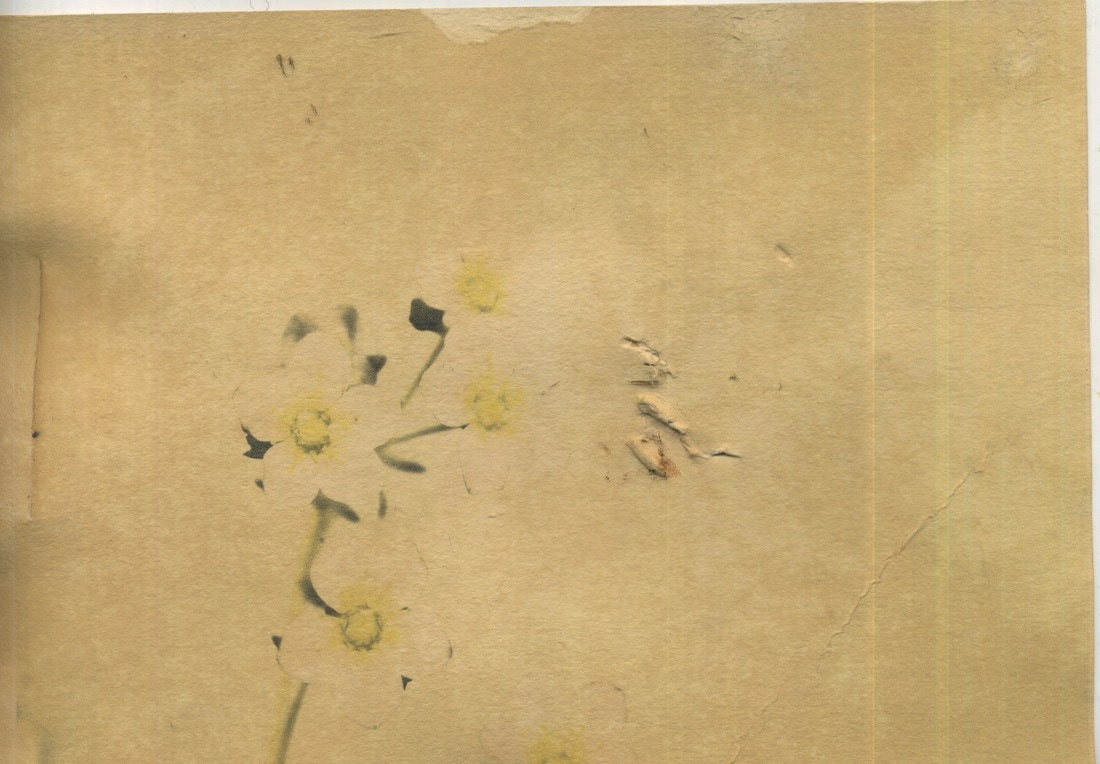
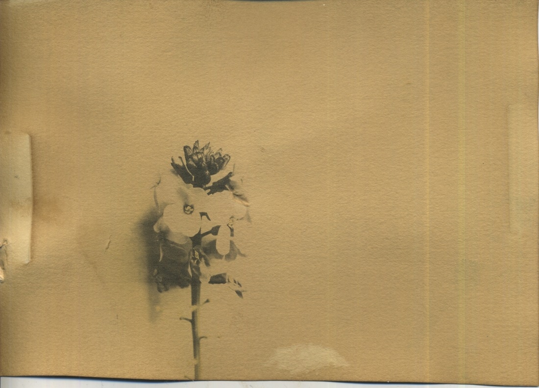
Aged Photographs
During the exam I reprinted my images onto different paper and checked on them every half an hour when they were being dyed. This meant I could avoid over dying them or losing too much colour. For some images the minute you liquid on them the colour was drained but for others this wasn't the case. Below is the a collection of the images I dyed during my exam, in which most of them remained in their dye for three to four hours.
Favourites
Dyed Prints
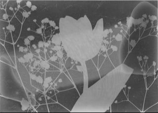
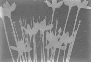
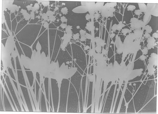
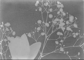
Photo-grams
As part of my final piece I bought a variety of fake flowers to use to make types of hybrid flowers in the dark room. I choose fake flowers over real flowers due to their sturdiness and more defined shapes, which would be picked up more easily in the dark room. Following this, to keep in theme with old fashioned style I wanted my prints to be in, I put my photo-grams in sepia toner to create a slightly brown hue to my photo-grams. This kept in fashion with the Victorian botanist look I was hoping to create through my final piece and the way it was exhibited. I used several different types of photographic paper that resulted in different textures and exposure of my photo grams. Additionally, I ultimately ended up incorporating real flowers into my photo grams as whilst the fake flowers had more sturdiness, they created more shadows, where as the real flowers could be pressed and experimented with more due to their malleability. Incorporating the two resulted in a variety of outcomes, which I felt all worked well with the style of Victorian botany and the theme of environment.
|
|
Anna Atkins
Anna Atkins was an English botanist and photographer. She is often considered the first person to publish a book illustrated with photographic images. Some sources claim that she was the first woman to create a photograph. Anna Atkins was born in 1799 and died in 1871. In her life span, Atkins was very close friends with William Henry Fox Talbot, and from him she learnt directly how to create his two photographic inventions - calotypes and 'photogenic drawing'. Another friend of Atkins was Sir John Herschel whom invented the cyanotype photographic process, which within a year Atkins applied to the process of algae by making cyanotype photograms that were contact printed. She self - published 'Photographs of British Algae: Cyanotype Impressions' in 1843. Even though it was privately published with only a few copies in existence, it is still considered the first book with photographic illustrations. Within a decade of the first volume of her book she created two more. In addition she collaborated with Anne Dixon, crafting several more albums of cyanotype photograms - 'Cyanotypes of British and Foreign Ferns' in 1853 and 'Cyanotypes of British and Foreign Flowering Plants and Ferns' in 1854.
Exhibition Mood Board - Channeling Victorian Botanists
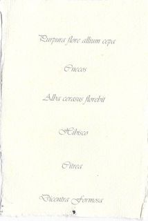
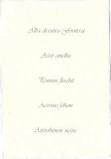
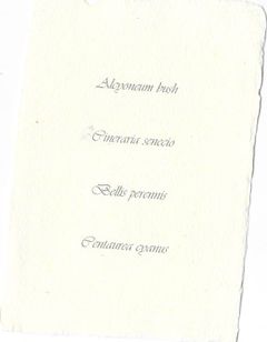
To add to my prints of flowers I chose to research the names of the flowers in Latin, adding to the Victorian feel of my images inspired by Victorian Botanists of the era. Through endless google searching and translating I managed to locate their names and decided to type them up in an old fashioned looking font, onto slightly aged and worn paper. I felt this contributed to the overall feel of my final piece whilst also adding originality and authenticity, keeping the influence behind my ideas clear throughout the whole of my work including its final presentation.
|
|
|
